I’ll beat this drum again, but I do believe it’s an important point for designers and novices.
Don’t get me wrong. I like Sparkle and have spent about a year using it, and I promote to others.
If one follows @duncan excellent instructional material one can construct a website with the 960 variant first. Then users start to design the 320 device. That’s the beginning of confusion for new users. They head to the 320 device and everything is duplicated. The user starts to select and turn off the show on this device setting. The 320 device design is far, far different than the 960 device. Images, effects, text. It all changes. The new user becomes confused. He/she then adds something new to the 320, and that appears on the 960 device. Thus creating the “back and forth” syndrome.
I have an idea and I’ll mention it again.
Rather than “show” on other devices, default “do not show”, or a “repeat” on other devices button, with default off.
There’s been a request for asset management, but if Sparkle doesn’t want to add an entire asset pane, it could easily be done by first, at least adding a default off, showing on other devices.
There’s many who design a great 960 site. The failure occurs when they try to create the 320 site. One works the “don’t show on this device”, adds a couple of elements, and by default they show up in the 960.
I’m not trying to reinvent Sparkle code or UI or bash the program. My aim in suggesting this is to stop the confusion that new users go through in the beginning of their experience, and adding more users is the prime intent of Sparkle.
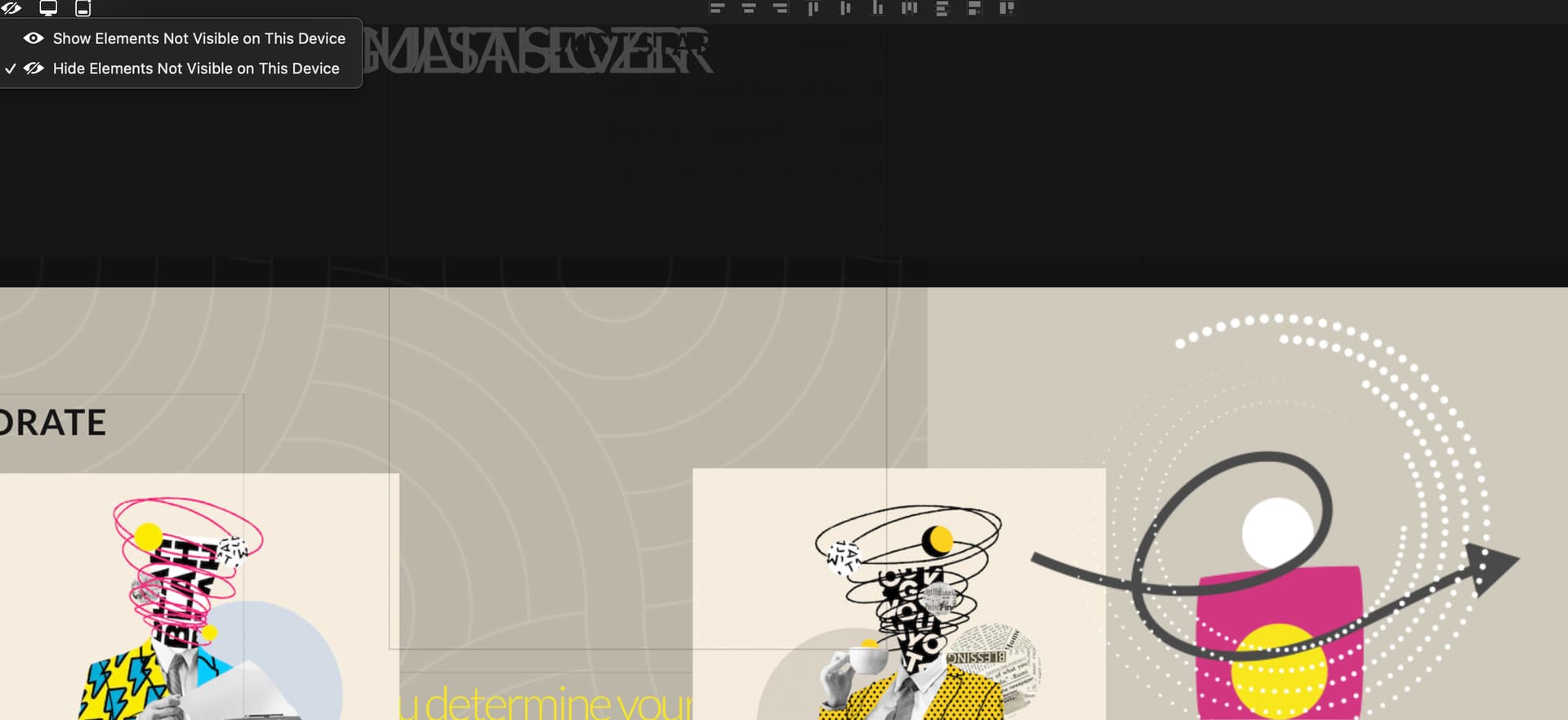
Thanks for the suggestion. I don’t know that “show on this device” should be used so heavily, the spirit of a responsive design is that all content is visible on all devices. Conceivably we could make the “show on this device” simpler to operate, even though going as far as defaulting to hiding everything feels like the wrong way.
The devices documentation is simplistic, but what it describes will lead to a responsive site 1) use text styles, 2) add the mobile layout, 3) go through all pages and resize text and other elements, reflowing them on each page.
Sparkle 4 has added layout blocks to help with step 3, reflowing is simpler when sections of a page are encapsulated in a layout block that can easily make space (and push other page sections down).
Adding users is important, but not necessarily at the expense of compromising on layout and design freedom.
We do want to make multi-device setups easier to manage, we do have a few things in mind that will help and are working towards those. One problem is a general problem in graphical user interfaces which I call “non local changes”, i.e. you do something in one place of the UI and it has invisible side effects in other parts, for example the addition of an element being only visible on one device, but being random on another. Another is the lack of semantics in how elements are positioned in a page relative to each other, preventing any kind of automatic behavior in Sparkle, for example a classic layout of image and text side by side in a desktop layout might be translated to a mobile layout with the image, above or below the text, or with the image scaled down and the text wrapping around, etc; this would change if Sparkle knew at a higher level how you intend to use text and image, what they mean.
I’m not sure how an assets pane would help though? How would it improve the situation? Please explain.
Duncan. A very thoughtful response thank you.
As you suggest in the final paragraph you’re working on some changes. Bravo.
On the idea of an assets panel. Example. Let’s say you have a 960 layout constructed. An asset panel would have a listing of all the elements.
The listing could have a “show” or “ not show” on the device your working on.
The user then moves to a 320 layout. Let’s say this is blank. You could simply drag items over with the “show” button activated. The designer then has the option of adding assets, or making a new element that shows in the asset panel. If the asset appeared in the 960 layout, one could select and turn off on the the asset panel.
At the moment all assets are in the layer panel which is well done. An asset panel might simplify things for new users who are constantly in the “ back and forth” fight.
Another idea might be a “repeating” element. One could chose “repeating” on all devices, or not repeating. This could be added to layers.
My thanks for working hard on v4.04. My belief is that Sparkle is easier than most if not all web programs for Mac.
Consumers do want something easy to use and intuitive like Sparkle, but the movement to 320 layouts can confuse many. Close to 70% now view on smartphones and tablets. Steve Jobs was right. It’s a complex landscape that Sparkle for the most part navigates well. Thank You for reading.
-W
I personally would love if other devices’ custom layout button would just convert image and text sizes to mobile version layout instead of automatically scaling the layout you designed on desktop version. Like the menu automatically becomes a hamburger menu. Layout Blocks could be great option for this (in my opinion).
Also, I would love an visual mobile or tablet preview on the side or in a seperated window option while you’re designing in order to have more accuracy. Just like xcode has. I mean, we could still use live preview on a regular browser by minimizing the window but it never feels the same to me. Currently I’m just opening the live preview on my phone with auto-lock disabled on the side of my monitor. (keeps falling off, though) Can’t wait to see what else Sparkle can do.
We’ve been thinking of Sparkle changes 24x7 since 2013
Another aspect we’re weary of is the explosion of options. And hiding UI or side effects creates problems, and while I’m still not quite sure how the assets panel would work (isn’t the layer panel showing “assets” already?), it does sound like it would make the UI even more complex.
Well another conceivable option would be to not scale text or other elements and leave them hanging out of the 320 pixel width, you still need to adapt everything but it’s not scaled?
There is currently no way to leave the text size unchanged but adapt the layout to mobile, without the semantics of what the layout intends to do. As per the previous reply, how do a side by side text block and image relate? How should they translate to mobile if the text becomes 3x the size?
Xcode… speaking of a 747 UI… and a symbolic description of a visual layout to boot!
I agree, the 960 to 320 is is very confusing. It took me a long time just to manage to understand it, I’m still confused. I wish @duncan makes a short video to shine more light on this. This is one of the most confusing task on Sparkle.
J-A
oh no, of course the size changes depending on the device. I wouldn’t want to keep the same size as desktop. But let’s think about a 3 column repeater design in a layout block and when you want to edit the mobile version, these columns become 3 rows repeater to adapt to the mobile view. I understand that may require the structure like tables. This can save some time while designing the other device layouts.
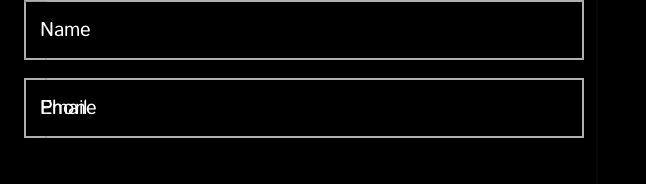
Like there are things that become very liquified and also the things that I’ve hidden keep showing up on other layouts regardless the hide/show setting. And that’s why I often go for Automatically Scaled option to make it easier instead of custom layout except for the mobile version. (like the ones below)
Yeah well that’s kind of the whole point for adding layout blocks, they are one of the ways to improve and simplify automatic behavior, where needed/desired.
This video is like 4 years old? I’d like to see something that is more up to date.
It would be helpful to have a few short videos made on different topics for those who are more visual learners …
I’m confused with what is the problem here… Sparkle can’t automate that transition because it isn’t a structured solution (like Bootstrap or something like that) which have responsiveness in its code itself, rather it’s a fixed solution.
The fastest and more perfect way i’ve found to work with 320 is just drag the canvas down as much as you think its enough, and work with sections. Start with the header section, grabbing everything that isn’t part of it down to the end of the canvas. Place the header as you want it to be in mobile, then keep going for the other sections one by one. It may be tedious but it still gives you the Sparkle freedom.
That’s the importance of layout blocks, or even just layers grouping to structure the website beforehand
Sparkle does have responsiveness built-in, it is just choosing a different tradeoff than automatic device layouts (for now).
While a “structured solution” will magically make any layout immediately work on multiple devices, there are tradeoffs there as well, that generally nobody mentions.
Structured solution means someone has come up with the structure, and created a few components that fit it, say a hero section or a text+image or a menu, and give some wiggle room within which you can change the appearance of those components; what this means:
if you need a different component you’re out of luck unless you can code to the level of bootstrap etc
if you need something the default look of the components and settings don’t allow, you’re out of luck
if you settle for existing components and their defaults, your site looks like everybody else’s
This feels a lot less magic, but bespoke-as-long-as-bootstrap-does-it mentality works well for designers on a high margins, tight budget I guess.
As anybody following might realize, we have been thinking about all this a lot and do have a plan that will try to combine the best of full layout freedom and just enough structure to make multidevice layout a lot more automated.
We think layout blocks already are a great help in this, and they are the basis for more improvements in this area.
Layout blocks improve over groups because they let you push other layout blocks up or down on the page, and preserve ordering on multiple devices which doesn’t just keep things tidy but also creates a more sane layout in coding terms.
I used to think why Sparkle does not have functions as the other builders or themes out there and was continuously annoyed about something that is not existing in Sparkle.
I had a break for a while and came back to Sparkle, why?
I have realised that the grass is always green on the other side.
My mindset now is to create a website with Sparkle with the functions that Sparkle offers and not try to make websites with functions that Sparkle does not offer.
No offence but I think a couple of people here need to shift their mindset slightly towards to life what Sparkle offers instead of what Sparkle does not offer.
I work much more relaxed this then.
Duncan and his team are well aware of things are missing in Sparkle but always keen to here about new ideas.
I have full trust in Sparkle and in Duncans team that they will create a more awesome Sparkle in the future to support us all in creating awesome websites.
And I totally agree with Duncan! There are trades off to everything and I will put a bit more time in my website creations to create something unique then have an auto-code base create my site locking me out of making something unique!
Having worked with Sparkle a good while now I have come down to 2 breakpoints in designing my websites… And it works a dream across mobile, tablet, and desktop!!!
Like it has been mentioned, Sparkle isn’t finished by a long shot but what we have so far works great allowing me to create fantastic websites!!!
You repeatedly and persistently claim that content is duplicated when you switch from 960 to 320.
Sorry, but that is nonsense. No offense intended. Or do you have verifiable proof of this?
Exactly the same is displayed, only scaled down, according to Sparkle’s rules. There’s no need to play “hide and seek”.
Please tell us more. If you hit your fingers while nailing, don’t blame the hammer.
I’d just like to add what is the reason for removing content out of the mobile compared to what is on the desktop/tablet?..
I know that it has been fluffed around on the internet and backed up by supposed “experts” saying people on the move don’t want to view all that content! Is that really true? Does people on the move only want to look at one page on the mobile?
As Designers we have control over the mobile device (aka breakpoint) so we can do a well thought out job on mobile to make it as easy as possible for the person on the move to navigate the site. That will make the difference to a person on the move digesting mobile content or not!
When really thought about do we need to have several devices on us to see different versions of a website? For me that is making life for the on-the-move person just outright difficult and frustrating!!!
 Can’t wait to see what else Sparkle can do.