Background color in a vertical (Hamburger) menu?

I’ve looked for the best way to make a mobile hamburger-menu that covers the page at least partly with Sparkle, the best solution I could find so far was this one. But there are some drawbacks to that solution, like it’s not possible to click the hamburger-button to close the menu with that option.

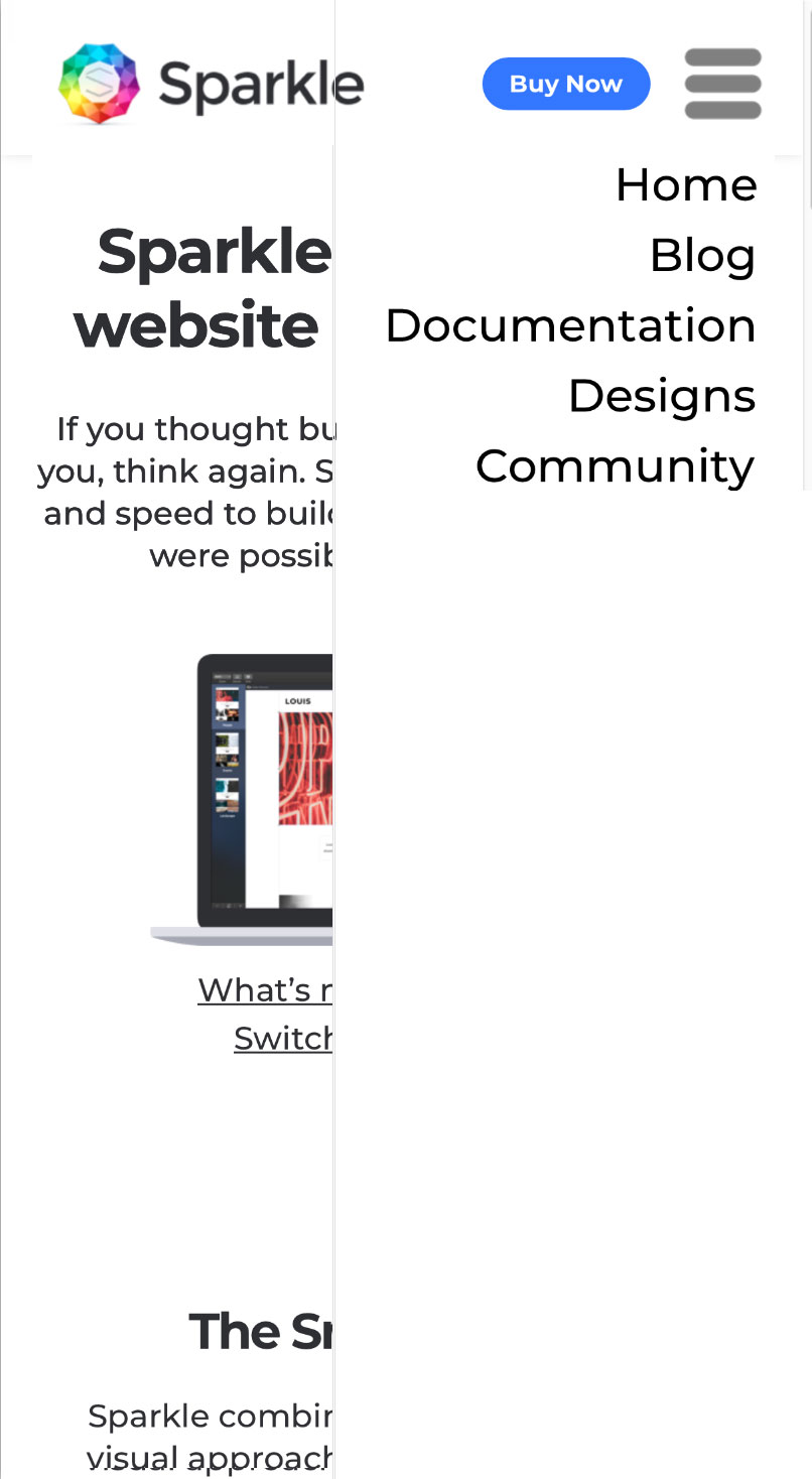
So I would like to use the hamburger menu-option of Sparkle itself, but combined with a solid (in my case white) background that covers about 3/4 of the screen.

Is this possible, and if yes, how?

Maybe this can help you: https://sparkleapp.com/docs/menus.html
If not, let me know.

Nope, read that as well, and no help in there (at least, not that I can find) that brings a solution to what I’m trying to achieve.

Maybe there’s something that I’m not seeing, but with the standard menu I can’t see how to make a solid (in my case white) background that covers about 3/4 of the screen.

I’m really not sure what you’re trying to achieve.

The menu can only place a solid background behind its items. If that’s not sufficient for your needs then I guess it can’t be done.

On mobile sparkleapp.com has a hamburger menu that covers the background by having a white fill. Can you describe how your need is different?

Hmm, that seems a variation on what I’m looking for, I’ve included a Photoshop mock-up with my idea. Not idea how you could make what you have in sparkleapp.com wither, I keep seeing the background through the gaps between te menu items.

One moment please. Gonna give it a try.

That’s doable, except it won’t extend all the way down on the page. The gaps are changed via the item spacing option.

Can’t find a desent workaround. Thought working with subfolder in the menu nav with letters in transparency was a solution. Very close.

That helped, I now have a menu on the right that I’m quite happy with. But you’re right, it doen’t extend all the way down. Pity, but I can certainly live with this solution. :wink:

Can you add items that link to nothing, and name them with a space? That will bring the menu down.

@gsstamas: good thinking :slight_smile:
Here a project with pagenames made with ‘space’.

Vertical hamburgermenu with white dropdown

@ RPX: thank you, shows that it’s definitely possible.

Now I have to figure out exactly how you did this, and how I can incorporate this in my Sparkle website… :wink:

If necessary I make a screen recording. :slightly_smiling_face:

If you could, that would help me a lot!

(because I’m trying, but I don’t know how to make this yet).

Here is one way to do that (different adjustments for other devices). Kludgey and maybe unpredictable?

1 Like

I was slowly figuring this out myself (with the help of the file of RPX). Didn’t have a clue how he got empty menu items, thanks tto gsstamas I now know that it simply a space (I was copying them from the file of RPX).

Thanks for all the help, I’m slowly getting there…!

:slight_smile:

1 Like

An added question (directly related to this menu): is it possible to show sub-menu items on mobile all of the time?

I have it all working now, but the folding out of the sub-menu’s is still a bit finicky (especially on a phone in landscape).

Trial and error with this. Lots of drawbacks except with the simplest of sites.