Hi, I got a very basic question about the text block: When I create a text block (f.e. 200 high) with some (Capital) letters (f.e. 100 high) in Sparkle(4) it looks more like the size of letters and the space over/under the letter are similar.
I created some letters with a hight of 50 in a textbook 100 high and to my surprise they do not at all cover the gap.
Can anyone help me/ explain/ point me towards a link to understand what is going on?
Sometimes I want to place a letter at the bottom of the box (right now the Layout block)
How can I do this numerical in Sparkle?
Let’s say: Textsize defines the size of typo in pixels.
Line hight defines the space around the letter.
Gear/Baseline defines, at which hight the text is shown in the box…
What are the rules for superscript/ subscript?
Why does Sparkle let me freely draw a box around it, which only complains, when it is “to small”?
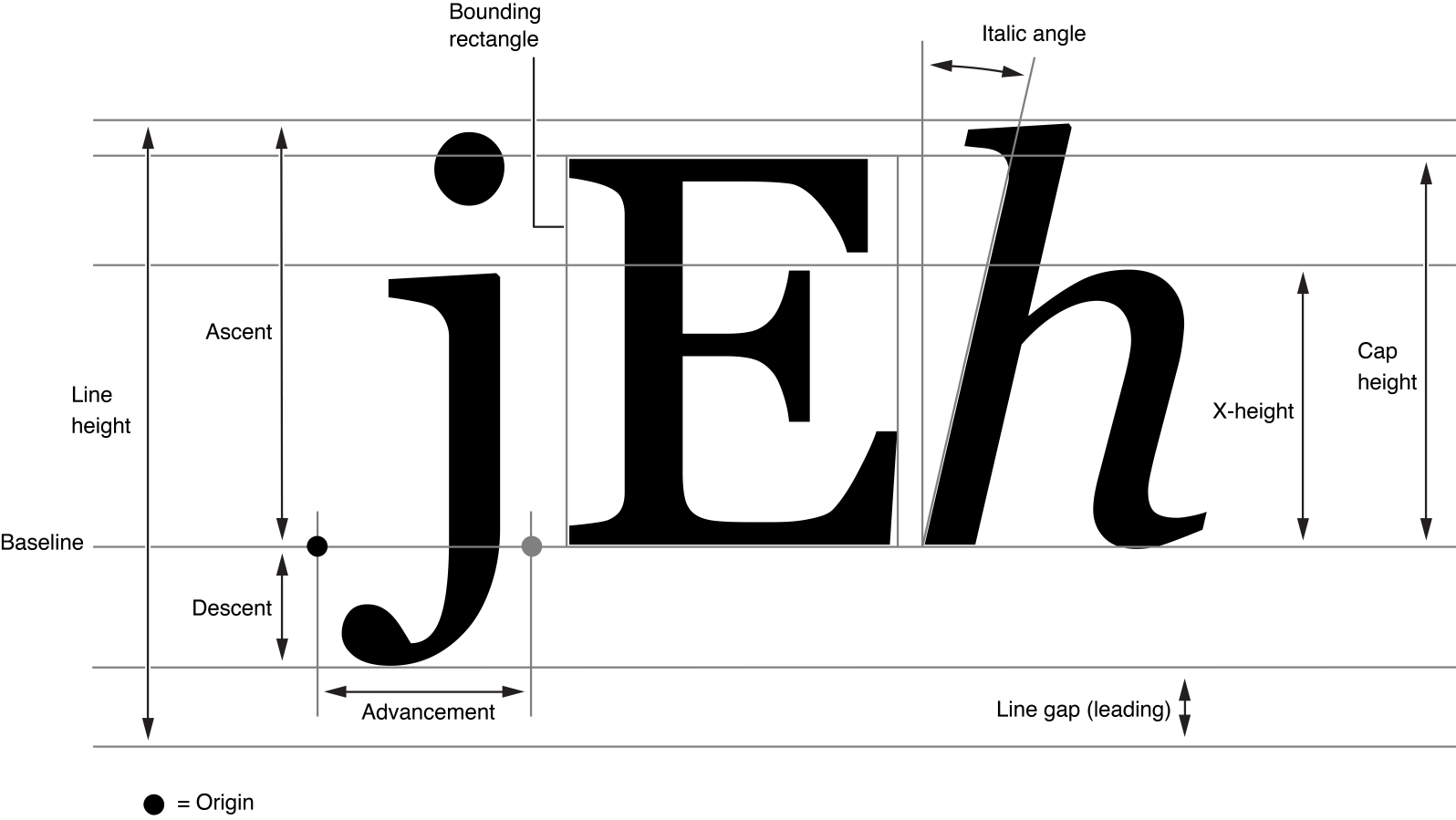
Hi @Vogeltom, maybe a screenshot would help, but the way text works is very complex, there are many parameters and not all fonts behave the same. The text can potentially extend much more than an individual letter makes you believe.
This is an illustration of the different font metrics:
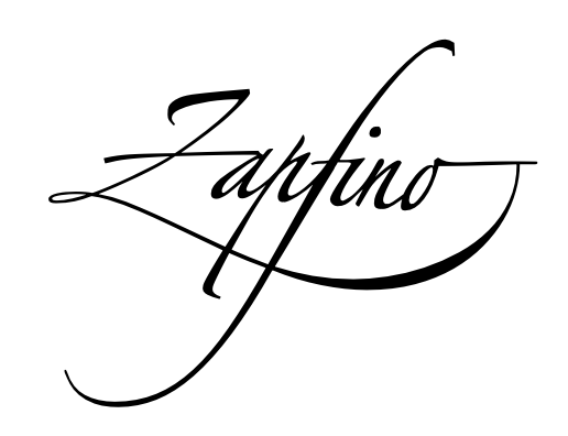
Now a font has the ability to set any of those to just about any value, because there are extremes where a font uses a lot of space. For example the famous, impossible to render correctly, super ligature of the Zapfino font:
But anyway in order to prevent text being cut off, Sparkle respects the metrics that the font declares, so the frame becomes red when potentially some text could over-extend much below the baseline.
The illustration makes it easier to talk about my question, indeed.
My question is about positioning of text in Sparkle: While the actual text is written on the baseline, the text box is positioned through coordinates for the top left corner. Since the textbox needs to enclose all features of a chosen text font, the size will vary downwards depending on the chosen textfont. Thats means, the position of the baseline in the textbox will vary from font to font. Makes sense.
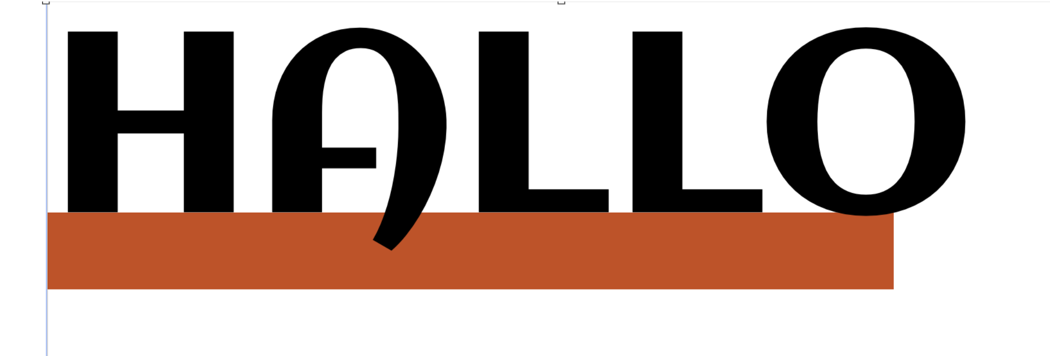
Sometimes I like text sitting on an edge like in the picture below:
So far I have been trying to find the baseline of a textbox visually by zooming into the page and moving objects my hand/mouse. Is there any way to “see” the baseline in Sparkle?
Best regards and thanks a lot for all the effort with Sparkle. What a nice late x-mas present! ;O)