Are you sure?!!!
If you thought the last critique was a bit harsh…
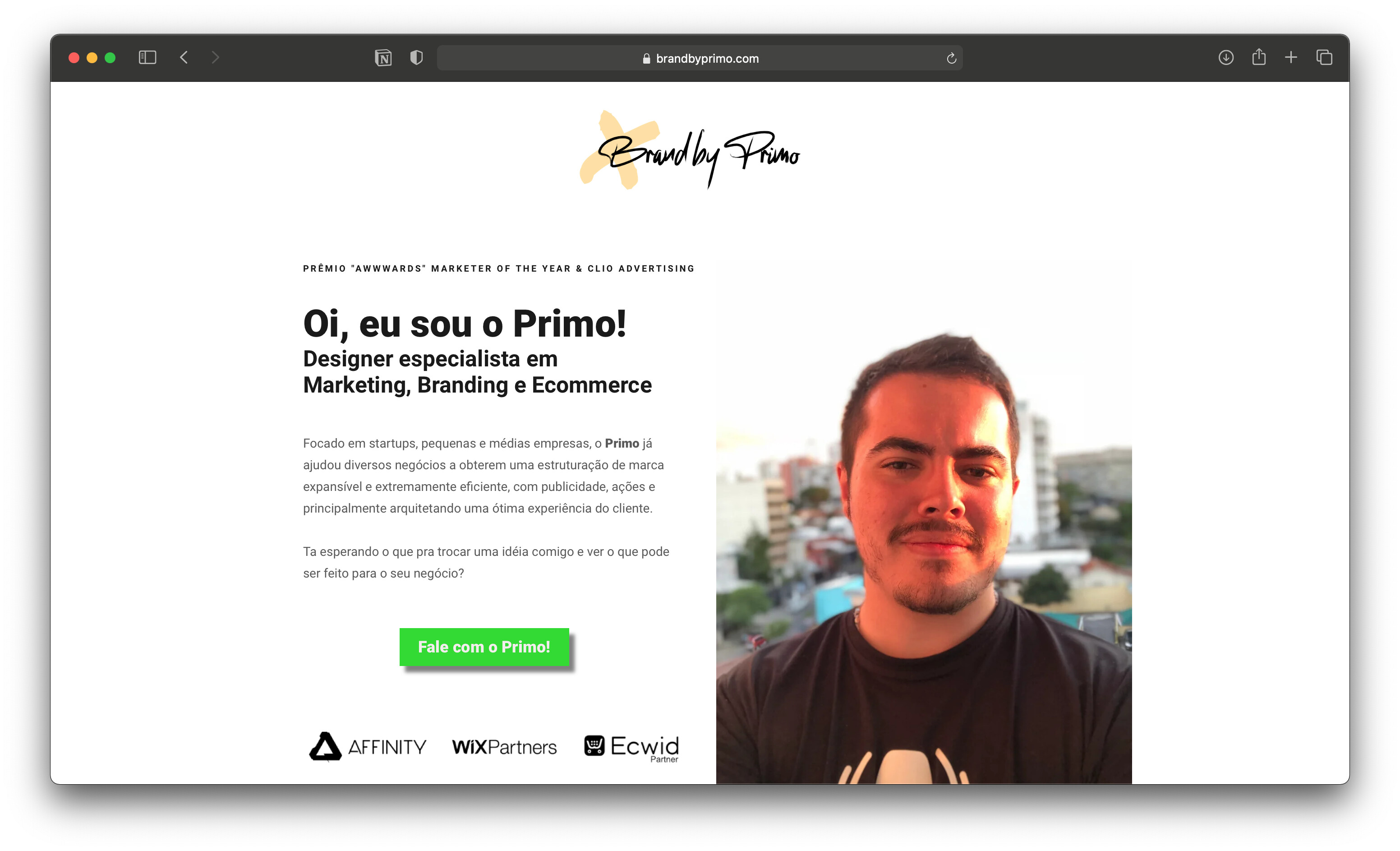
The following all depends what you want to the site to do for you. If it is intended to be a design portfolio site, then read on. If it is just a bit of personal fun, then ignore what I have to say – which, of course, you can anyway!
OK. First off. I’d say you are using far too many gimmicky effects. Just because you can have photos animate and slide in, doesn’t mean you have to. If there is a solid reason to do something, do it. If not, then don’t. You should use image slide-ins to help direct the eye where you want it to be. I am never a fan of gimmick for the sake of it. Slide-ins done well, it can add to the experience, but done gratuitously they just serve to cheapen.
As I say, I have assumed your site is intended to serve as a portfolio and to introduce your services and skills. If so, then why am I seeing your breakfast, your dog, your son (I assume), a snail, etc. I can only guess you are trying to tell the world about who you are as a person. Potential clients care less about what you ate for breakfast than they do about how you can help them achieve their goals.
I don’t mind the big, friendly ‘hola’, but it would work better if you didn’t try and squeeze a logo into the O and just had clear, type. It is all a bit too obvious and predictable as it stands and, if I am honest, not particularly successfully done. The lettering of the logo leaves a lot to be desired and needs work to tidy it up and make it more legible. Again, there is a fair bit of typographic gimmickry going on.
This all means you have to scroll down to even get to anything like relevant content. Then when you do…
The emojis and a taco bouncing in. Just don’t! They really make it look more like a social media site, than the site of a serious graphic designer.
Typographically, this site is lacking. Very poor hierarchy. Little focus. My eyes are drawn all over the place. The largest piece of type on there says that you like to watch YouTube? What is that about? By this point, as a potential client, I’d be unlikely to read further. If I did, the next thing I read is that you are not creative and that you’d rather spend your time being recreational.
I’d be long gone.
If however, I was particularly bored and had ten minutes to kill and I o read further down that body of text and find that, ‘No soy el mejor pero tampoco intento serlo. Soy lo que toca ser. ’ You are not the best, and you are not even trying to be the best. You are what you need to be. Unless my translation of that is way off the mark, that reads to me as though you will do only what’s needed and no more.
It all comes across as very apathetic.
Next: Don’t use English for the sake of it, because somehow it makes you look more cosmopolitan or global. If you really want to appeal to an English-speaking market, create a second, translated site in English. Moreover – and this is a huge one – if you are going to use English. Never, never do so without getting it checked by a mother-tongue speaker, or a professional translator. Your English makes absolutely no sense whatsoever. If any English speaker reads it, it just makes you look ridiculous.
Now, given that this site is supposed to be to promote you as a graphic designer – I think – you make it very difficult for anyone to find your portfolio pieces. Eventually I found a page with some meaningless logos on. No context. No explanation of the problem solved. No sense of how you fulfilled a brief. Design as adornment. Then I get to 2 little dancer icons. Why?!
After that some random, poorly presented images of what I assume is some of your work.
You do make a point on the first page of saying that you have worked with some fairly big organisations. However, I see absolutely no evidence of any work you have produced for them, unless they made you sign an NDA. If so, then I am guessing they wouldn’t take kindly to their logos being used either.
And again, another picture of your dog. Absolutely meaningless. Keep things like this for your personal Facebook page.
If I were a potential client, I definitely would have had too may alarm bells ringing to put my work your way, I am afraid.
If you are a trained graphic designer (your CV says you have a degree?), then you should know already that it is all about communicating an intended message to an intended audience. I think you need to rethink what you are trying to say and to whom – unless, you want potential clients to assume you are designer who doesn’t try too hard, can’t be bothered presenting work in any sort of considered way and care more about your dog and your breakfast than problem-solving for them. Currently the site looks more like, indulgent, self-referencing social media than a serious portfolio site. You need to resolve clarity of message.
Bet you are sorry you asked now!
As I said to Primo on his critique, none of this is intended to be hurtful or malicious. It is intended to show up problems I see with your site. I am afraid, as it stands, it is one of the most un-focussed sites I’ve seen in a long time.
Finally, as I said, feel free to ignore all of the above. It is only my opinion.


 (sin dudarlo, esto es lo primero que va a desaparecer de la web)