Hello.
Sorry to bring this up again, but it’s driving me crazy. Do we have a math professor here who can explain breakpoints to me?
The point is: A device determines which mobile page should be displayed in the browser, depending on which screen you have available. But how to calculate this in advance?
I made a test page and different pages for all 5 versions in Sparkle to see what my device displays. And I don’t understand it.
Here are my mobile devices.
Galaxy S20 Phone, 6.2" display, 1,400 x 3,200 px, 566 ppi
Portrait mode: I see the 320 px page. OK
Landscape mode: I see the 768 px page: OK
Galaxy S6 Tablet, 10.5" display, 1,536 x 2,560 px, 284 ppi
Portrait mode: I see the 480 px page: NOT OK. I actually expect the 768 px page. There are wide “grief margins” on the left and right.
Landscape mode: I see the 960 px page: OK
Browser is Chrome for mobile devices. Is there a trick to this, other than enabling “show desktop version” on the tablet?
Thank you.
Mr. F.
@Mr_Fozzie, This topic can go on and on and on…
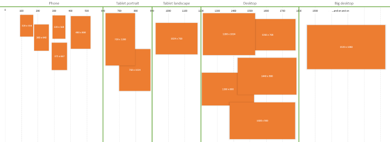
Maybe this visual I got from the internet (freecodecamp) can give you an idea of how the devices work within the breakpoints…
1 Like
Hello.
Yes I know that this topic is annoying and bothersome.
I have found hundreds of such breakpoint tables on the internet myself. But this does not answer my real question. Maybe I have expressed myself a little unclear.
Can I find out what the viewer gets displayed based on the screen size, pixels and orientation of the device (tablet in this case)?
What mathematics or calculation formulas are behind this?
Mr. F.
@Mr_Fozzie, I can’t answer that for you so I think it is best you email @duncan for the mathematics behind it.
What I would say is remove your 480 device and your tablet will pick up the 768 device.
The 480 landscape is really not needed.
I have removed the 480 px device, but my f****ing tablet shows the 320 page.
From 768 to 480 the gap is 288 px, and from 480 to 320 it is 160 px.
I think, the nearest point is chosen.
Mr. F.
Hi @Mr_Fozzie,
This is a common mistake I see people doing all the time… people are mixing the physical device screen size/resolution with the logical resolution.
This is an extensive technical topic … in the beginning everything was a lot more simple because all the screens had the same pixel density (72) 96ppi.
To simplify, what you’ve listed for each device is their physical device screen size.
The way all apps including Chome is drawing on the screen is based on the logical resolution.
Logical resolution essentially is what a device’s resolution would be if it did not have high resolution (read more here).
The way it works for any screen size is to take the most closest/appropriate logical resolution/size and drawit on the entire screen.
In Sparkle case, you have these breakpoints for a page: 320, 480, 768, 960, 1200
Here is how it works the browser will use the most closer/appropriate version to draw on the screen, in your case:
Galaxy S20 Phone, 6.2" display,
Physical resolution: 1,400 x 3,200 px, 566 ppi
Logical With = 1400 x 96 / 566 = 238 points
For Portrait mode it will use the closest breakpoint: 320
Logical Height = 3200 x 96/566 = 542 points
For Landscape mode it will use the closest breakpoint: 768
Galaxy S6 Tablet, 10.5" display
Physical resolution: 1,536 x 2,560 px, 284 ppi
Logical With = 1536 x 96 / 284 = 519 points
For Portrait mode it will use the closest breakpoint: 768
Logical Height = 2560x 96/284= 865 points
For Landscape mode it will use the closest breakpoint: 960
I hope this helps.
2 Likes
That is really strange @Mr_Fozzie?
I have a Samsung 8" Android and I don’t have that issue! The Samsung tablet picks up the portrait and landscape on the 768 device. Are you looking at this in Preview? If so have you got Preview set to “Show all devices”?
1 Like
@luciandesign: And here is my math professor. Thank’s. That explains it better.
But my tablet does not know this math 
And why is 519 closer to 768 than to 480?
Maybe that’s the answer.
@FlaminFig: It is the live website. I will try preview with the QR code.
Mr. F.
Hi @Mr_Fozzie … the closest number is always the higher number/breakpoint.
This is actually a “safe” mechanism so you don’t get “blurry/pixelated” images.
Hello.
I think we are getting closer.
I just recently removed the 480 px, which was previously set to “Automatic”. Is it possible that in older files there is still information that refers to this device?
Would a clean republish help? So delete everything first and re-upload with Sparkle?
Mr. F.
@Mr_Fozzie, Yes I would give that a try. It wouldn’t hurt…
Did not hurt 
Did not help 
I found the problem 
It is in the settings for the tablet. You have the function “screen zoom” and that was set to +1. With set to 0 i have the behavior i expect. It’s hard to believe that such a thing even exists.
Case closed!
Mr. F.
@Mr_Fozzie, Can you share the website link?
It might be best to have a talk with Duncan by using feedback@sparkleapp.com