I am having a problem with the site I am designing in Sparkle. It is virtually done, and I am starting to get the mobile responsive site started.
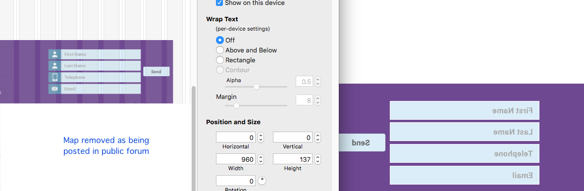
When I first switched to the 320px width and looked at the preview, several elements that are supposed to be grouped together were all dispersed. So without making any changes, I went back to 960px, and grouped those elements so they would stay together. However, this changed layers for some reason so that certain elements would overlay my menu in the 960px preview. I’d come across this before (and posted about it), so thought I knew what to do. I selected the header area, and made it the top layer. Which gave this very peculiar effect of reversing the text in the preview, as shown in the screenshot below.
I can’t seem to get the layers to sit nicely, without something manifesting strangely.
Please help, as I am now at an impasse and can’t proceed further. I’m happy to send you my sparkle file -it is ~65Mb
Thanks