I continue to build www.northeastspca.org in Sparkle. The signature color is a very bright lime green which I try to use sparingly. Too much of this color is distracting. I’m looking for complimentary colours that can be used for bars, rectangles as backgrounds. Any ideas Sparklers?
Hi Woodrow, I would choose a dark “night” blue, but you can also check and try this: https://color.adobe.com/nl/create/color-wheel
Thanks Karin. I think a darker sandy brown will work as well.
Consider orange. In it’s most vivid intensities it’s seen as playful, gregarious, happy, and childlike. These attributes are what many people associate with animals, especially kittens and puppies.
Lighter shades of orange such as peach, apricot, coral, and melon have some of the most pleasant word associations. These softer shades are pleasing to the sophisticated eye and are very appealing to the upscale market. They are nurturing, approachable, tactile colors, that, just like the appeal of animals, people have to reach and touch or be touched.
When trying to decide on color and color combinations it’s best to work right in the Sparkle canvas. An effective way to do this is create Boxes and fill each box with a color. Then move the boxes around the canvas to see how the colors look in relation to the overall page.
When comparing colors to each other, again create a Box, but this time fill the box with a Gradient. One color in the gradient would be your Lime green and the other color would be, oh say, your sandy brown, Karin’s dark night blue, or an orange. To mach your lime green exactly, use the color dropper tool to sample your color from the canvas.
A trick…Sparkle only allows two-color gradients. So, to compare a third color, create a wide Border around the Box and fill with a third color. Now you’ve created a three-color palette for structural elements.
Nice trick! I will keep this in mind 
@Woodrow, if you’re still testing complementary colours for your site, I have another idea.
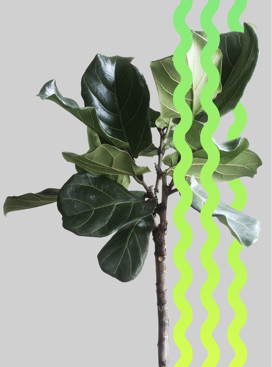
Working with a new client who has lime green as a primary color for her site reminded me of you. I’m proposing a palette of greens to be taken from the attached image. Use the Color Dropper tool in Sparkle to sample the greens from this image.
Pro tip…I get my best colour inspiration from nature. I picked the branch in the image while hiking.
2 Likes

Many thanks. Most of the greens work very well.
I’ve also found that orange works well as well. Just a rusty orange.
I just took on another non profit. Www.MelfortMuseum.org
This one is going to take a ton of work. Presently a bit of a mess.
The main colour is Rusty Red. I’ve included a jpeg of their logo.
What colours compliment “Rusty Red”?
~Bill

I think your choices may be a little limited, but I suppose you could make something interesting with these colours (along with black and white).
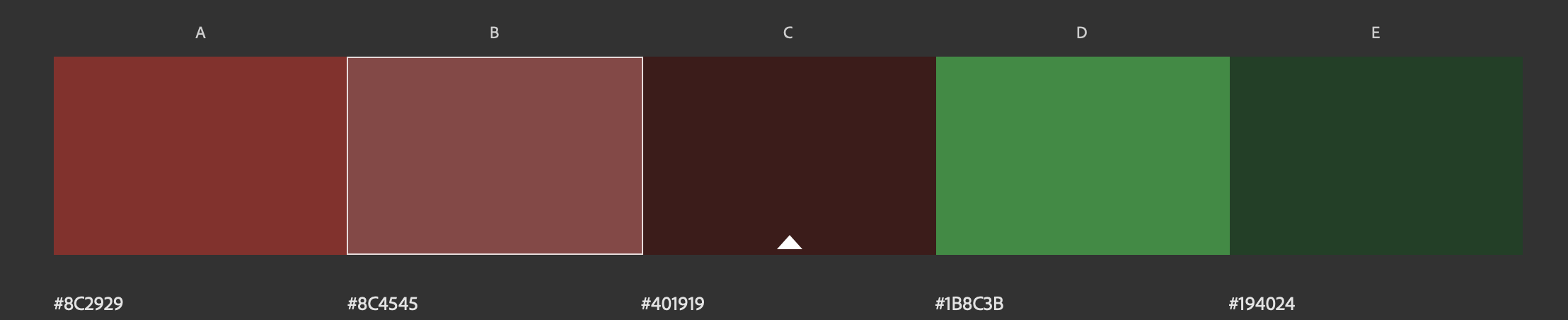
And these are the beige tones you could add to the mix.

1 Like
Bill~ Client sites that are “a bit of a mess” can be great, they need you!
My take:
Your client is delivering an experience to two audiences; attendees and donors. The finished site should simulate that experience digitally. Attendees should get a sense of how cool it would be to attend, while donors want to feel they are donating to something worthwhile. Attendees attend for a good experience, donors donate to make themselves feel good.
Here’s your assignment:
If possible visit the museum and take pictures of the buildings materials. This is going to be your colour palette. These are old buildings made of brick, stone and wood.Take up-close pictures of the sand used between the bricks and stone. Look at the patina of the old brick and stone. If you can’t visit, look for old buildings near you.
If your colour palette appears limited as @francbrowne said, that’s okay. With fewer colors use them more often versus having many colors that should be used sparingly.
This site should tell the museums story through video, pictures, and written accounts of people who have visited, and old transcripts of former residents. Take people inside the buildings and show life as it was then.
A final comment…see if you can design a new logo. The current one looks like clip art from and old Microsoft app.
2 Likes
My thoughts likewise on the logo - clipart.
You wouldn’t even make it out on mobile.
A website is like the physical shopfront to a pocket of reality where patrons come and experience its nuances, but most of the time a website is set up like a Word document //face-plant and I’m running for the hills!
1 Like
Sadly I don’t think I can change their logo. At this point it seems it’s on every doc and wall covering that they have.
Thanks for the many excellent suggestions.
~Bill