As soon as I have finished my content for largest device (I prefer to start with the largest device) and choose the next smaller device all content kind of moves completely strange to any place but not at all in the same spot as the larger device was set up to. Coming from Muse there was some helpful like “copy size and position to next breakpoint”. Is there something similar in sparkle possible? If I just choose to do the “automatic scaling” I cannot see what sparkle does - it is not to choose and of course I do not want to let a machine choose how to change position, resize elements and text formatting. Is this approach better when I start with the smallest device? Let me add, that text also changes color from largest to smallest device which is not to explain for me. Even if I choose the correct text format it does not change to original color.
Testing out, to start with smallest device I encounter the same issue vice versa - text gets extremely large (instead of leaving it the same small size - so I can set it easily a bit larger). Also now since the latest update text formatting between devices seems not to work anymore, as I want my footer text on mobiles centered and on bigger screens left aligned. Is this a bug?
Can I go back in the 4.1.0 in order to see if that had the same issues? As I did another - almost finished website with the last version of sparkle, where I hadn’t had this text-formatting issue, that would be nice, I guess. What am I missing here?
the best way to approach this is using the layout blocks and sectorizing the content inside multiples layout blocks. This way, when in another device/breakpoint, the content will scale down within that layout box restriction - then you’ll only need to adjust to the new screen you’re designing
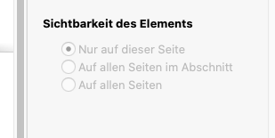
Of course I used layoutblocks (would be great, if they help in between breakpoints/devices to organize but as you can see on my screenshots it does not). Sectorizing inside layoutblocks if one has an image and one textelement and a logo on top - what should one sectorize. It is a known bug since the last version as well (that rescaling issue issue with textelements and other elements, too) and was told to be looked at. Which is not as of this reading. The content in my case does not even need to be resized that much, it is more a repositioning, that why the automatic scaling does not work for me. The image needs to be resized slightly, text-element needs to get a little more narrow and the logo stays pretty much the same. And how do I sectorize inside a layoutblock? Anyway, this resizing to completely nonsense sizes (veryveryvery small into positions where they almost are not found but only inside the layers panel) is not helpful and even worse, I cannot set different text attributes between breakpoints - the size is always the same - and in order to prevent duplicate content I want to avoid "Sichbarkeit auf allen Geraeten - auf diesem Geratet - usw.) and it is greyed out anyway so no chance to do that workaround.
If necessary and helpful I can pass a file here: WeTransfer - Send Large Files & Share Photos Online - Up to 2GB Free
It is a wetransfer pro link with no zip, just the file itself.
Thanks in advance and Kind Regards,
Uwe
usually, I start structuring with layout blocks only in one device size. After i’ve finished it, then I enable other devices so everything will be scaled to proportion but in the same position, then i’ll just need to re-arrange how I want on that specific device. From the looks of it, you’ve enabled all devices before finishing the layout structure block (correct me if i’m wrong), so there wasn’t resizing.
About the font size and different text attributes between breakpoints, make sure to turn off this option. When it is enable, only the size will be different between all devices, and when it is off, everything regarding text will be different between devices.
Also, a personal tip: using 1920 pixels on the ultra-wide desktop PC considers that the viewport width is 1920 - i’ve found better results (aka no horizontal scrolling) by getting it down a little bit, to like 1700 ou 1800. This tool is useful for this kind of thing.
Anyway, if its a bug on your end, hope Duncan can get the file and understand it better!
Also having used Muse in the past I know what you are talking about here. In the beginning Muse was also a fixed width responsive layout framework and we had to do very similar to what Sparkle does.
Muse eventually morphed into a fluid width responsive layout framework which is how many other cookie-cutter web design frameworks work nowadays, like SquareSpace, WordPress, etc, etc…
So just to cover a few points you have raised…
With Sparkle your smaller device content is scaled down to fit within the 320 fixed width so physically adjusting the layout and text sizing is normal
Sparkle doesn’t have the action “copy size and position to next breakpoint”
Sparkle’s auto scaling works really well and yes you cannot access the devices you have assigned auto scaling too. What you do need to do is test on an actual device to see how it looks and then go back to the original device you have created and adjust the text size, etc to make it look legible and all on the auto scaled device
With your colour text change… Have you assigned a style to the text? For example a paragraph text… You need to assign font style, font size, font colour, and HTML tag as a bear minimum. The reason for this is that you can re-style this for the smaller device and then all your paragraph text will adjust on mass, and of course you will need to adjust the text boxes to accommodate
The previous point also goes for starting with a 320 device
I know Duncan & Daniele are working hard on further fine-tuning how we can more efficiently work between devices, but for me I truely love the fixed width responsive layout framework, because like a Print Designer I have full custom control over my websites!!!
Happy Days!!!
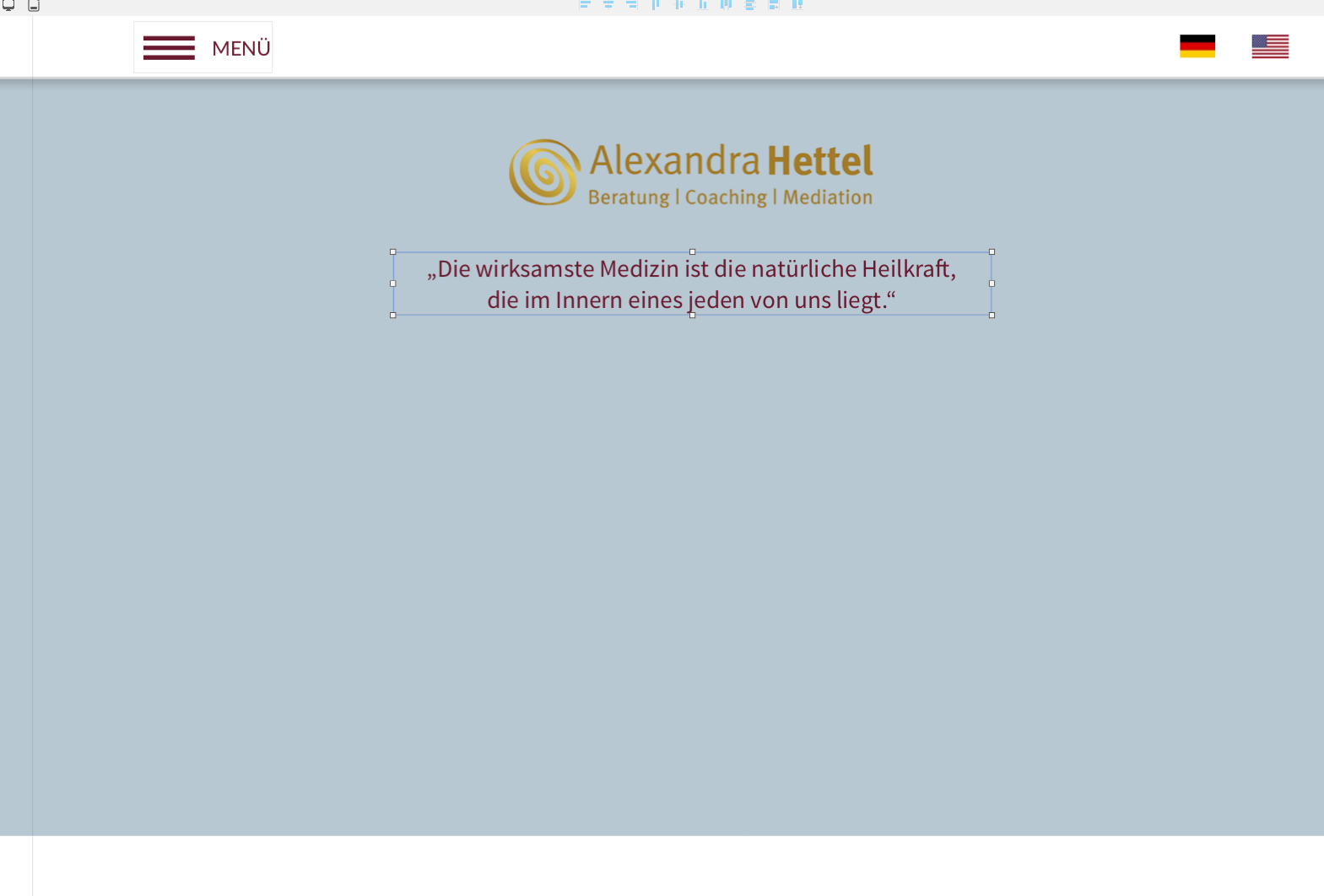
I started from scratch with just one, the largest device - all devices are set to be visible only, because I tried after the 1920 device to readjust like you also adviced. Exactly there happens the issue for me. And unfortunately the elements do not resize in position like you could see in my first screenshot. But okay I do again, just in case I misses something - just the menubar - a box, a hambuger and two flags, which I need on largest device:
Unfortunately for the header bar there’s no layoutblock possible because to make it say on top of all and let content scroll below that block would not stay on top. But anyway, let’s add some contentlayoutblock:
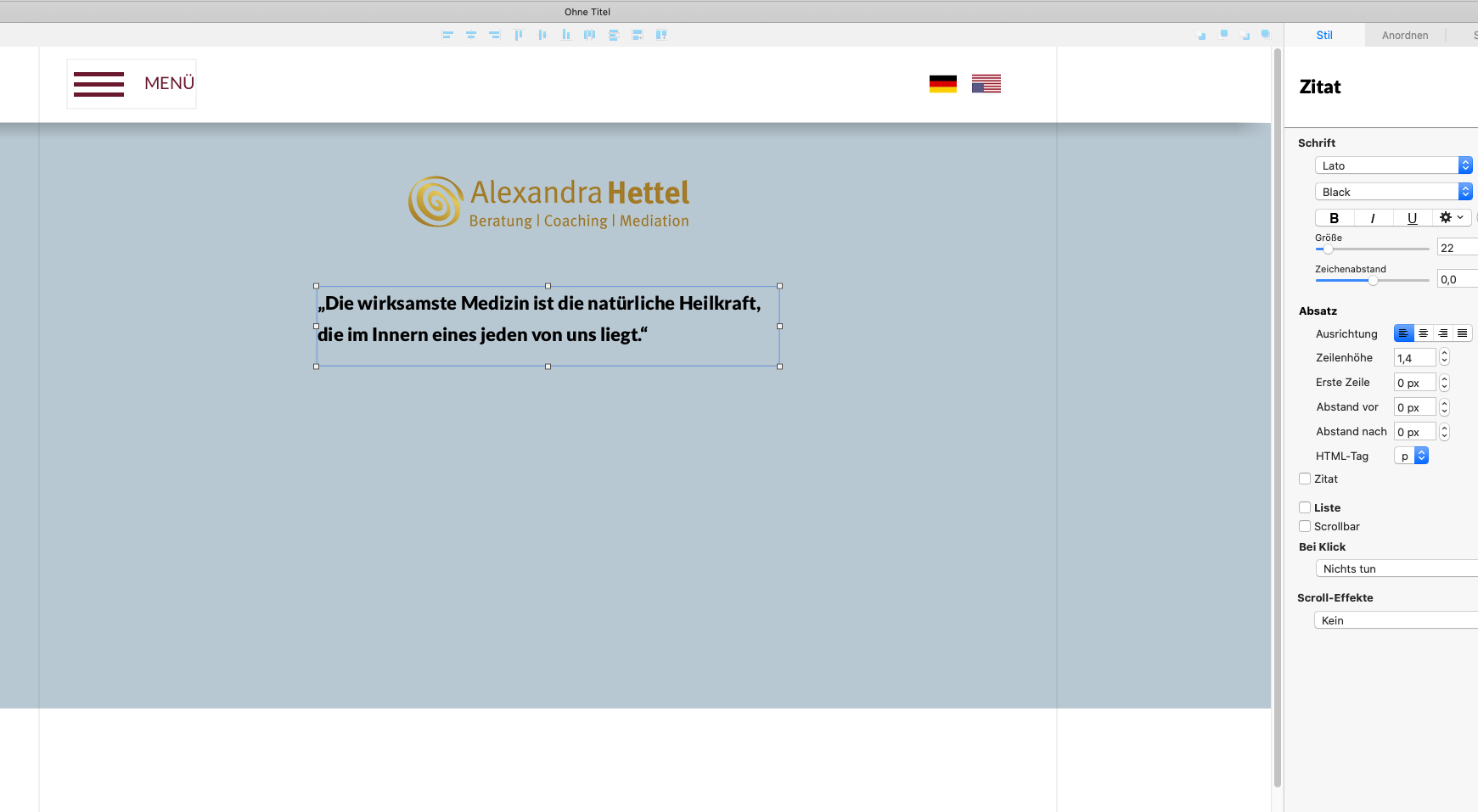
Put in the logo and the quote, copied with its text attribute - this happens:
But as one might see, this is only possible if one does all breakpoints device by device and element by element, because if I finish the whole page in one breakpoint with all its layout blocks and groups this will be simply a a mess on the all following devices. Just for example, text from 1920 to 1200 changes from let’s say size 22 to size 13 which is no reasonable downscaling as far as I experienced.
At the moment I am stuck with this and in my “feeling” it was not that bad with the last version but I may just had more “luck” then?
Thanks in advance and Kind Regards,
Uwe
Yes, FlaminFig, I also love the fixed width breakpoint style. Yes in Muse still both is possible depending wether you choose fluid width breakpoints or fixed width.
With the text styles , yes it is setup with its color and size and formatting - found no additional way to set it up differently. But it still changes in strange ways on my side.
For my case, scaling within sparkle does maybe well with the automatic setup, which I doubt. That checkmark, mentioned by primo helps a little but still the size of the textboxes between breakpoints are tedious.
For my understanding it would be much better if the size would just remain from one breakpoint/device to the next one in need to be scaled down or at least let the aspect ratio the same and scale it down automatically.
Thanks and Kind Regards,
Uwe
Yes that has been talked about that us Designers actually scale down everything to meet the needs of the 320 device. I don’t see that as an issue but I wonder how Sparkle Newbies would go with that?
With Muse your canvases were introduced when you set the breakpoints up for your website.
With Sparkle that is not the case. A new device canvas is introduced by you selecting it manually.
When you introduce a new device in Sparkle, Sparkle does a bit of magic and carries across a number of “constants” to the newly introduced device.
As Primo mentioned, in Sparkle we create our website pages in the one device and when done we introduce the other devices…
@UweRausB I’m sorry but I don’t understand the problem at all.
There is no meaningful difference between 4.0/4.1/4.1.1 in the area of multi-device management, most likely no difference at all.
This is not to say there is no complexity, some Sparkle behavior that can be unclear, or is not sufficiently manifest in the interface, and also perhaps a set of assumptions you bring from Muse that don’t apply in Sparkle.
Sparkle autoscales the content in two instances, one is if you set the device to be “automatically scaled”, the other is when creating a new “Custom layout”. If the device already had a custom layout then switching to custom layout doesn’t necessarily create a new layout (and apply the autoscaling), so you need to go through the “Not present” layout option to clear it out, and the next time you set it to custom layout it will autoscale from the nearest device layout.
In the context of autoscaling, text is always resized. We are aware that this is not ideal or in fact flat our wrong for device layouts that have a very different size, and the expectation is that the Sparkle user will adapt the text size.
Now within this described behavior, Sparkle behaves as expected as far as we are aware. If you have a case demonstrating a behavior that deviates from this we definitely want to see it. feedback@sparkleapp.com with a sample project is best for bugs.
That’s where my mismanagement started, thanks. I started with setting all devices to be “personalized” first and then started my largest device and if I understood correctly, I have to start designing my first device without setting all devices to be personalized but instead set them up to be “not present”.
So I did my largest device first as I mentioned before but with all devices to be “personalized”. Yes, you assume right with Muse because in Muse one was recommended to set up the breakpoints first and then start with either the largest or smallest device because the overall process was more dragging between breakpoints during the design process - that was sometimes helpful and sometimes not.
As of text resizing, I just experienced that only the text-box size should scale in height but overall the text should be readable the same way on all devices so it might be the smallest textsize to be maybe 18 to 16. What about “ems” for this point?
Sparkle scales down text because it’s the only sensible way to translate the whole layout from say 960 to 320. Scaling in a way that preserves text size, and thus enlarging text boxes, means understanding the layout and where other elements surrounding text should align and land on the final page.
We are making steps in that direction with layout blocks that add structure to the page, at least in vertical positioning, though (future) changes are still needed to make things more automatic.
“ems” are a web developer concept that doesn’t really have a reason to exist for a non developer, text size is text size and you can express it in different units, but if the overall size of a text box changes, there still are layout implications that can’t be solved automatically, or not without taking away at least some layout freedom.