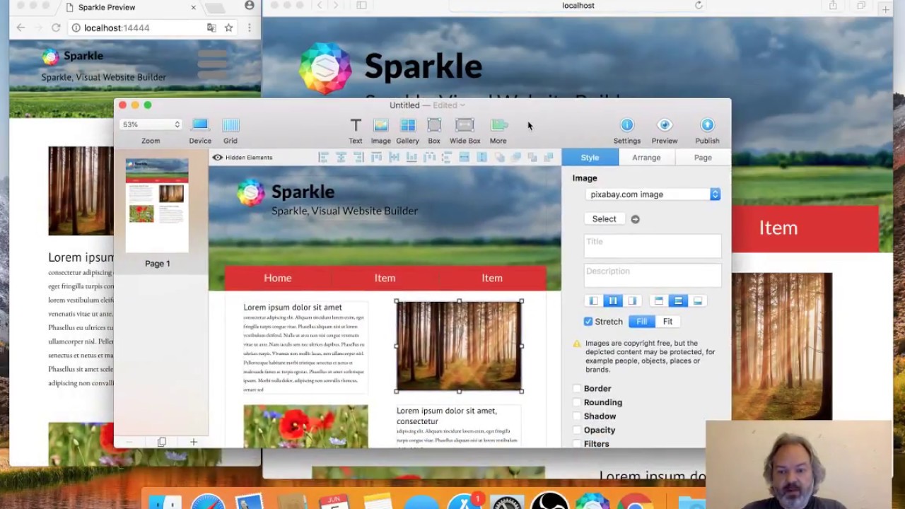
Hi, I am making my first tries with sparkle and what confuses me, that obviously I have to construct at least three different layouts for PC, Tablet and Mobile. It is getting a total mess, when I start this because I have to start the layout from the beginning. Why does a responsive template not resize text to a readable format? I have no time to each time I build a website to do three different layouts. Is there any solution or I am doing something wrong?
Thank you for any help.
Hello and welcome to the Sparkle Forum.
And to the first lecture “Philosophy of web design for beginners”.
This is an excerpt from the literature list for basic knowledge:
Sparkle Youtube Channels:
Workflow for different devices:
Let’s get started!
Mr. F.
Thank you Mr. F. for your reply. This is exactly what I thought, when I go through the second video. At least I have to do a totally different layout for the mobile page. It is a pity, because I had wished, that this is automatically done.
Hello.
Of course you need to make a different layout for a smartphone. An automatic can’t decide how you want to arrange the content. And another important tip: use styles for the text sizes. This will save you a lot of work later.
But this procedure should have been clear to you - so how Sparkle works. And there are many satisfied users here.
Keep at it and don’t despair. Here in the forum, a lot of questions about these topics have already been asked and answered. Also use the search function.
Mr. F.
Thank you for your help. I see the advantages and the limitations more clearly. The limitation is not in the software but more in the time I have. Overall it seems to be a very good software.

