Hi Hans,
It is not possible in Sparkle to make actual different pages. What I did was hide most of the desktop content, make new content for mobile and hide this in the desktop version. So they have completely different content, but in fact they are the same page. This is the normal Sparkle way, you can see and compare at www.tranceform.eu.
The reason I started the topic was a weird glitch that appeared while doing this, in which hidden images left a non usable space. But it’s solved.
To be clear, it is entirely possible to show different content in different devices. It’s just not the natural way for responsive web design, Sparkle merely adheres to the modern style of web development.
The philosophy is that you should not force people to change device to view all the content. In some places people only have a mobile device. In some age groups people only have a desktop. Tweaking the layout is one thing, hiding content is another.
Hi. What you could do is building a complete new project, designed for the mobil device only. So you would have two projects to maintain.
When your website is mynicepage.what make a subdomain m.mynicepage.what and place the new project there. Next step is to find code that detects the device and place it in the homepage for desktop. The code then should redirect to the new mobil website.
Hi Mr. F. thanks for the supporting brainstorming. I went on the path to make different pages within the same website. A set for desktop and a set for mobile devices (including different menus). That works in the preview for both devices but now I want to publish and need to go from the Desktop home page to the Mobile “home page”. That could probably work with some code detecting the device type. Anyone with experience?
You would need the 2nd project file and the subdomain. To me that looks very elegant and smart. The .htaccess file can not be done with sparcle. You need a good texteditor and a ftp uploader.
Thanks, for new websites I can understand that is the right approach. I now need to switch an existing WP site with different layouts for desktop and mobile to an equal Sparkle site. Once this move is made I can start to push towards a more modern approach. Having 2 device layout’s on the same page is not easy to maintain.
As long as a website meets the users needs, there is no such thing as a wrong way to design a website.
Different mobile and desktop web views will not affect SEO. In fact, many times it is an advantage. Mobile users are usually on the go and need fast access to what they want. They don’t have time or the desire to search and scroll. Give them quick access to the most vital information. Google rewards great, thorough, and authoritative content that directly answers the search.
No such thing as an “old fashion” or “modern” site. Again, Google and users, especially mobile, just want access to accurate, easily available content.
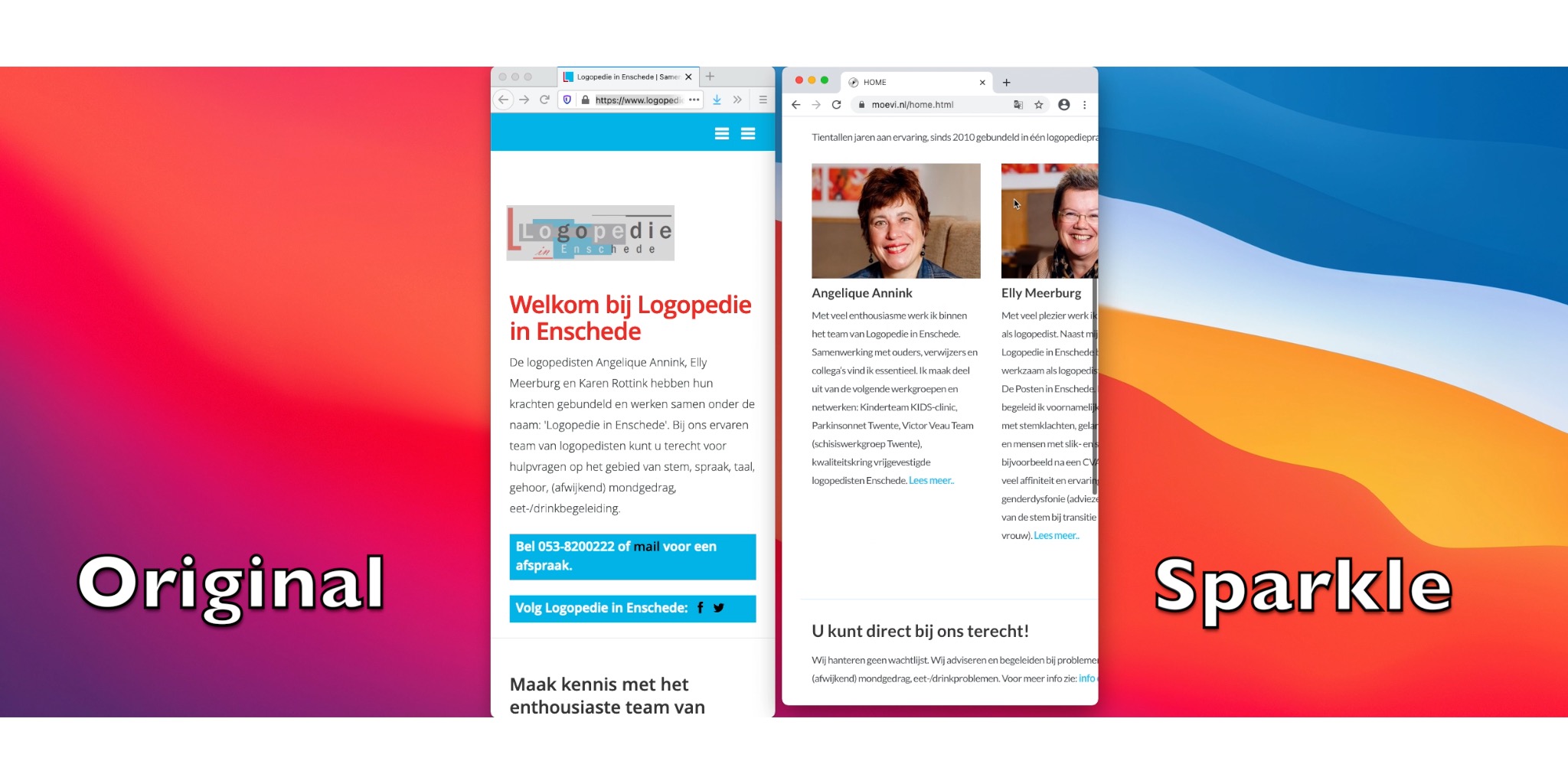
Changing the browser window of the original website is different than with the one I’ve re-build with Sparkle. Left is the original website, to the right my re-build version. The behaviour left is resulting in a view that I also see on the phone. How can I achieve this with Sparkle? https://youtu.be/PYIzQ5lqEgE
Thanks Mr. F. This is was I need. Will study it! I thought it was more complicated and that you needed to use to configure “show on this device” for each object per device type.
Again many thanks @Mr_Fozzie and @duncan I’ve managed to get what I wanted. I’ve only noticed that by default the paragraph properties will change on both devices. But that is workable.
See for the result: https://youtu.be/wkYx_TUAM3Q
Nice job!
You should tick “synchronize text attributes across devices”. You will notice that the font size will be very small when you come from desktop to smartphone. No problem. Set the font (for the style) to the size you want. You see an * next to the style name. And then klick “accept” (may be different, i have german version). Then this style will be for the smartphone only.
Let’s say body text for pc is 14pt and for smartphone you can set it to 12pt. I think this is in the tutorial as well.
Wow thanks again @Mr_Fozzie. I’ve unticked the synchronize text attributes accross devices. And now I can change the attributes device independant. Next is implementing the use of text styles. Great advise. Vielen Dank und mit ganz freundliche Grusse aus Holland, Hans.