- Have horizontal guides as well. My nav buttons got moved and it was hard getting them all aligned again on each page. A horizontal guide would be nice.
- The Nav buttons at 14 size look good on a computer web page but unreadable on an iPhone. I had to make them 20 and still they were small and hard to read. I don’t want giant ones for the computer display, how is this addressed or does something need to get changed at your end to adapt? Thanks, Karen
@pikapal1, Welcome onboard! 
I can only comment on your point 2 - from what you are saying it sounds like you are viewing your desktop on mobile, where in Sparkle you can add a mobile device and then tweak it for mobile leaving your desktop as you want it. You can find that function at the top left of your Sparkle canvas, called “Device”.
Thanks for responding but I went there and all other options were greyed out. See screen cap that I hope attached. Karen
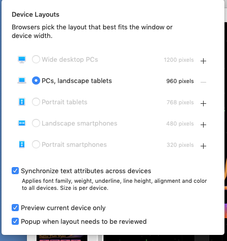
@pikapal1, Yep you are in the right place! You just have to click one of the “+”, in your case the 320 pixels. Once you click on the “+” Sparkle will create you your mobile breakpoint where you will need to make layout and font/image adjustments to get it to look the part…
So do I have to make a website for each device or are they all saved as one on upload? I am not clear on this. Thanks for you help!
@pikapal1, By default Sparkle uses the 960 pixel which caters for laptop and desktop but as you found out not for mobile. By creating a 960 device and Publishing it to your hosting server you get your website. To make more versions of your website, mobile in your case, you have to request Sparkle to generate it by clicking the “+” icon. Once you have finished tweaking your 320 pixel layout you just re-Publish and now when you view your site on mobile you will see the 320 pixel served to you on your mobile.
Sparkle does most of the work for you when you add another Device, but depending on the layout you will most likely need to adjust things. But just experiment because you can always remove a Device, but remember when you remove a Device (after you have worked on it) then you can’t get that Device back. You will have to start all over again.
If you think about it this way, your 960 pixel is your poster layout then your mobile is like your brochure layout - same content and visuals but you need to work it so that it fits the smaller space.
So the answer to your question is yes. If you have selected two devices then Sparkle Publishes them on the same server and that is all you have to do.
1 Like
Hello @pikapal1
Your first point:
Sparkle’s format bar can help you to align objects on the canvas:
As described here in section 5: