Thanks! I saw that mentioned but didn’t think it would matter as far as changing the other size site.
Will have to try it…
Reading between the lines of what you write, maybe what’s unclear in the interface is that the elements on the page are not fully independent in different devices. In other words, you can change the size and position of elements, but everything else is the same (there are actually a few things that can change but they’re generally called out in the interface).
So you can’t say have a box with a border 20 on desktop and a border 5 on mobile. Some of these we should address because they are possible, we just haven’t exposed them in Sparkle. Other are not possible in HTML/CSS.
That said the 960 shouldn’t be messed up, it should inherit some of the changes made in 320.
If you can be more specific about what’s changing, maybe starting with a simple page with 2-3 elements in it that you tweak on 960 and in 320, maybe we can be of more help.
5 Likes
Hi Nola. Welcome to the community. It took me a while too. I did start playing in a 960, and turned all synching off. In fact I made everything custom in the dialogue box. The “do not show on this device” is your friend. No object or text block disappears from variant to variant, but you can “not show”. Remember if you happen to add anything to the 320, it shows up in the 960, so going back and forth only frustrates the matter.
As many mention they start with the 320, then move to the 960. Then moving to the 960, you may add more elements but remember the “show on this device only”. I custom design every page. Just remember again if you add any element, it shows up in all variants. You just have to tell Sparkle “not show in this device”
Try opening a new sparkle file with one page, with two variants. Add just a few elements as @duncan mentioned. Move them around, play with settings. Sparkle is a program that you must play around with to learn the basics. Have fun, and don’t get frustrated.
-Bill
3 Likes
Tip#1
It helps to work in sections. Start with a section on one device. Anything that fits on your screen without scrolling. Perfect this section’s layout and then move to another device. Adjust the layout on device #2 and move onto another device. Do this until the section is perfect on all devices. Now scroll to a blank screen and work on the next section. It’s a workflow nightmare to build out a whole site or page on one device at a time.
Tip#2
If you have a second monitor or iPad, display Sparkle Preview on it. Keep Sparkle full screen on your main monitor. This way you don’t have to leave Sparkle, breaking your flow, you just glance over at your second screen. An iPad as a second screen is best because you can view all device sizes using Slide Over and Split View.
1 Like
Thanks for the replies and tips. I have been beating my head against this wall for a few weeks now and I just can’t figure out what I am doing wrong. (Usually, I can.) I have done a few of the suggestions you guys have posted, by the way. No joy.
I am going to take a break from Sparkle to clear my head and start fresh. I didn’t realize when I bought Sparkle that it really builds adaptive sites not responsive sites (or whatever the terminology is  .)
.)
In the meantime, I will return to Blocs - the new version has really improved that program. Blocs 3 couldn’t do somethings I wanted but it looks like Blocs 4 can.
I really like Sparkle except for that adaptive part. If it was truly responsive, it would be perfect.
Thanks again and a good chance I will be back.

@Nola, Your terminology is correct, Sparkle is what is termed as adaptive web design (fixed breakpoints) but in that it is slightly responsive either side of the assigned breakpoint, plus responsive in the sense that the correct page variant is served up to the device you are viewing it on. There are also a few elements within Sparkle that are responsive across the devices, for example widebox.
Adobe Muse also started off with fixed breakpoints (adaptive), aka devices in Sparkle’s terminology.
Customers complained and Adobe finally buckled and introduced responsive breakpoints and then the mess started with the breakpoints not being picked up correctly and myriad of other issues that plagued Adobe Muse until they pulled the pin on it.
So no Sparkle isn’t a drag and drop block component canvas that creates auto responsive breakpoints like WordPress or Blocs for example, where a number of designers leaves it up to the platform to do all the work and for the most part doesn’t check it which is seen in the wild by mobile elements mis-aligned, images far too small, and text that is not legible.
So yes, Sparkle is more hands on across the devices you implement.
But for sure there can be more improvements made to it like…
- instead of “view on this device” be able to toggle on/off the element in the right-hand panel as per device giving us a quick visual instead of hunting across the devices
- when introducing a device not have the elements scale down which means they have to appear beyond the fixed width canvas setting and we drag and scale them to fit the breakpoint which will make far less work and improve time-wise the workflow
- have a drag handle that allows me to move all elements below it in one move down the page instead of me having to select all those elements and dragging them down the page… this would be a massive time saver on mobile
Anyways I’m just babbling now. Hope to see you back but in the meantime good luck with Blocs 4! 
2 Likes
Greenskin, you are exactly correct.
I sure hope no one thinks that I am bashing Sparkle, because I am not. There are so many good things about Sparkle, that I am sure that I will revisit it. As far Blocs, it has many pros and many cons. Not sure how that will work out…
1 Like
Delete and forget about any templates u r using. Start fresh with a blank canvas and u should be fine. I Experince a similar challenge until I did that
Hi @Nola, I think you’ve understood well the difference between adaptive and responsive sites, but you should also perhaps understand the real differences between framework environments and Sparkle. I live quite happily with both products, even mixing pages from each app within a single website.
Framework environments are fairly rigid in order to create responsive sites. This can often mean lack of flexibility when it comes to pure design. The good thing about Sparkle is that you do not have a rigid structure to contend with - you can simply lay out your page on a blank canvas.
This flexibility can be very useful in many situations. For example, someone on the Blocs forum recently wanted to create a circular navigation similar to this:
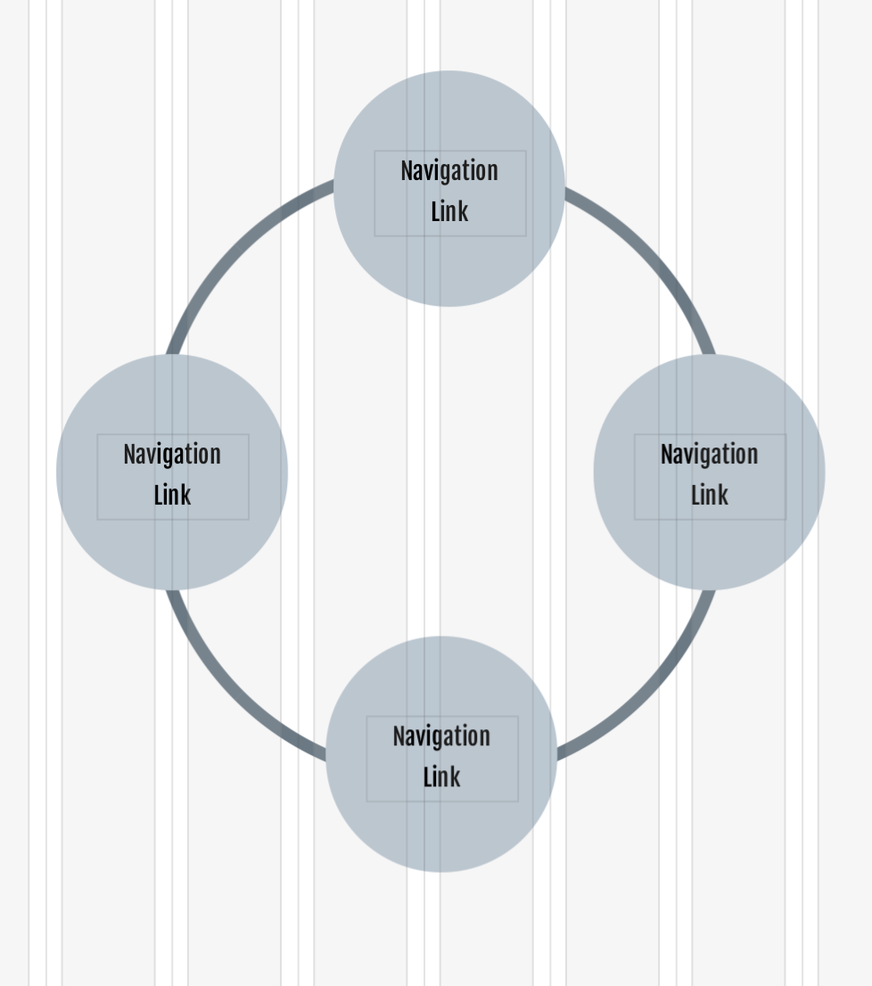
This would be quite difficult in framework environments, but is an absolute breeze in Sparkle. So, By all means go back to to your framework environment, but don’t forget Sparkle. You will find yourself returning to Sparkle to overcome some of the more difficult design challenges you may face in the future.
Like a said, I use both products to mix and match pages. Some pages are better created in a totally flexible environment, whilst others are more easily created in a framework product. So, get creative and leave yourself open to the challenges of web design. You have both products so you have a fairly good toolbox. Just use each one according to needs and don’t be afraid to mix things up.
1 Like
I appreciate your response.

Hi Nola, I had exactly the same problem, trying to perfect the 320 smartphone layout screwed up my basic desktop layout. It was driving me crazy. But thanks to some very good suggestions from Duncan I learned what I could change in the 320 layout without affecting other layouts, in particular the all-important 960 desktop layout.
Here is my Cheat Sheet, or notes on what I can get away with changing:
“What you can change on a per-device basis” i.e. not affecting other size devices
(but not called out, or specified, in the UI):
1 size and position of any element
2 text size
additionally (but actually explained or “called out” in the UI):
3 menu layout
4 text wrapping
Plus what you can change when unchecking the “synchronize text attributes across devices” :
5 all the other text and paragraph settings
And the four states for each device
I hope this helps, it allowed me to radically customize the 320 pixel layout without affecting any other layout. Cheers. Lito
4 Likes
Lito,
Thanks for the cheat sheet. Exactly the kind of stuff I need!!!
Appreciate it…
This might be a good topic for a video tutorial. I know there are several already dealing with adaptive/responsive Sparkle, but a short one showing specifically how to configure the 320 site after a larger 960 site is done (without changing the 960 one), using Lito’s suggestions, etc. could be very helpful. It does seem that there are a fair number of people besides me that could use it.
3 Likes
For my workflow I wouldn’t mind the “show on other devices” defaulting to off. Customarily we design for 960 and 320 px. Let’s say we complete a 960. I’d like to move to my 320 and see nothing other than a menu, and a blank page.
For myself it’s far more understandable. We have to resize our images anyway, and change text for the 320. We tend to design these sizes independently from one another.
It’s the constant back and forth from variant to variant that is tiring. The recommended workflow is 960, then on to the 320 and pick and chose what you want. Newbies forget that if you add any element to the 320 it shows in the 960 variant.
I’d like to see a default “non sharing” with devices, then for each element you can choose to “share” on other devices. The only element which is shared across devices would be the menu.
I can understand your point of view, but there are two reasons for wanting to avoid this:
- on one hand each element you add to a page makes your page larger, if you can share an element between devices you achieve a space savings such that effectively the element in other devices has zero or near zero impact on the page size; conversely making elements entirely separate makes the page larger in a way that’s downloaded for a visiting device of any kind, even if it’s not used; particularly with text this is bad because the entire text is repeated in the source HTML code, which will result in confusion for search engines or other bots visiting the page
- on the other hand the whole point of making content available on multiple devices is to offer that same content to everyone, to be device agnostic, to put in more effort so viewing your site is effortless on any device; changing content so that it’s different based on the device is like having a physical shop that routes customers to a different floor based on some discriminatory feature (yes it’s that bad)
With all that said, it’s super easy to select all (CMD-A), then in the arrange inspector uncheck the “show on this device” checkbox. I still suggest not adding different elements, but perhaps using that as a first step to then bring it back progressively as you work through the page.
3 Likes
Thanks Duncan. Well explained.
I would find a video very useful as well. I’m not a developer. I don’t know HTML. I’m modernizing a still existing personal web site that I originally built many years ago using WYSIWYG “Shutterbug” software.
I love Sparkle. I have already built back a 960 site with over 100 pages. But I am not looking forward to starting on the 320 site. I think that I understand most of the principles involved(I understand the words), from reading the previous postings. But I do not feel confident about going back and forth from 960 to 320, changing things, hiding this, hiding that, making mistakes and then not being able to easily get back to a previous state.
I’d really like to see someone do it, with many examples, and explain what they are doing with each step, and why. And also - describing things that you can’t do, along with things that you can do, and showing potential mistakes that can be made, etc. Very basic and simple would be good.
2 Likes
Still using Muse because for me still sparkle lacks of big screens and many other elements to hide (accordions, tabbed panels), Muse used adaptive designs first - that#s correct so far but then changed to the “breakpoints” setup. Here comes the fun fact: there were/are fixed width breakpoints and fluid width breakpoints, responsive were both of them - just to make it clear and to jump by as a “Muser”. The adaptive approach, to my information is kind of getting punished by search engines, isn’t it? To start with 320? Why Apple has created 27" screens? Although mobile is important, big screens are as well. And to be limited to 1280 with sparkle, except the hero images or full width elements is also still strange to me.
2 Likes
Hey @UweRausB, Welcome onboard… The more the merrier! :)…
Also an X-Muser who had lots of fun using its canvas to create websites. Firstly adaptive breakpoints and then we went to responsive breakpoints, and as you make out is also not very clearly defined in the world wide web even today!
I know that google (and the like) favours responsive breakpoints that use media queries (CSS) to reflow the totally downloaded website per viewing device, but I haven’t heard that they “punish” fixed-width breakpoints sites? In fact the big corporate players use fixed-width breakpoints sites (aka adaptive) so to improve their marketing reach per device-user.
Google also says that they will punish websites built still in tables but that isn’t the case either!!!
I do agree we need a bit more TLC when it comes to the bigger screen and the ability to pin to browser’s edge, etc… Good rumour has it that the new Imac Pro’s will be 30" plus but that won’t change the fact that their are more mobile devices using the WWW then what there is desktops as of 2-3 years ago so for now mobile is king.
Anyways this is a big unresolved topic that we can talk about for hours, but I think the most important thing is that we are able to serve up our clients a sound stable website architect which Sparkle does really well! :)…
Hi @UweRausB,
you can test a site with webpagetest.org or Google Pagespeed Insights, both use “lighthouse” testing under the hood.
What’s mainly punished these days is poor scores on “web vitals”. The Google search console also warns about a mobile site that has small text or small links (tap targets).
Google does punish a site that has a separate URL for a mobile site (and uses server side detection + redirection based on where you come from), but Sparkle sites are not built like that, they’re fully responsive with an adaptive layout switcher (instead of the fluid layout switcher you are conflating with responsive).
We are painfully aware of the limitations, trust me. But I won’t speak about Sparkle’s future because I think anybody using Sparkle should choose it based on its current abilities (or in other words we are not Microsoft and we don’t want to end up like Osborne).
By the way Sparkle popups can be used to implement something essentially like tabbed panels. We need better tutorials on this.
This is still our stance on accordions:
2 Likes