Hi there, when I choose the highest resolution everything looks good on my mobile devices. The whole page is filled out. When I watch the side on a 5K iMac the actual page has big borders on the sides. The actual page is less than 50% wide. I already use full-width hero from sparkle themes, but it is not possible to fill the 5K display neither. Are there any known solutions?
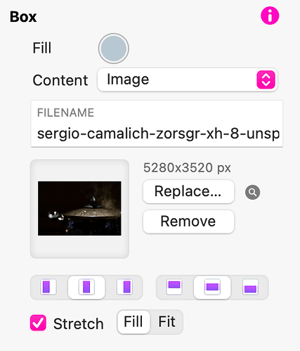
Your page width is set to the various breakpoints within the Sparkle app. If you want an image to extend beyond the page width (screen width) you must add a full width box to your page and then fill it with an image. Make sure you use the settings shown below to ensure that the image fills the box.
Your image will now stretch to the size of your browser window.
For your mobile breakpoints, there is no need to have a full width box to display your image. This is because mobiles and tablet displays use a fixed viewport and your page will automatically display at the full width of the device screen - so there is no white space on either side of the page. For these breakpoints, just add a normal image box and stretch it to fit the full width of the page.
Thanks a lot. If I have understood it right: I can widen a box, but not the whole page. There is no work around to design a wider page, because of the limited breakpoints of the Sparkle app?
Widening a whole page would not produce a good result. Essentially, lines of text would be far too long for comfortable reading and your design would break if someone views your site in a smaller window than full screen. This is why there are certain fixed widths for different devices. These allow the site to work well across a range of device sizes. As I said in my previous post, it’s really only the desktop/laptop devices that show the white margin either side of the web page. All other devices will fit the website into the available device width.
Okay, I can live with that, but I have slideshow that I want to put on full width. It is possible to stretch it, but when I watch it with a browser on an iMac there is most of the height missing. Same with the Sparkle App template “Create”.
