Hamburger menu irregular widths

Hi

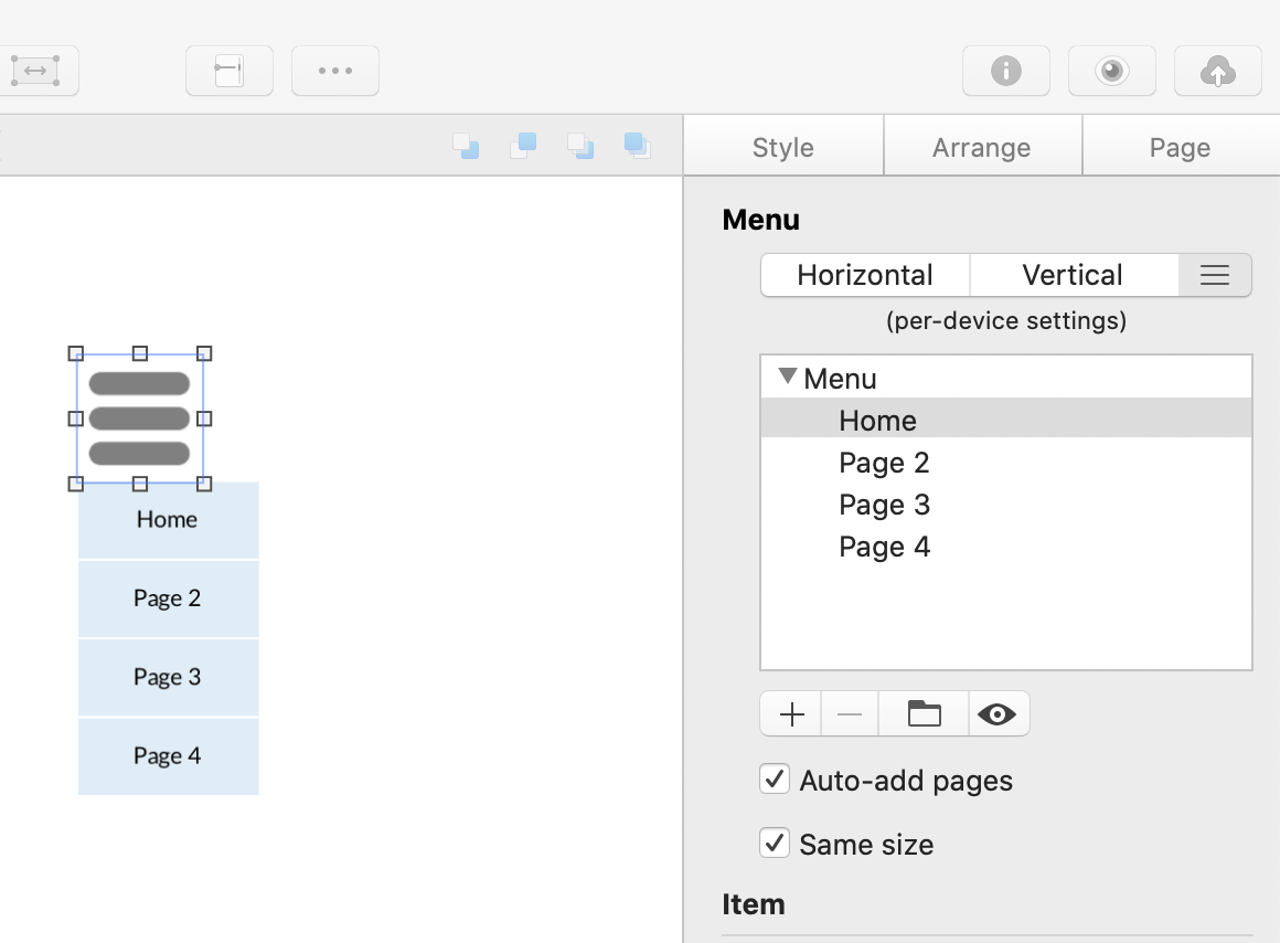
I am genuinely trying not to be a dunce, but having tried repeatedly to get the effect I want with a mobile layout hamburger menu, perhaps one of you can put me right.

I have a menu, and several of the menu items have submenus. So far so good.
But when I open the hamburger menu, the item backgrounds are all different widths. See image below:
Screen Shot 2020-06-07 at 18.22.43

The submenus are fine and and all the same…

Screen Shot 2020-06-07 at 18.36.07

I would like them to all be the same width, so I can centre this in the page and they open below (I am aware they can’t be made full width yet)

Is this possible? TIA!

If you set the menu and use the ‘same size’ option?

Best
Scott

Thanks Scott. :clap:

I think I have been staring at my screen so long, I’ve developed eye burn, and didn’t even see that option.

Appreciate your fast response too!
Vishal

Yeah, I get what I call it brain fog, after about 5 minutes of doing anything useful with my brain haha!!!
Glad it has helped :slight_smile:

Best,
Scott

For bonus marks, is there any way to place the hamburger in the middle of the page, and have the menu open below it, centred on the page?

If you align the menu items with centre align that should work… is this what you mean… this is centre in preview.

Hmm. Tried that. Not doing the same thing for me, and always offsets to one side

Just drag the Right side of the menu nav to make it wider etc… Make sure the menu Nav is also align centre etc

Can’t thank you enough Scott.

Might actually get beyond the responsive part of page 1 today…

Glad I could help in some way :call_me_hand:

1 Like