I am trying to make my site mobil. I watched Duncan’s video, read the instructions on the Sparkle help and did everything to those instructions. I turned the Device layout to portrait smart phone and edited the entire site. I watched the preview on my phone and everything looked great. I then wanted to see if it still looked the same for the PC 960, so when I switched over, it made the mobil layout bigger! I haven’t published yet because I don’t want to loose the PC layout, the preview is clearly showing just a larger mobile view! What am I doing wrong? HELP!
@EvolvedFamily, I’m thinking you have “Preview current device only” ticked?
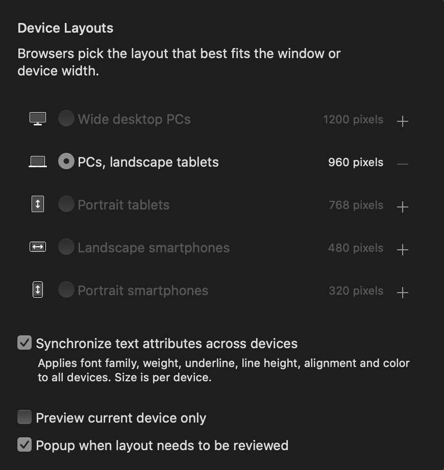
When you open your “device” panel and it drops open you’ll see at the bottom three tick boxes. It is the second tick box you need to untick, please see image…
@FlaminFig Thank you, but sadly, I tried that as well, and it’s still just gives me the mobil view only larger when I have those in the options checked in your figure. Any other things you might have come across? How did you do your mobil?
@EvolvedFamily, Ok that’s not good! So can I clarify that you created your site in the 960 pixel device and when finished you added the 320 pixel device and readjusted the layout on the canvas for mobile portrait?
Can you take a screenshot of the what you see on your desktop please…
Hi @duncan, I emailed the file, it was to large for gmail so I there is a link in google drive I hope you can get too. Thank you in advance for taking a look.
Lisa
Thank you @FlaminFig, Hendrik, I sent the file to Duncan so he can take a look. I’ll let you know what we find! -Lisa