Hero image resolution different on different device layouts

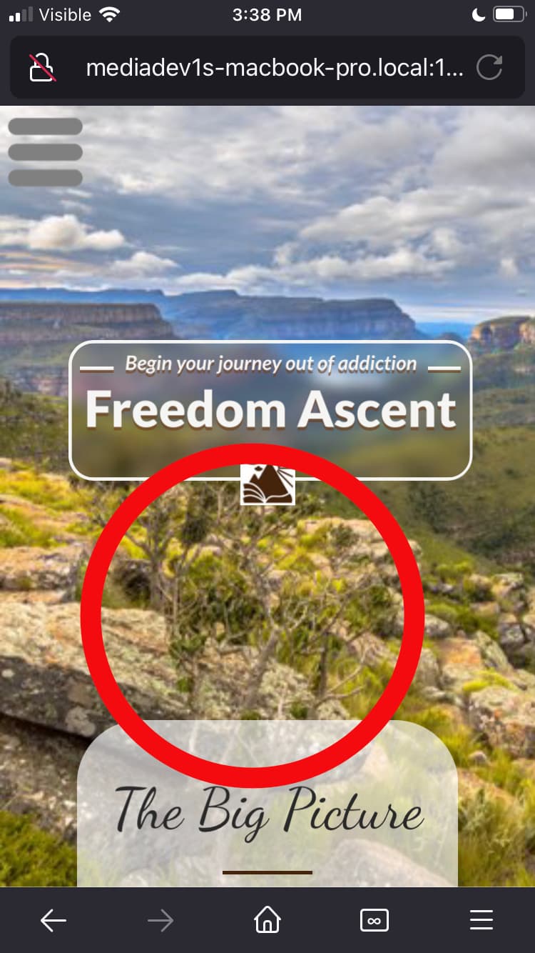
Hi there, I’m a bit puzzled as to why the same hero image looks crisp on my laptop and external wide monitor when Preview is set for Current Device, but fuzzy when set to All Devices. And regardless of which of those two preview settings I use, the hero image on mobile portrait layout is always fuzzy (not to mention that it zooms in some when I start scrolling, which is weird).

It seems to be a similar problem the one described here: https://community.sparkleapp.com/t/resolution-for-images/3486

Is there some way I can fix this? Here are the comparison images, note the bush circled in red in each image for comparison:

Blurriness: do you have images set to generate 3x resolution? Just a hunch that maybe there’s something in that area

Zoom on scroll: my guess is you have a fixed position image, and what you are seeing is the effect of the top and bottom of the iOS browser shrinking, that make the viewport larger, thus causing the fixed image to adapt to fit the larger space

Bluriness: So for the hero image I have a box filled with the photo, fixed in window, stretched to fill, and set to full page width.

Zoom on scroll: ok, makes sense, since it doesn’t happen on my android phone.

Sorry I meant specifically the image settings in the site settings. Is it set to generate 3x images?

I had just changed the settings to 1x, 2x & 3x, and set jpeg compression to Better Compression. But I still get the same blurriness.

Try changing the image setting back to 2x.

I still get the same blurriness.

Ok it’s probably best if you send the project file so we can take a look. feedback@sparkleapp.com

Email it to you at feedback@sparkleapp.com?