I am still a bit confused about setting up my page to look right on all devices. If I build the site on the 2nd device PCs, can I change all the others without effecting the original intent? And does the web site automatically use the appropriate layout that I set? I know this is simple but I am having certain problems. Thanks in advance
Les Hooper
Hi Les,
I feel your pain, believe me.
But after reading a suggestion here, I tried what they said: Start by building the 320 pixel mobile site first. Do not check the Desktop version box yet. At least 80% of all websites (probably more!) are viewed on phones nowadays, so that must be the first priority. I haven’t bothered with the other phone layout, since almost no one I know ever holds their phone sideways. Do you?
Once the mobile site is done, you can go into Sparkle’s settings and add the Desktop version.
Yes, there will be adjustments, but fewer of them IF you are a good scout and use consistent text styles to begin with in the mobile version. This will help a lot as you transition to the Desktop version.
You may need to reposition some graphics and fiddle with some text, but overall, you’ll be ahead of the game by starting with a Mobile layout.
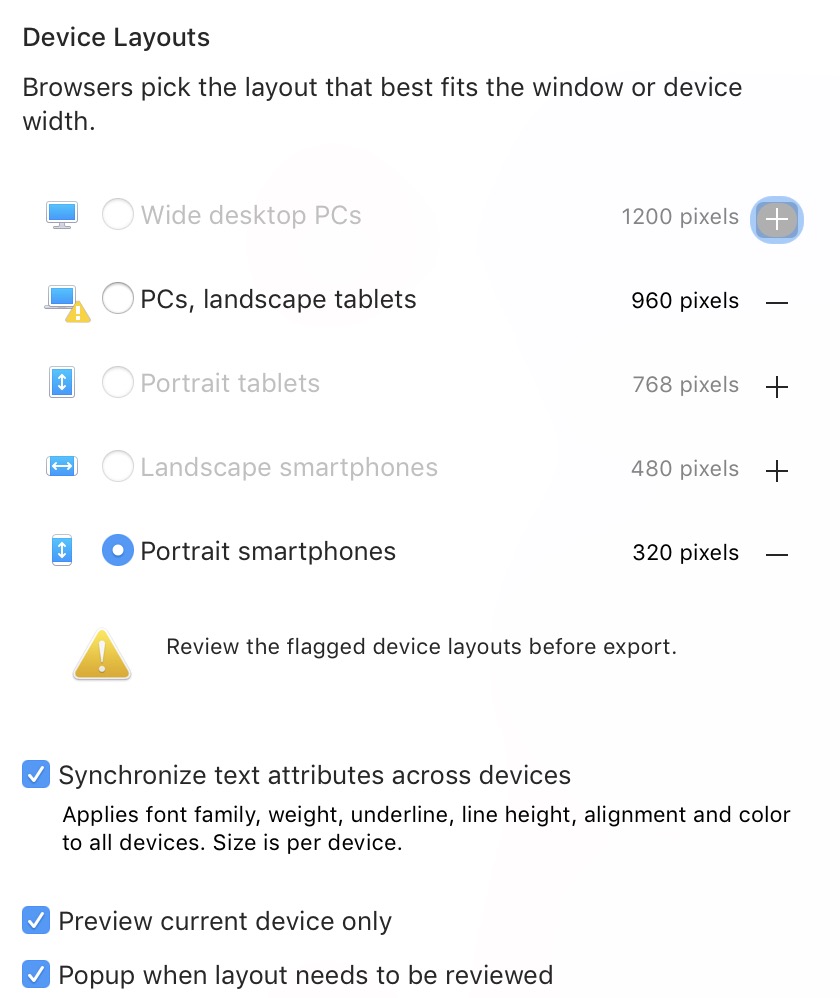
See the Device Layouts palette and be sure to check all of the boxes in the bottom list of options.
Best,
Dave
2 Likes
Hello @Leshooper
Maybe some of the information in this thread will help you as well …
And yes, as @macmancape said, text styles are important and help with the workflow.
Hi, As the Devices Layout Palette says…
“Browsers pick the layout that best fits the window or device width”.
So…not your problem  …thankfully!
Dave
1 Like
Just to make sure I’m understanding the proper process…
You’re supposed to START with the mobile-device layout first, then go to WIDE PC and make adjustments there? I’ve been doing it backwards and on my newest (and most important site) I’m having major issues with the simplest of things, having a drop-shadow keeps it’s settings between WIDE and MOBILE settings.
I create/size/ajust on WIDE PC, then when I’ve gotten “finished” I’ll turn on the MOBILE device setting and everything goes wonky. Drop-shadow settings are totally inappropriate for MOBILE but are perfect for WIDE.
I’ve been trying to figure out how to keep them completely separate but I haven’t figure it out - yet.
So again, I’m currently doing it backwards then? Build/finish MOBILE first, then goto WIDE and adjust?
Please, I hope V3 makes this simpler/easier to understand…
@producerguyaz, It is up to you how you preference the process. If you want you can build mobile first but it is not a hard and fast rule. What we forget is that you have to know how your mobile-first layout is going to flow in your wide pc (aka desktop breakpoint) otherwise you’ll hit a roadblock!
It is easier though to reduce layouts rather than expand the layouts like when we convert to mobile after building out the desktop.
I’m hearing your frustration, but I’m also reading that you are jumping in and out of the two breakpoints while adjusting. You either totally build out your desktop or mobile device first. Once you are finished with the one you have chosen to go with then you add the second device and adjust the layout until you are happy with it.
So the issue I’m having is that I’m doing exactly that, I’m building for WIDE first because my target audience is almost always going to see it on a desktop first.
The problem I’m running into is a seemingly simple one: I have a selection of photo/boxes that I’ve set a size, position and drop-shadow setting for. When I turn on MOBILE those settings don’t work; the drop shadow is way too strong/large and the size/position needs to change.
So when I apply the “fix” for mobile it affects the WIDE version, rather than keeping these settings separate.
Am I doing something wrong or is this not possible with this version of Sparkle, that elements cannot have differing settings based on breakpoint/device type?
@producerguyaz, Ok like I mentioned your mobile layout is not going to look like your desktop layout plus everything will have been sized smaller - images, text, etc…
But all the styles, images, test remain a constant across the devices so just enlarging your image to a decent size will make it look the part, but if you change the style of your image on mobile then it will affect the styling of that image on desktop. Your content and styling work across your devices, but your sizings and layout are independent of the devices.
When you open your Devices tab which tick boxes are ticked at the bottom of the Devices pop-out window?
Now I’m even more confused:
“…but if you change the style of your image on mobile then it will affect the styling of that image on desktop. Your content and styling work across your devices, but your sizings and layout are independent of the devices.”
So “style” cannot be separated between devices, but “size and layout” are. So there truly is no clean separation between device-settings, it’s only partial, correct?
So how can I design a page that’s completely separate between devices? Is it possible to re-direct viewers to a mobile-only site so that elements are truly separate? I mean, I thought that was the whole point of a “responsive” design, yes?
What about creating sub-pages and a first-to-view menu option that says either, “desktop” or “mobile” viewing options, with a redirect to a sub-site? Would that be the simplest and cleanest method to do this? Starting to seem like it…
I found my solution here:
So until Sparkle can actually create a fully, clean/separate design between breakpoints this is the only way to make everything fully independent from each other’s device settings.
SEO implications aside, this is the most logical and elegant solution - for now.
@producerguyaz, What are you trying to achieve? Your text is shared across all the devices but if you want to make styling totally independent per device then that styled image we talked about… you remove it by unticking “Arrange / Show on this device” and in place create your image for mobile with that different style you mentioned. Once done you need to go back to your desktop device and click on the mobile image you just created (it will show up on the desktop device) and do the same thing - unticking “Arrange / Show on this device”. That way you can make your mobile device look totally different in layout and style to your desktop device.
No need for re-directs.
Maybe this can further help - https://sparkleapp.com/docs/devices.html
And maybe this - https://youtu.be/Bj3fpBHLJeQ
2 Likes
Appreciate the suggestions, but the only way I can accomplish what I want within Sparkle is a completely separate sub-site. I’m hoping V3 makes this easier/simpler.
I reread your suggestion I must have misunderstood it before. This solution might exactly solve my problem. unfortunately I can’t get to my system until Sunday to test it but this might just save me from having to duplicate work.
That feature show on this device and how it works is confusing on its face, I’m going to have to play with it more to fully understand it.
Nope, it definitely doesn’t work the way described. The design settings remain connected and don’t stay separated at all.
I think I’ve finally run up against the wall of what Sparkle is incapable of, which means a major work-around or, rebuilding it elsewhere. Too much work just to get something simple done, but it’s not acting “responsive” it’s just scaling between breakpoints. Not the same thing and it’s becoming glaringly obvious.
1 Like
What doesn’t work as describe? And described where?
Look at my earlier posts in this thread; I’m taking too much time trying to figure this out. I need to get back to creating content not finding workarounds.
@producerguyaz I too am a content creator. And as content creators we have to build for the device, not the breakpoint, where we make money. For you it’s desktop and for me it’s mobile (iPhones/iPads). That means you design, build, and publish for desktop before you ever look at any other device. Once that’s done you can go back to the others.
I build websites for myself and clients, but I don’t make money off websites. I make my money creating content. For me a website is wrapping/packaging to tell a story with content.
There is great confusion between breakpoints and devices and Sparkle adds to the confusion because it’s mixes devices and breakpoints. A single device has multiple breakpoints. To see this in action, open a website in Safari and load the Develop Menu Responsive Design Mode. What you see is icons of devices. Click on a device, multiple times, and you rotate through the breakpoints each device can display.
But there is more to the story. With Apple’s recent devices and the current version of Safari (iOS and iPadOS 14), Safari chooses the breakpoint for how the user is viewing content, regardless of how the site is designed or how the web server offers it. Safari does this on device with Machine Learning. This is most evident on the iPad Pro.
Sparkle’s great strength of designing for breakpoints is marred by its workflow implementation. What we designers need is the ability to have at least one other breakpoint show side-by-side with whichever breakpoint we are currently building. A a reference, in Apple’s Final Cut Pro X I can view multiple camera angles simultaneously. Toggling between breakpoint views in Sparkle disrupts the creative process.
So the takeaway is to design websites that will forcibly display different per device we have to incur the extra workload to build separate websites. We can then use Sparkle to target breakpoints.
2 Likes
Settings such as drop shadows and animation apply the same to all device types that you have active.
Option 1
Keep your design choices subtle and test them by previewing each device until you are satisfied across the board of devices that you are using.
Option 2
Design for one device type, hide those elements on your other device types and create new ones with the styling that you want and hide those on the other device types.
You can shorten the ‘create new ones’ with some clever copy and paste/hide on this device combinations. Once the penny drops, it becomes a very fast process.
1 Like
What I have come to learn is that Sparkle is at best a “flexible” designer, not “responsive”. And there is a massive difference.
When Sparkle adjusts for a breakpoint all it does is scale up or down, it does not actually realign, automatically resize or repost text content period which is why you have to physically rebuild it for each break point.
I made the switch to Sparkle from WiX because for whatever reason the technology and wix became unreliable and therefore unusable. I never really had to concern myself with so-called breakpoints because the web interface design took care of that on the back end. You could easily preview between both and their software made all those changes in the background.
So when I started using Sparkle and had to manually deal with these breakpoints and having now used other tools to redesign my site it is obvious what the true difference is. And Sparkle should not be ever be considered “responsive”, not in its current version.
Not being a code monkey I had an expert take a look at the code in Sparkle from my only published site, and he showed me the difference between what Sparkle creates and what other builders create. Sparkles’ code is a mess.
If all I had to concern myself with was a desktop site then Sparkle would be the absolute perfect tool, hands down. There’d be no competition. But I’d be a fool to only build a desktop site.
Sparkle sure turned out to be a Godsend for getting away from WiX, but going forward there are other tools that actually do the job a responsive builder and that’s where I’m going.
I hope development continues and hope version 3 is everything we all hope it will be.
1 Like
Sorry your expert friend is wrong.
There’s lots of prejudice among web coders against visual website builders, mostly due to frontpage and similar tools (20 years ago). Happy to be challenged about Sparkle’s code.
You don’t need to justify your choices anyway, there’s many tools for many needs.
4 Likes