Lets talk Devices and design

I am new to Sparkle, but I have built a couple dozen html / css sites from scratch in PageMill, GoLive and Dreamweaver - so not unfamiliar with the process, though I would never claim to be a coder. I am working on my first site in Sparkle, and took to heart the advice of “Don’t Over Think It”. I laid out my first site (v1) as a wide desktop, figuring this is something I could easily revisit as things went along. My main concern was adding a navigation menu, but I knew Sparkle would be able to do that automatically by following my three sections and about 16 pages overall. The site previewed good on my desktop. I should note that my first action in creating the site was putting down a Layout Block (which I have read about more sense then). In my view it is just a big .div.

I duplicated the site and renamed it v2. At that point I added the menu-burger and it worked well. I went ahead and published the site so I could look at it in other devices. There were quite a few problems, particularly on my small phone, but also in the tablet. I had expected some problems because I could see the warning triangle under devices, so I expected some work ahead.

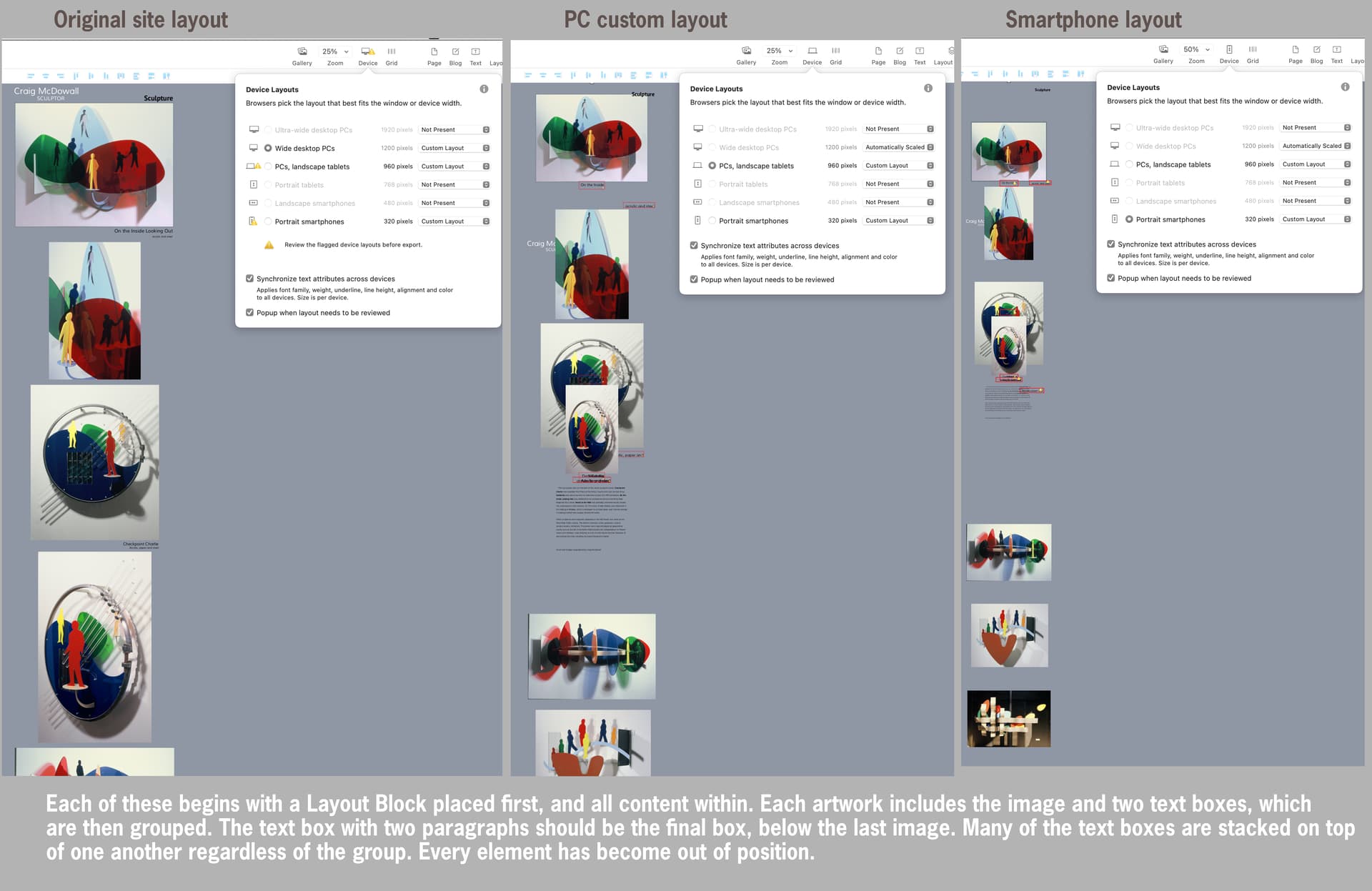
I changed the device settings to focus on 960 and 320, as is recommended in the documentation. Changing that one parameter changed my pages DRAMATICALLY - quite a few pages are worse then my example screenshots, which I chose as being most illustrative. On several pages all the images stacked up into two piles, with the text all over the place. This was not expected at all. The docs talk about ‘tweaking’ for different device layouts, but this is completely redoing every page of the site. This happened site wide today, even though I was ONLY editing the home page (index). I thought I was whipping together a nice simple site in pretty decent time, but that has gone completely out the window.

I honestly am having a hard time deciding if I should continue editing this site, or just take what I have learned and just start over. In any case, going from wide desktop to 960 PC should NOT completely alter everything about the look of the page - particularly site wide with pages you didn’t even know were changing so much. There is tweaking, and then there is starting over.

This is definitely a rant, because the software shouldn’t change every page in the site when I am only working on the home page. I am providing the screen shots so you have a better idea of what I am seeing. I guess my question is: WAS THIS AVOIDABLE ???

What are the best practices for starting a new site, like the first 5 steps everyone should do when they begin to layout that first page ? For example, one of those first steps must certainly be deciding on the devices you intend to edit for. That is obviously not a trivial decision, or one that can be made later.

Here is the screen shot. Thanks for any guidance you might offer. Craig

1 Like

Yes initially for a Newbie it can be daunting, but there is always hope at the end of the tunnel. :slight_smile:

I think you are on the money when you say “…one of those first steps must certainly be deciding on the devices you intend to edit for.” This decision could also be dependant on your Users if you already had a website up online collecting website statistics.

I don’t start at the 1200 device, but you have and I heard you first completed your 1200 device before introducing any other devices… a good move. The next step I would suggest is only introduce the next chosen device, in your case it was the 960. But before I go any further do you have the most recent Sparkle version loaded? It should be V4.5.6

I don’t know every step you have taken but it is unusual for all that movement in the Layout Block in the 960 device? But what is a constant is Sparkle scales down your content so to fit the constraints of your 960 device. So the next thing to do before adding any more devices is to tweak and slightly arrange your 960 device (plus increase text size) until you have all looking good. Once completed you then introduce your 320 device and yes their will be downscaling and yes there will be layout arrangements needed and tweaks to finish it off.

Sparkle works like no other website design platform out there so it is a matter of time that will have you get it all, especially how the introduced devices work…

I should also add that when you introduce a Device all of you pages (in your case 16) will be scaled down or up depending which side of the scale you introduce it. Also knowing you have your 1200 device looking great you can remove the other devices (it won’t mess up your 1200 device) and try the suggestion I have mentioned in this post.

But I should add that if you feel something doesn’t look right or totally unexpected then @duncan is the man to have a chit chat with on feedback@sparkleapp.com

2 Likes

@CalicoSilver while I sympathize with the frustration of a bad experience, there isn’t enough information in here to understand what path you took to get to that result.

My guess based on the available information is you added the 960 and 320 device layouts upfront, then fleshed out the site, then switched back to the other device layouts to work on them. This is likely the original cause of the mix up: Sparkle will autoscale when initially adding a device layout, and in some cases preserve the autoscaling functionality even after that, but in general to only have position tweaking you need to add the device from scratch.

So I suggest:

  1. set all devices except your initial 1200 layout to “not present”
  2. set the 960/768/480 devices to “Automatically scaled”
  3. set the “320” layout back to custom layout

Now you will find the 320 layout to be the same general layout as the 1200 layout, only scaled down, and you can move/resize everything as you need it.

One of the purposes of layout blocks is to help with mobile adaptation. So in between steps 1 and 2 above, if your original layout allows for it, I’d suggest breaking up the page where every major vertical separation or break is its own layout block.

Specifically this helps because when you need to resize text, on mobile it generally is going to be taller than the scaled down version Sparkle produces. Once the text is resized you will need to make vertical space for the text and move down everything that follows. Layout blocks have the bottom handle that does precisely that, it resizes the layout block and also moves down the following ones.

Plus it’s simple to swap two layout blocks if you should need that.

Hope this helps.

Thanks for the input. I have learned two things from 23 years on my Mac, A) use Timemachine 2) always do a Save As when beginning the next big phase of a project. I still have draft-1 one set up at 1200 and it is all intact as intended. Draft-2 was the addition of the nav menu and the publish set up, and where things went sideways with the devices.

What I am going to do is this: I will start a new site from scratch, following the devices plan Duncan laid out. I found that I could have two sites open at a time, so I am going to copy and paste each of my artworks into its own layout block on the new page, just marching right down each page. Doing that should look exactly as my original draft-1. The first layout block will be the menu/header, now that I have a better idea of how that works now.

Where a lot of additional work will have to be is the SEO, since I had already filled in much of that info.

Anyhow, I’ll follow Duncan’s plan regarding the devices and layout blocks. When you guys talk about adding a device, that is counter intuitive. While it makes sense to start large, then tweak the smaller sizes (which is what I thought I was doing), I don’t see why a designer can not go back and forth between devices – why else have a keyboard shortcut to move between them? So for example, why couldn’t on my new site, set up for 1200, 960 and 320, add my first layout block (with one artwork), adjust all the device sizes, then add my second block and one artwork and adjust all the sizes, and so one right down the page. You would always know where you are and if things are not working. That seems like a viable plan too.

I am using 4.5.6 on a new install. Anyhow, lots of work to do this afternoon. I appreciate your advice. C

PS: noticed a nice feature. The browser preview is ‘live’, meaning it updates when the project is saved. So I can keep a browser window open on my second monitor and watch the progress… Cool