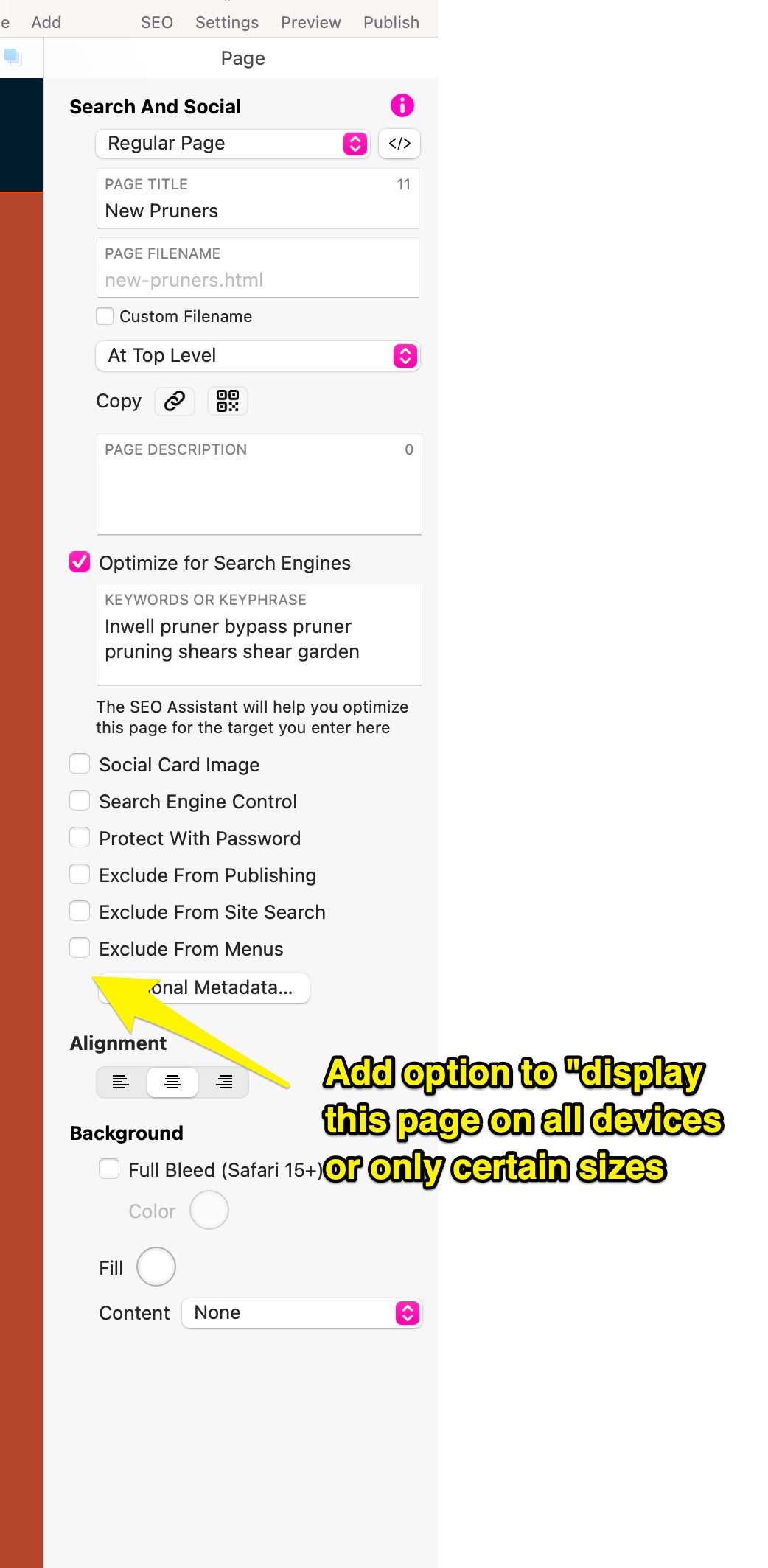
I would love to see the ability to create mobile only or desktop only pages. Yes, I know I can change the layout, hide elements from each one, etc.
However, there are cases where it would be much easier for me to build a page for desktop and a seperate page for mobile. Display only the page that applies to the device from which the site is being accessed.
Is this something that could be implemented as part of the page setup?
First the premise that we (Sparkle) are somewhat guilty of making this seem like something that revolves around devices. In reality the underlying responsive web tech is based exclusively on the device width, not device type. The device type can be guessed, but it’s not fool proof. Someone can browse the web with a 400 pixel wide browser, and view the mobile web for the most part.
Coming to what you suggest, while it seems like something simple, in practice it means changing a whole lot of things so that the page is a good web citizen despite being broken by this.
A simple example I can think of is say you have this mobile-only page with a desktop counterpart, that’s actually two pages with two URLs. Suppose one of the two is bookmarked or shared, now the pages need to have some machinery to redirect to one another based on identifying the device that’s actually viewing the page. Even ignoring SEO impact, this is not great. The infamous m.youtube.com kind of mobile URL that sticks.
Or worse, if the mobile-only page doesn’t have a desktop counterpart, or a desktop-only page doesn’t have a mobile counterpart, what then?
I’m assuming the underlying problem is the complexity of adapting pages to mobile, something we are painfully aware of. Are there specific cases you have in mind that exacerbate this?
For me as a web designer this throws up so many issues, especially SEO ones!