Hello, I have selected for the website be “automatically scaled” for the mobile size, but the site is off and not very functional. Do you have to go through each page and select the mobile size and then make any changes to them? When i do, and switch back to Wide PCs, it is off from the adjustments I made to the mobile size. Hope this makes sense. Website is here.
Hi.
I make this short and crisp 
Yes. That’s the problem with “auto scale” from big to small.
Yes, you have to do that. And check the settings for the devices. Very often these settings are used:
extra wide: n.a.
1200 px: auto
960 px: custom
768 px: auto
480 px: n.a.
320 px: custom
And i highly recommend to watch this video:
Making a page responsive.
Mr. F.
1 Like
Hi Settide, could you explain what is off and not functional on mobile version of your website?
I visited your site on a pc and a phone, it looks identical of both and functional as well.
ZbR
Thanks for the help. If I make changes to the pages for the mobile, will it keep any previous changes I have for a different size? Bascially, will any changes done to mobile size affect other sizes?
@Settide, every device you layout in “custom layout” will not effect any other “custom layout” devices. But if you delete or add to a “custom layout” text boxes, images, etc… it will effect other “custom layout” devices. For example if you have created a “custom layout” of the 960 device and then add a 320 “custom layout” and then add or remove elements on your 320 device, you will see those added or removed elements on your 960 devices unless you untick “show in this device” in the right-hand panel under Arrange.
It is also good practice to create your font styles on the original device your started with, and that way you have control over your font styles independently across devices, especially on the 320 device.
Would you suggest to simply change font sizes, re-arrange images, page boxes, etc rather than delete and add different things for different “custom layout” types?
Yes @Settide.
All the elements that go into making up your website you have introduced on the 1 device. All those elements are presented on any device that you introduce afterwards, so it is a matter of increasing font size, image size and rearranging the elements so it look the part.
Thanks for the clarification, appreciate it.
1 Like
What is off and not very functional?
May I try to clear things up?
Sparkle is very bad in autoscaling, at least with sparkle 4. Mainly because it handles text not really clever.
For example a headline on 1200 with size - 70 appears on mobile with 11. So it is not really readable and same happens to body text starting with size - 30 , scaling down to 5. So really not readable at all.
I recommend, not to use autoscaling at all.
I recommend to do at first one empty page with all text variations you need for all devices/breakpoints.
Start with Heading-h1 to h2 to h3 and so on and body text with -p-.
Set this up for all devices, how you think it is reasonable for your design for hierarchy reasons.
Now on all content pages you simply have to setup your text as desired.
Be aware that all elements should be on all devices/breakpoints visible, except there’s a good reason not to do so. It should be really good reasons.
If you have setup your content now for one device, no matter starting from small or big screens, watch the layers and their naming, in order to find and replace them much easier on other breakpoints.
Sparkle sometimes places elements in strange ways and sometimes very very small, and so very difficult to find without selecting those in the layers panel.
Now, if all elements are there only once, it gets more and more easy, …
Hope that helps,
Kind regards,
Uwe
Auto Scaling is not perfect but in most cases it is most certainly being used in the wrong fashion!!! No one here should be creating a 1200 device and auto scaling all other devices. This is madness and outright lazy!
It must be known that Sparkle’s fixed devices (aka breakpoints) is as such - a fixed width. So for Sparkle to keep the content within that set width it’s mathematics scales everything down. The majority of the Sparkle elements placed on the canvas ARE NOT LIQUID RESPONSIVE. So yes a 70px heading on a 1200 device auto-scaled down to mobile is 11px, but this is not how Sparkle works, and is outright lazy design!!!
Auto scaling can be used for devices either side of a custom laid out device and that’s it!
That’s what I say. Autoscaling should not be with text. That’s all I mean. Referring to the OP that the site is off on mobile. Asking wether to make changes in every “device”, right? Coming from Adobe Muse, it had a function called: keep place and size in next breakpoint. That’s what would be nice to have. Just referring to text and nothing else. And also, autoscaling – placing any elements in weird places from one to the next device/breakpoint is strange, too. Known as being aware of by Duncan, so …
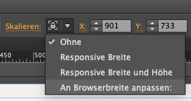
I know about fixed width breakpoints and fluid width breakpoints though, realizing that sometimes images react like fluid and sometimes not, when scaling browser windows.
Kind Regards,
Uwe
It’s been a few years now!.. Did Adobe Muse (when it had fixed width breakpoints) have that text feature as well between breakpoints?
Sparkle and Adobe Muse foundation code and framework must be vastly different so I don’t have an answer for the text sizing between devices. It could be better but let’s see what Sparkle 5 brings to the table! 
Yes, the text-feature also was not restricted to text but also to all elements. With text it was and still is a feature to be able to set text and paragraph styles to all breakpoints be the same but before changing to another/next device
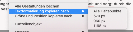
- kind of like in sparkle, but if one adds a new text-box it’s necessary to click that new text-box in all devices/breakpoints in order to set the paragraph style to it (what I do on one extra page page right before I start with a new project):
In muse one of the great features was this:
Kind Regards,
Uwe