Moved from wordpress to Sparkle and it works better now. Even seo is better now.
Do you have any suggestions to optimise?
Thx and cheers
8 Likes
Beautifully done, and the mobile layout is great as well.
1 Like
Sehr schöne Seite und richtig gut umgesetzt. Habe spontan keine verbessungsvorschlaege. Gut gemacht und mach weiter so 
1 Like
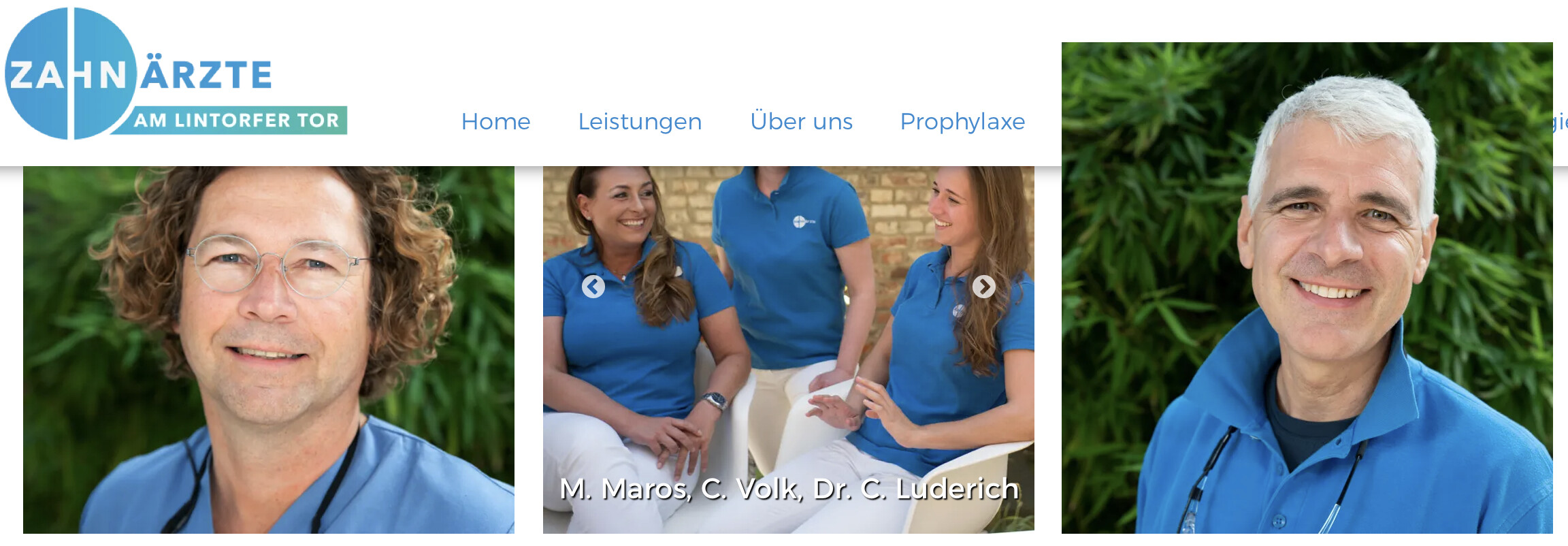
Wunderbar! Gratuliere! Da müsste man schon Kleinigkeiten finden… Das einzige, was mir auf die Schnelle aufgefallen ist: Das Team-Foto am Ende der Homepage ist im Gegensatz zu den übrigen Bildern gering aufgelöst. Aber das war’s auch schon.
Beste Grüße!
1 Like
Well done @Steffi
I see you have used the title and alt tags with your images, you have page title and description in place - all good! I don’t read German but another trick is name your image files for SEO as well and knowing you have anchor points they are also a great source for SEO optimisation.
Just check your on page telephone link!
2 Likes
Thank you for your good tips! 
Schöne Seite Glückwunsch.
Diesen Schriftfehler schon gesehen im Impressum?
Herzliche Grüße, und frohe Weihnachten
Fernando
Hallo Fernando, Du bist ein Held! Ich habe das nicht gesehen und in der App ist auch alles in Ordnung. Das scheint ein Bug zu sein. Gut, dass Du das gesehen hast. Vielen Dank! Viele Grüße und frohe Weihnachten Steffi
Great job, it give a friendly impression for the staff, if it was not so far away I would like to go there. I am form QUÉBEC CANADA hihi!
2 Likes

Thank you. It Reality is a very good dentist.
Very Nice! Totally Pro looking, nice typography, balance and uese of animating effects. Great Job.
1 Like
@Steffi This is a well done and professional site Steffi. I just have one suggestion from an average viewer in Canada.
After your log in form, you have a map. After the map an interesting parallax view and and nice pic of your staff, then the footer.
Usually after a log in for info your viewer may assume that’s the end of the page. They will miss the group shot. Consider moving the group shot and parallax up. Let your map be last, then your footer. Just a suggestion.
-Bill
1 Like
Thank you Bill, I agree with xou. But as we have the team at the top of the page, we do not really need it again. I did not even want a contact form, but it is used very often on the page and peopl have to see where it is. This is why it is combined with the pictures of the house. But I thank everyone for feedback! Thank you and stay healthy. Cheers Steffi
Hi Steffi
Great work, congrats! The image of Mr. Vogelbush is overlapping the navigation at the top when scrolling.
1 Like
Thank you so much! yesterday I made some changes and didn‘t check. Thank you so much!!! 