Not sure what I’m doing wrong — or if this is a problem that I just encountered or if I’ve had it for the past month but didn’t notice it.
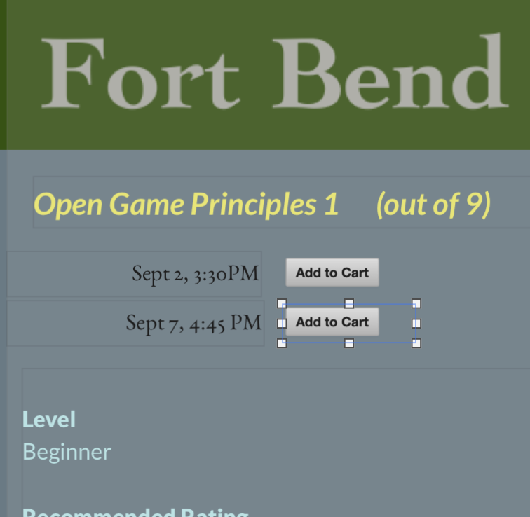
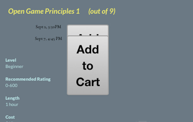
The buttons I’ve created in Sparkle look good in Sparkle, and they look good on the laptop browser and iPad when I visit the published site. But the buttons on the iPhone are super-sized and not right.
@chuckbo, have you left it up to Sparkle to create the mobile device, aka “automatically scale”? If you have you will need to go in and adjust the buttons and their font size.
The other thing is that you haven’t created your mobile device?
If that is the case you need to introduce a mobile device and then adjust the layout, images, and font size.
Yes, I’ve let Sparkle do the automatic scaling, and everything had looked good (I thought).
I’m trying to avoid having to constantly edit about 60 buttons spread out over 2 dozen pages for the phone landscape and portrait.(And also for the iPad portrait option I now discovered.) But it sounds like that will be the only option.
But I don’t understand your comment about introducing a mobile device. My devices menu shows the five default sizes.
Are you saying there’s something else I can do here that might make a difference?
I’m just surprised by this behavior of the scaling. The buttons are smaller and consistent with the size of the preceding textboxes in Sparkle and on the PC pages. But on the phone, the textboxes are scaled nicely but the button images have exploded.
@chuckbo, I see what you have done now and totally understand why your issue…
There is many ways to go about this but like @Mr_Fozzie mentions that there is a far better way than only working on the one device and scaling everything else. Sparkle allows total control over every device but of course there is a bit more work to be done
Please take @Mr_Fozzie advice regarding the devices (aka breakpoints) and you’ll have a great result!
Let me summarize to see if I understand correctly.
You create the landscape view for the landscape tablet.
You let Sparkle generate the view for the wide-screen PC and the landscape phone and the portrait tablet.
And you create the portrait view for the phone.
I’m guessing the portrait view for the tablet is generated from the portrait phone and the landscape view for the phone and landscape view for the PC are generated from the landscape tablet?
Yes you are on the right track…
From my experience there is no real need for the 480 device. For the majority Users only use their phone in landscape when viewing video.
So of late I have been having fun with the following that works quite well for me…
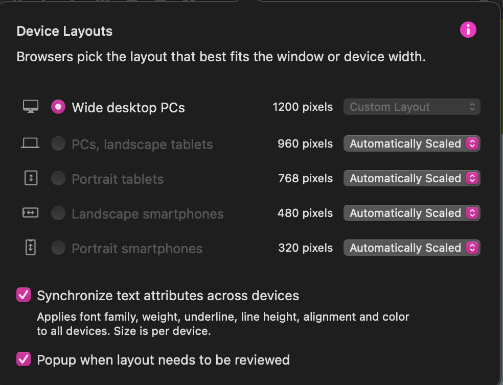
Create 1200 device, and “Automatically Scaled” 960, 768, 480, 320.
Then I “Not Present” 960 and 480
Then I covert to “Custom Layout” the 320
So the 1200 also controls the 769, and the 320 I go in and fine tune for the breakpoint, aka device.
So in other words I’m creating the desktop covering the tablet, and then separately refining for mobile.
I appreciate your suggestions & wisdom, and I have a follow-up question, now that I’m making significant changes to my site.
You said that you disable the 960 format. But it seems to me that landscape tablet is more common than the portrait tablet. If it’s disabled, does it just mean that the page isn’t scaled and that anyone on a landscape table will scroll side to side if the page’s content extends past its right border?
I apologize for being kind of slow these days. Is this what you’re recommending:
• Set a custom layout for 1200 and for 320
• Set 768 to be automatically scaled.
• Set 960 and 480 to be Not Published.
I saw one note that I interpreted with this recommendation. But I see another note that recommends personalizing the 960 format and letting the 1200 and 768 auto format.
I usually create a 1200 device with the fonts at a good size - paragraph minimum 18pt.
I then create the 768 device. I usually manually, but your can “automatically scale”
And finish off with the 320 device that I manually layout, etc…
With the above scenario my iPad in landscape will pick up my 1200 scaled down to fit the screen - the reason for the 18pt paragraph text. When I turn the iPad to portrait it will pick up the 768 device.
Because Sparkle is so simple and intuitive to use the best thing you can do is play and experiment to see which method you prefer of the others… Enjoy!