I am new to Sparkle but cannot stop working with it. It is so much fun and quick results. And of course there is a learning curve but there are lots of great hints and tips here in this forum. Just wanted to say thanks to the Sparkle team and this community. Here is a sneak peek of a family website I am currently updating. Not ready yet but it is getting there. Comments/suggestions welcome.
Stephan
https://ottiangles.de
3 Likes
You’re off to a good start!
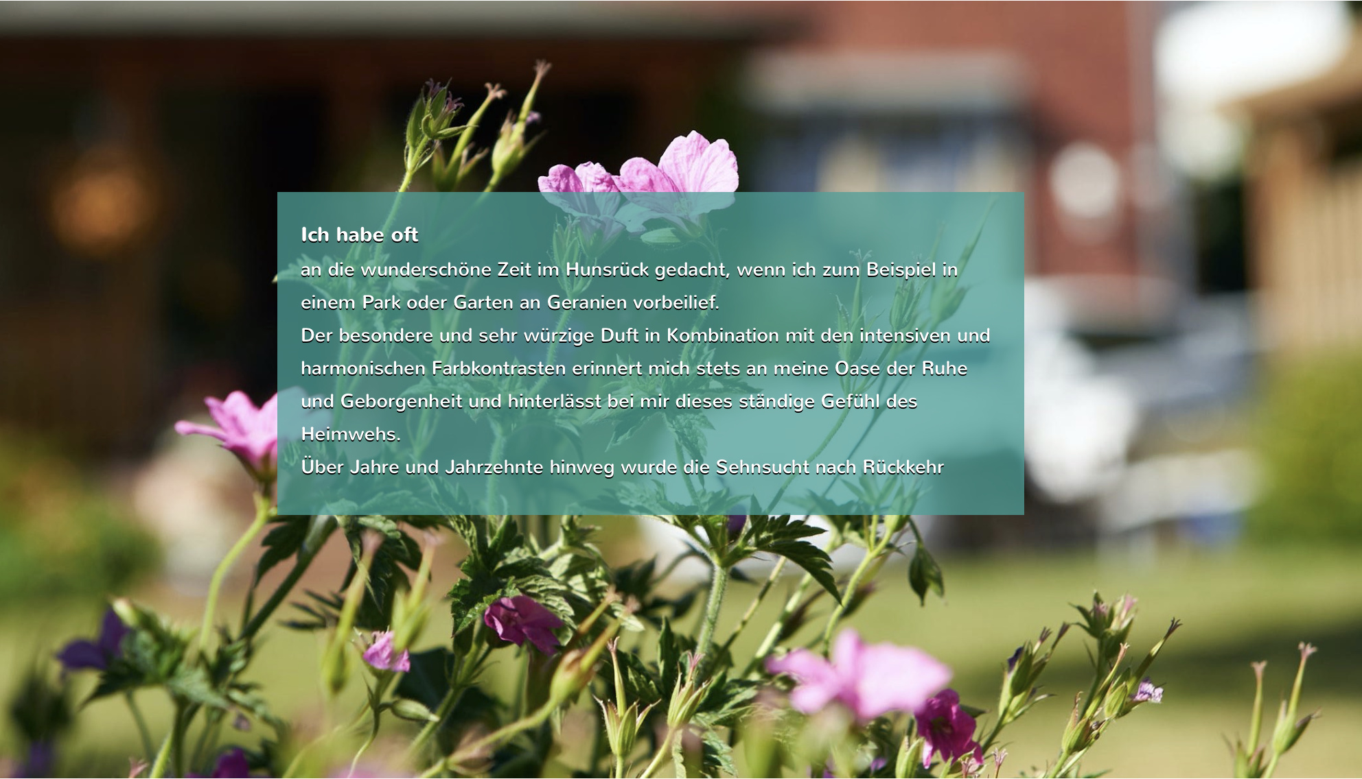
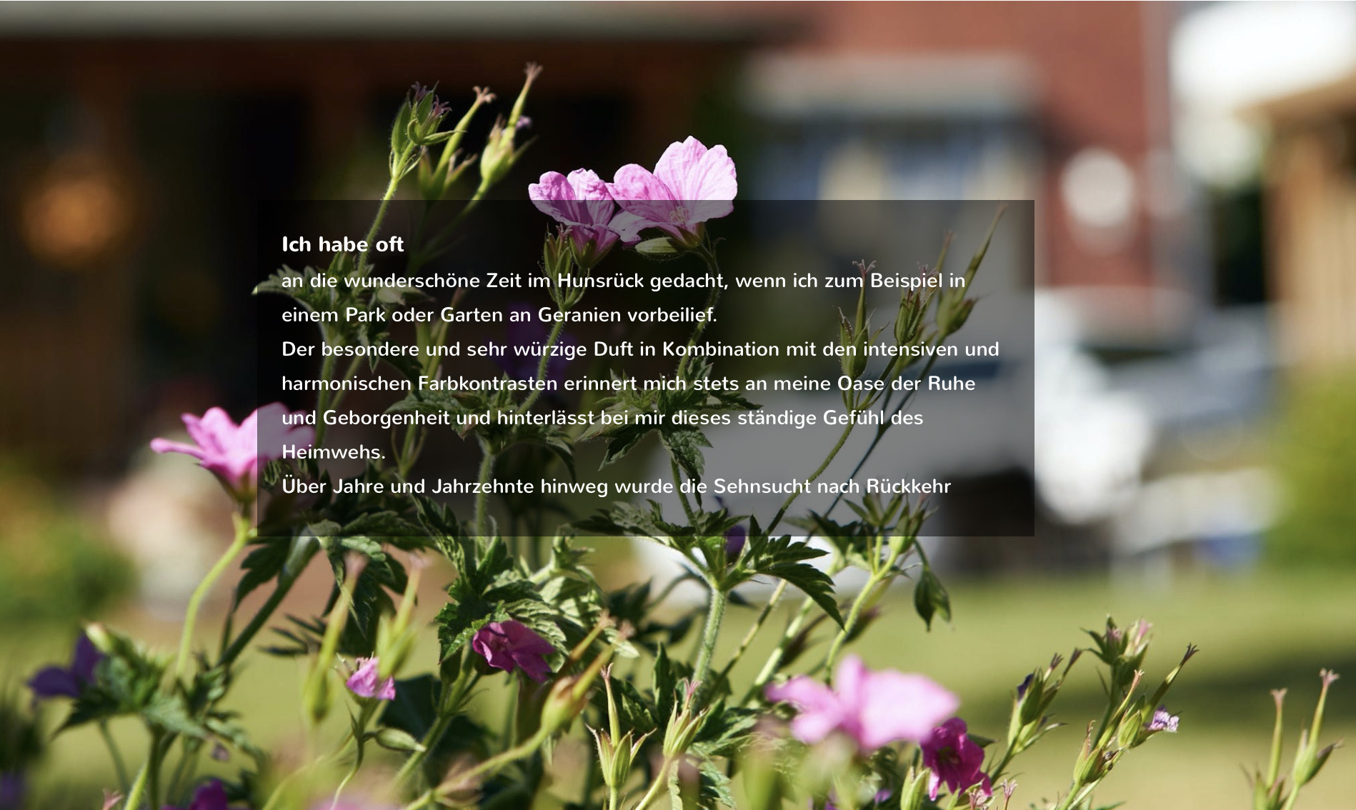
Two suggestions…Don’t use “text background”. It actually lowers the text readability, not enhances it, and detracts from your photographic backgrounds. My suggestion is to create a box that sits behind the text. Make it slightly larger than the whole text box. Fill the box with a color from the background of the image it overlays. Then lower the opacity of the box to the point the text is easy to read and the image background is still easily seen.
Suggestion two…Create a transition between your Wide Box image backgrounds. You can do this by creating new, very thin wide boxes between the Wide Box image backgrounds. Fill the transition wide boxes with a gradient consisting of one or two colours from the adjoining backgrounds or one non gradient colour that is complimentary. As you have it now, the abrupt transition between the images is startling to the eye. I don’t think you are intending that effect.
1 Like
I agree wholeheartedly with @thetravelhikelife. It’s much better, and looks more balanced, to use an opaque background box behind your text over images. Here are two examples (different colours) of what @thetravelhikelife is suggesting.
1 Like
Thanks for the review and your suggestions it’s really appreciated. Both advises sound very promising and I will give it a try.
The transition between the wide box image backgrounds seems a bit challenging. Currently the wide boxes have a height of 1,000 - so I will start with 80 as transition zone i.e. “very thin”.
Thanks a lot for the visualization of the effect. It is much better the way the two of you suggested.
Great 
Hello again, I have now updated the site and applied the suggestions from @thetravelhikelife and @francbrowne. It worked out well so thanks again for the input. I have also included content on the other pages within the site including some real short vids and I hope you’ll enjoy.
1 Like
Well done!! Increase your font size to 16 or 18 on smartphones Portrait and Landscape device settings and see if you like it.
Thanks. Now optimized for smartphones too 
Das sieht Klasse aus! Mit die viele (scharfe) Bilder ist es genießen ihre Website zu besuchen und ich würde gerne irgendwann Hunsrück besuchen.
https://www.devrind.eu
Erg bedankt! Deze pagina wordt aanbevolen voor vakanties: https://www.hunsruecktouristik.de/nl/
je zal er geen spijt van krijgen.
I also like your homepage https://www.devrind.eu/ quite a lot. It is amazing what artwork can be done also with “simple” pictures. I like the boat in the dry sand at the shore, it looks dramatically & awesome at the same time.
1 Like
Grosse Klasse Stephan!
1 Like
Add font size on mobile to 16. To small to read. Google webmaster might not optimized ur mobile site
Dankeschön 
Thanks for the suggestion. I tried several sizes and found the one I am using right now to be the perfect fit. Google analytics did not complain (yet). 