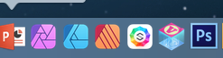
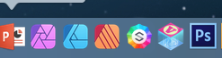
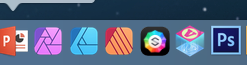
I would like to suggest that the very next update to the Sparkle app include an update to the application’s dock icon. Presently, it looks rather small and unattractive, trapped on the white background. Is it possible to enlarge the Sparkle icon and place it on a transparent background?
That’s cool, but I don’t think you can alter the app icon, unless you break open the application package and know where to go to replace the icon files.
Oh! Well, if this format has been imposed by Apple, that’s unfortunate.
In that case, I would recommend using a black, or dark background color to allow the Sparkle icon to pop visually. The white background competes with the white in the icon’s center and weakens the impact of the colored facets.
Can easily swap the new icon for the old or just make your own that syncs with your workspace theme. Here’s a 5 min stab at something “fuller”. Needs work, but you get the idea.
Office and Photoshop are on their way out. Affinity and Sparkle, however, are new arrivals and eventual replacements for the Adobe suite. Pages, Keynote and Numbers have already replaced my Office apps.
I meant, just replace the icons with something better- not the apps themselves. Affinity is awesome. Love Designer. Still use PS mostly, but can see an exit someday. Same boat with Pages, Keynote and Numbers replacing Office.
Affinity, Sparkle & DaVinci Resolve are the new wave.
The app icon is excellent and fully adhers to macOS Big Sur design language (the outer glow is especially nice). Before posting such comments please make sure you understand what you are talking about.
I’m very glad the new icon looks more distinguishable from the Photos icon. I can’t count how many times I clicked on one when I meant to click the other.
And in the same vein, I wish a search on “sparkle” didn’t bring up so many pages of unwanted links. In other words, I wish for something that would distinguish it somehow. On the bright side, there seem to be so few web sites or pages about Sparkle it doesn’t seem to matter much.