I have just uploaded a new website,…works well on a my desktop computer and an IPad, but iphone it doesn’t…could anyone take a look and advise me…Love the program but a bit mystified. Web address is www.adadvertisinganddesign.co.uk…Thanks
A good attempt @S1MONS. From what you have described it looks like you have built your site for the 960px breakpoint which would allow for a good landscape tablet view. To get your site ready for mobile you need to go to the top left of the Sparkle app and click on “Device”… This will open up a panel where you can add further responsive fixed breakpoints, aka tablet and mobile.
Good luck! 
Thanks for that I will try and play around with this and see if I can get it to work,…any other thoughts?..
Hi @S1MONS,
that happens when you add devices and don’t switch to them to review the layout.
The way Sparkle device layouts works is Sparkle will initially scale the layout when you add the device, but you then need to manually adapt the layout. This can become tedious, but Sparkle doesn’t really have a way of knowing how you want a 960 pixel wide design to fit in a 320 pixel wide one, for example. We have written up a quick workflow here:
https://sparkleapp.com/docs/devices.html
In general you can just edit 960 and 320, and add the other devices when you are done, using Sparkle’s scaling.
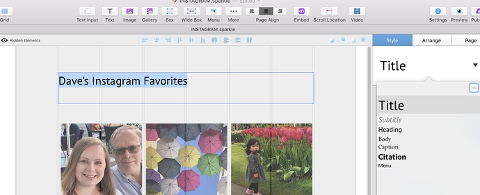
Duncan makes good points (below)…the main thing to know is to use Sparkle’s text styles menu in your desktop site… headlines, etc…which then will carry over to the mobile version and inform it. See my screenshot below.
Honestly, I built a number of websites in Sparkle and ignored this feature until recently. Yes, it’s an additional step, having to worry about text styles, but these days, it’s absolutely necessary, since 3/4s of all sites are viewed on mobile devices. You’ve just gotta do what you’ve gotta do!
Thanks for all your very kind info…I will be taking as many as these up as I can in the next day or so. One thing which I probably should have mentioned is this is website is loosely based on a template design - TRAVELICIOUS! which is by Francesca CHITI, obviously I have adajted it and added a few new this like the Portfolio page,…but could someone tell me why the slideshow is looking not great on and iphone here…fine on a mac, ipad etc…but not an iphone.
Sorry spelling error…"…adjusted it" and ."…added added few new things".
Sorry
@S1MONS, remember how I mentioned the steps to make your website mobile friendly? At the moment (when checking out your live website) it isn’t mobile friendly, aka it hasn’t been designed for the 320px fixed-width-breakpoint and that is why your slideshow isn’t showing up legible.
