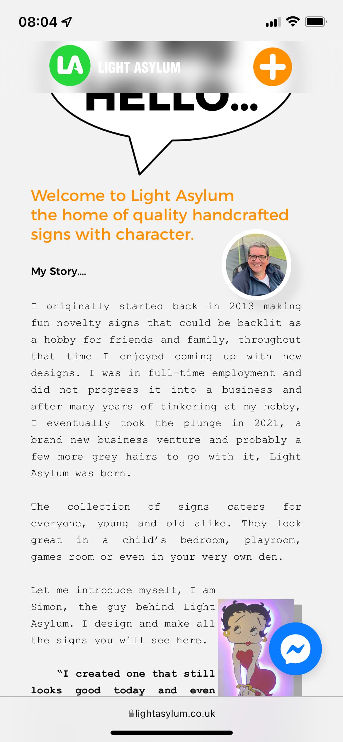
Hello Fellow Sparklers.
I have been redeveloping my website for my small business, it has taken a while and has used the invaluable advice from this forum, which I think is great.
Now it’s my turn to put my head above the parapet and ask for your opinion on my site.
I am open to any suggestions or improvements that would make it that bit better.
An issue I do have though, is when the site first loads up, the text and my large logo do not appear until you start to scroll, anyone got any idea why this is the case? if I refresh the page, it is fine.
Best wishes
Simon.
It’s a very nice little page, I like the animations and the page effects very much, those are not too many but enough to make it interesting.
I watched it on my iPhone and on couple page I have a higher white space at the end before the footer starts.
I and probably some others too would be curious what you have used for the testimonial slider and what shop System you have used.
Thank you @MiWe, I appreciate your comments. The site is not quite finished with a few small details I need to finish, one of them is the large white space before the footer begins, sometimes when I mess with the page length it creates these white spaces. My thinking was sort out everything else then approach the white space problem as it can mess things up a bit.
The testimonial slider is just the gallery view slider with Sparkle, I created the individual images from my reviews and then placed them within the gallery. The only problem doing it this way is you have to keep onto of it yourself to create the images, I hope that makes sense.
The shop system is Ecwid, I found it very easy to implement.
Lo que más me ha gustado es el trabajo, enhorabuena! Los luminosos graffity me han gustado en especial, son muy buenos.
La web agradable y en sintonía con el trabajo. Solo una sugerencia, en la tienda, los botones de “mi cuenta”, “seguimiento de pedidos” “favoritos” y "carrito, los pondría en la parte superior, solo por aquello de unificar y dar confianza al comprador, aunque las reglas están para romper, facilitar la compra nunca está de mas, y esos botones los buscamos instintivamente en la parte superior.
Saludos.
Pd.: he visto la web en escritorio y con google traductor a español. lo hace correctamente.
Hi @AdeGarci can you please write in English?
This is a English forum and I think it’s just respectful to others to write in English. Thank you so much.
I see you have been busy with integration to further extend your website and it really works well like the Messenger Chat and Facebook comments plugin. Your Ecwid integration works also really well.
A few things I could suggest…
If you can take a look at your website on a 27" iMac and see if you think if it looks to big
Just check Instagram on the smaller devices as it is pushing beyond the device width
On mobile your “LA” is covering over the Image Gallery dots
On mobile your text on the About Us page sits hard up against the edge of the device
Thank you for the replies so far, I really do appreciate them. @AdeGarci thank you for your comments on My Graffiti work, I really do enjoy making them. On the shopping cart etc. buttons, you suggested moving them to the top, I don’t think I can do that, it is part of the Ecwid plugin, or should I say I haven’t found out how to do that . @FlaminFig can you just expand on “do you think it may look too big”? I did build it on a 27", however, I never have a full size window open.
Can I ask what mobile device you are viewing it on, as on my iPhone 12 Pro it doesn’t look against the edge of the device (Screen shot attached)?
I’m wondering if you have the desktop-wide device scaled up?
I have Safari opened about 4/5 and I was noticing your website looked big in images, the hero, and the titles/headings. But I asked the question because it is something that is subjective.
I viewed your mobile on three different sizings and on the 320 (iPhone SE) the left edge is up against the screen which you wouldn’t see on the larger screens.
Interesting, I’ve just looked at my site in full-blown 27" and it is a bit in your face but as you say, it is subjective and I don’t know many who view websites that big, I need to give that a bit more thought.
As for the smaller screen, have you any suggestions on how to cure the left edge being up against the side because as I mentioned, it does look fine on my screen?
@FlaminFig Hi Hendrik, I have now enabled auto-scaling in the settings, I think this may have solved the issue, would you be so kind as to check on your device again, I have used the responsive layout on safari and does seem fine.
Simon
@MiWe Michael, you mentioned earlier on about the white space before the footer, this really has me perplexed. I have looked at the other topics in the community but can not seem to get it to work. When I move the footer elements on the about page to lose the white space, the footer elements also move on the other pages. I tried it by unticking follow footer, I’ve tried it with the follow footer selected, am I missing something, why does it affect the other pages. Do you happen to know a solution?
Yes, I have. I’m not able to even make the pages shorter by moving the handle upwards, it only goes so far then stops, hence the large gaps. I have checked for any hidden elements but nothing there. I may have to enlist @duncan to see if he could assist.
You’ve done well @Sicherry! It’s looking the part now on mobile!
Regarding the footer…
I would firstly go to the page you originally created your footer block in and then untick Show on all pages. Get the footer block to look and position how you want it and then once done tick Show on all pages making sure before you do you have also ticked the Follow Footer.
Then go to all other pages and check if the footer block is in the right place. If not use the footer scrubber (4 x 2 pairs of dots at the bottom of the UI) and double click it for it to move up to the last element on the page and further adjust if needed.
Regarding the Layout Block… Make sure you have removed unnecessary space from the top and from the bottom by repositioning your elements within the Layout. Block.
Hi @Sicherry, the most common issue is some invisible or hidden element in the canvas, or a popup that’s that tall.
Less frequently what might happen is an element flagged as “follow footer”, possibly incorrectly, has ended up at the top of the page. Since it moves relative to the page bottom, and it can’t go further up than the top of the page, it blocks the page height from shrinking.
IT WAS THE POP-UP. After many hours of messing with the site, I found the pop up that was causing the issue, I decided to delete it, which then made the setting of the footer correct, following @FlaminFig instructions above. however, it still is a tedious task especially if you happen to have lots of pages. Thank you everyone for your help.
I think you’ve done a great job; one of the best creative layouts I’ve seen in a long time.
Ironically I’ve been re-designing my own site which turns out to be heavily visually oriented similar to yours. (I keep threatening to finish it but then either life happens or I’d rather be outside in the fresh air instead of staring at a screen - haha)
I even picked up on a few visual tricks you used (non-animation) that I might add, so the inspiration is great.
Only thing I noticed was the initial load-time was a tad slow. Not sure if it’s all the animations loading the background or the large background photo/collage that’s chewing up data-space and not even sure it’s worth fussing about since the end result it so great, but it’s a noticeable slow-up and wanted to mention it.