First, let me state how pleased I am with the WYSIWYG pixel-precise layout model of Sparkle. What a godsend this feature of Sparkle has been.
Having said that, I wonder if some degree of fluidity could be introduced.
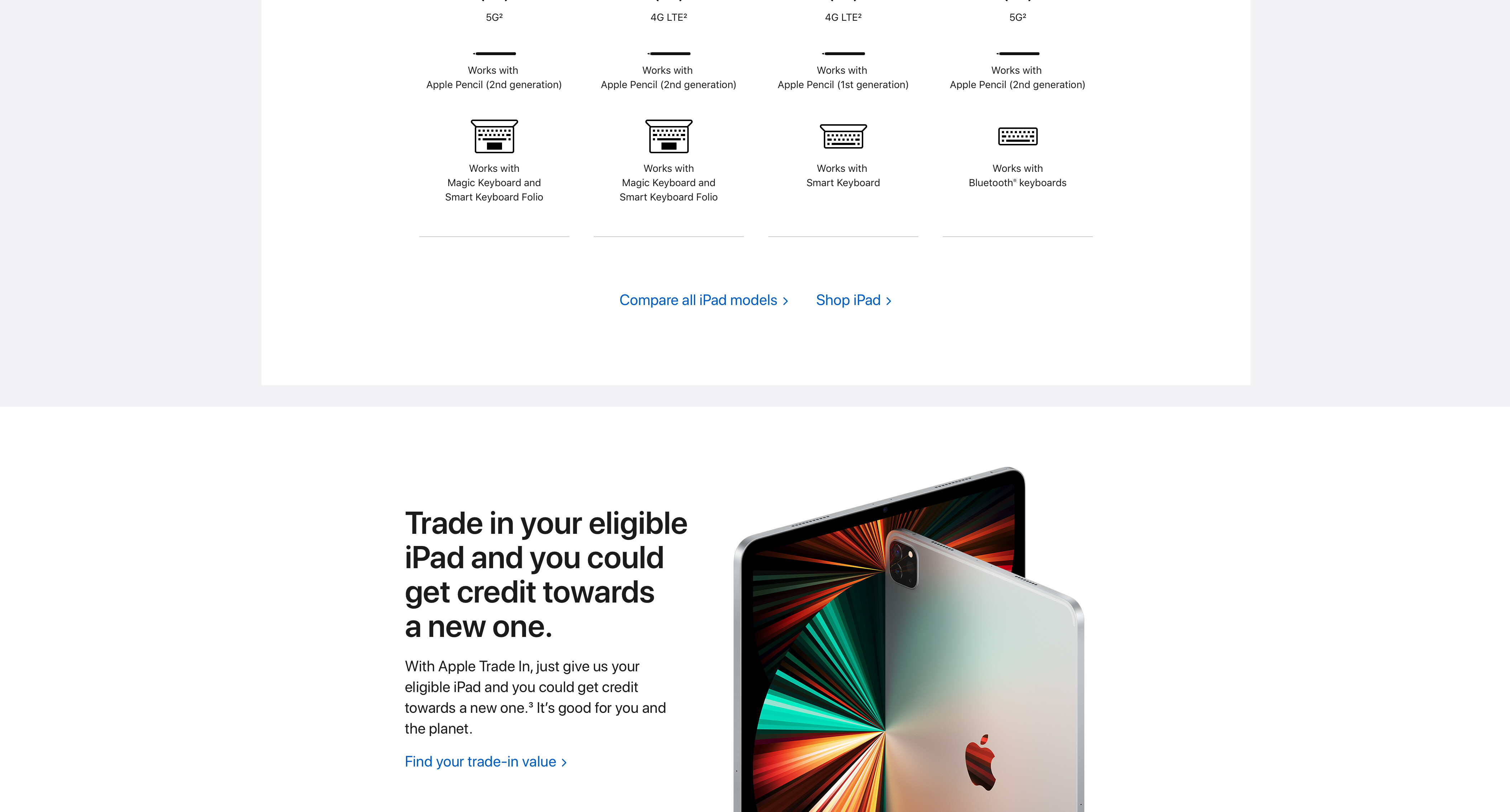
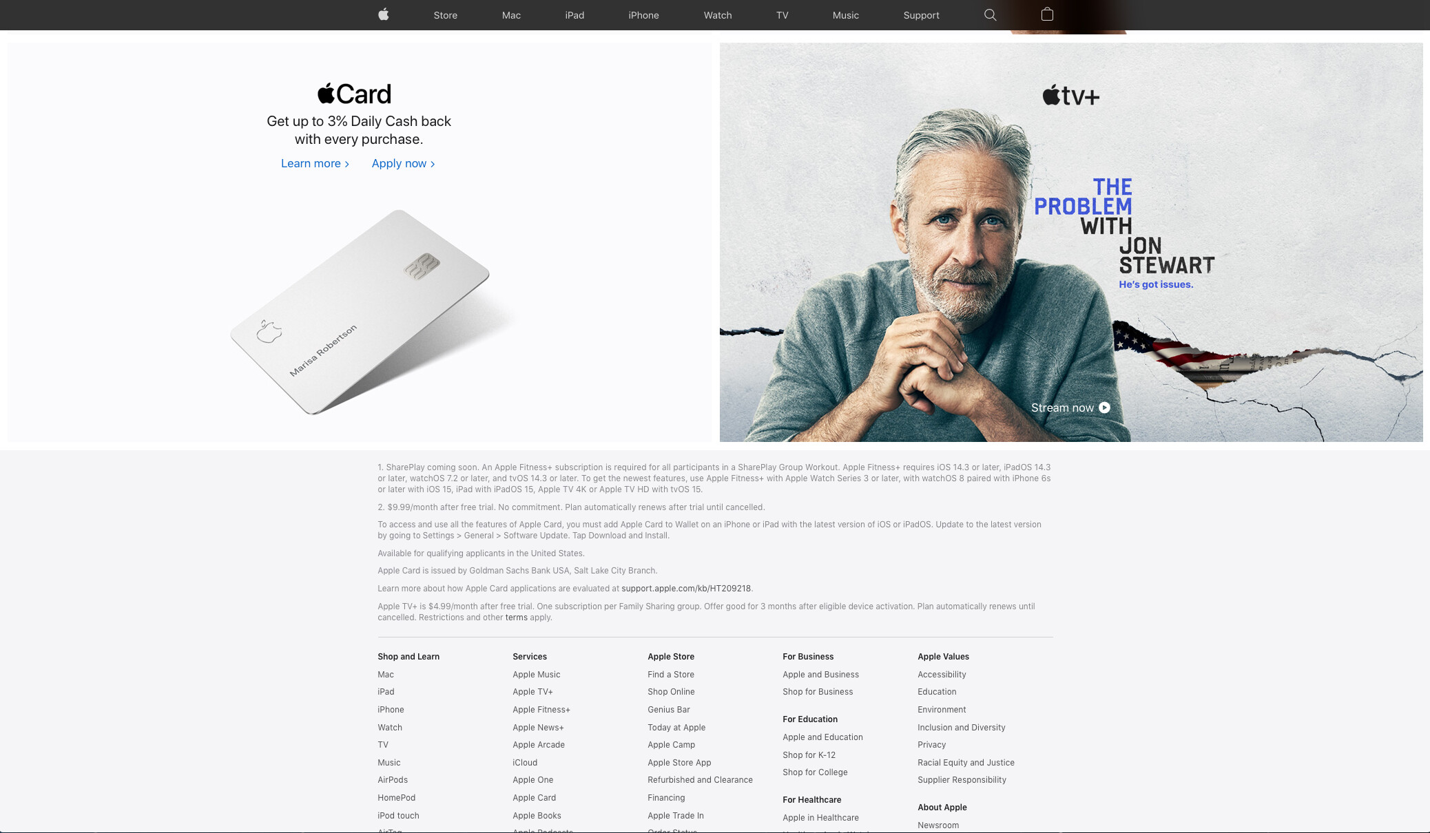
Take a look at the apple.com website (attachment below). What you’ll find is a navbar and page footer that conform to fixed page widths at various break points. In between the navbar and footer you find what looks to be the equivalent of stacked Sparkle wide boxes. Many of these are single frame (DIV tag?) wide boxes with center aligned content. But in some cases you will see fluid/flexible-width 2- and 3-column divisions of these stacked “wide boxes”.
Could the layouts seen on the Apple site be achieved with Sparkle by means of nested flexible boxes (DIV containers) within the current Sparkle wide box? Could these nested flexible width boxes and their content flow beyond the page width as the browser window is pulled wide?
And a related question: Could these nested flexible boxes still allow for pixel-precise visual layout by incorporating their own local pixel grid? Many years ago there was a German website tool called GoLive, and it offered a pixel grid element that could be dropped into table cells. Could Sparkle offer a pixel grid element to drop into these proposed flexible width boxes?
Maybe this is an issue of semantics, but visit the apple.com website and observe the behavior of the 2- and 3-column rows. You will see the box frames of the 2- and 3-column rows stretch to fit a browser window as it is pulled wide, and the content extends beyond the normal page width.
Presently in Sparkle, this is not possible to achieve.
From my take the only reason you would see the content (mainly text) flow is that you are playing with the width of your browser window. Under normal user circumstances this would not be the case. The website would open to the browser’s width and look good.
This is also the case when that same website is viewed on a tablet or a mobile. Based on your viewing device your Sparkle website will present the site closes to the device you are using and therefore there is no need for fluid flowing text.
From a Designers point of view I have pixel-perfect accuracy of the elements on my Sparkle website no matter what device is used… ahhh peace of mind!