I am having trouble with the footer placement at the bottom of the page. Initially I had created a footer on the main page and then chose the option “Display on all pages”. The footer was not sticking to the bottom of the page. Due to varied length of the pages, there was a visible white space between the footer and the last element on the page just above the footer.
Then I read a post in this forum that we should create a separate page for the footer and then chose “Display on all pages” from that page. So I did accordingly. I still have pages with different content lengths.
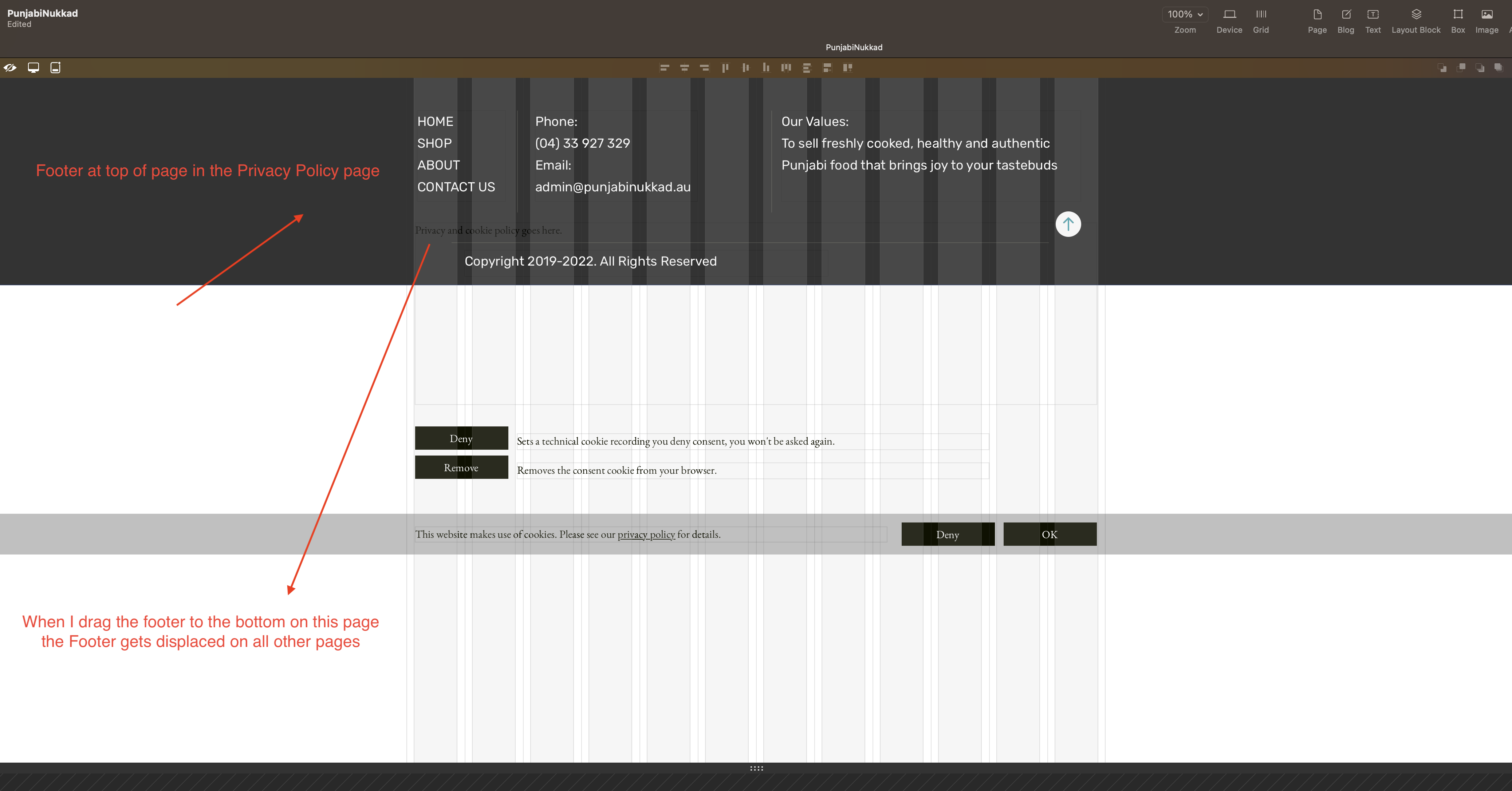
Now the problem is that on the Privacy Policy page the footer is at the top of the page. I have set the footer to the bottom of every page manually, but as soon as I set the footer to the bottom of the page in the Privacy Policy page, it gets displaced and starts showing the white space on all the other pages. I have done this a couple of times.
So finally I set the footer to the bottom on all the pages and left the Privacy Policy page as it is. The Privacy page has the footer on top of the page now, but all other pages are fine with the footer. I published my site. Now on the live site the footer seems okay on all pages, but in the live preview of About Page, there is a visible white space below the footer.
When I compare the Live Preview Page and the Live Website, I can see that the elements on the Live Website are getting bigger in size as compared to the elements on Live Preview Page covering the visible white space at the bottom of the Footer.
Please Note: I am comparing the same PC Layout on both the Live Preview and Live Website.
What you have missed is the “Move with page bottom” option (formerly named “Follow footer”), which moves the element relative to the page bottom separator, which can be different on each page.
Your local view @vermau looks to be your 960 device, while what you have on your server is maybe your 1200 device… I would also check your individual devices for the issue you have.
Oh I understand now, my screen is iMac 27" which is 1920 px wide, that is why it was getting auto scaled. Goodness how could I not understand this simple thing…
So it means that it is okay to set screens manually from 960 wide downwards leaving the 480 wide to Auto scale and not worry about the landscape smartphone placement as advised by you previously…
Auto upscaling from 960 wide onwards is good… Sparkle takes off so much of design headache and makes things easy…
I am just curious to see what will V5 of Sparkle have in store for us !!
I just wanted a piece of advice. If I am currently designing my website on 27" iMac, then what should be the default screen I should be using to design the website for and keep the rest at “Auto Scale”. Should my default design screen be 960px, 1200 px or 1920 px.
I do have MacBook Pro as well, but I mostly work on my iMac when at home. I only use MacBook Pro when I am traveling.
Of course my way would be different to others, but I have based my way on website analytics from my clients over the years showing (because the smartphone is just about tablet size) that the predominate action is on mobile, then desktop, and then tablet.
Sparkle is marvellously versatile in how we set it up for a project, but based on experience and analytics I have gone this way not only with our clients, but also with our Flamin’ Fig website templates for Sparkle.
I custom layout the 960 device keeping in mind the font sizing, and do the following…
1200 device, auto-scale (websites greater than 1800px wide just looks hideous on the larger monitors plus hard on the eyes to read)
768 device auto-scale (I make sure the font sizing is legible and if not go back to the 960 and tweak)
320 device, custom layout
For me that covers everything and in my experience it offers a great website experience for my clients and their Users.
Hello Hendrik, I did not understand the second point where you say that you custom layout the 960 ox and leave the 768 ox in Auto scale but do check the font size on 768 and if they are not appropriate. You go back to 969 and adjust the font size
How will adjusting the font size in 969 affect the font size in 768 px.
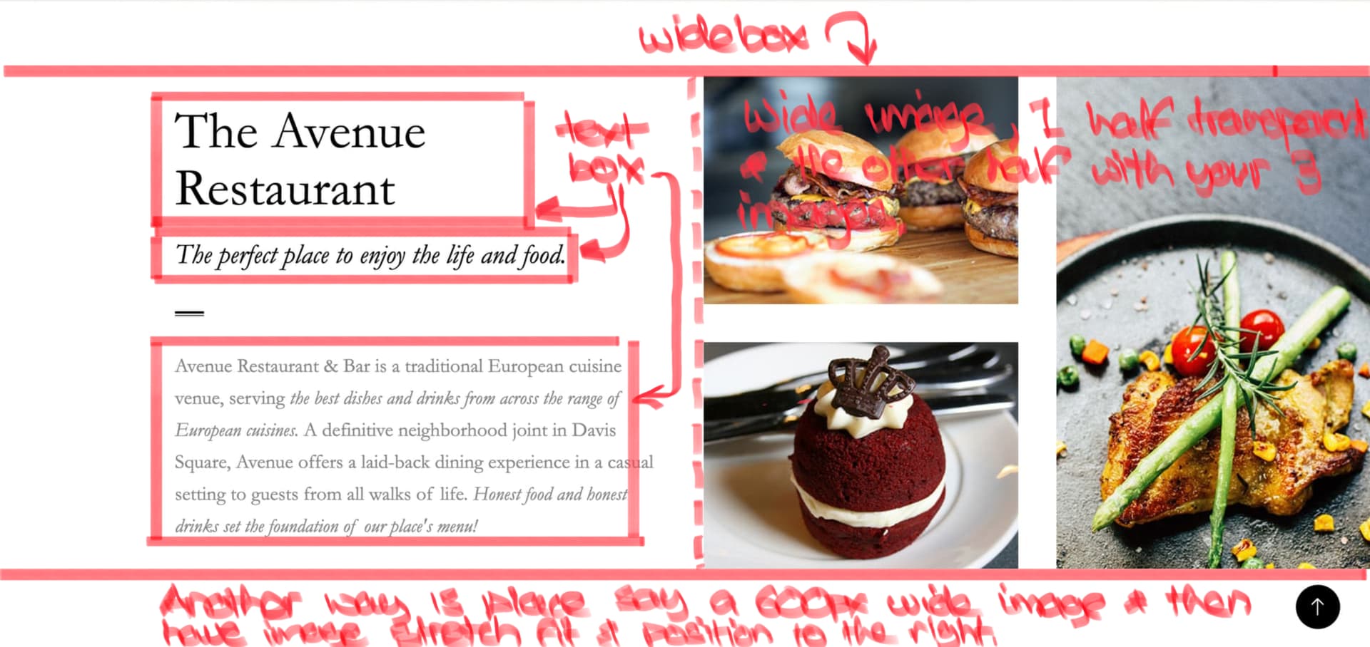
Also another important think I wanted advise on. Is it possible to layout Text outside the 12 columns near the border of the screen just like the wide box goes
Out of the 12 columns. I want to display wide image covering half left of the screen and halft right to be covered by the Textbox on 1200, 969 amd 768 px wide screens
Once you have auto-scale in place you cannot edit the device, so in my case because I have auto-scaled my 768 device from my 960 device I would go back into my 960 device and adjust the text sizing and then see how it looks on the auto-scaled 768 device - and do so until I’m happy with it.
No you cannot have any text boxes beyond the set device’s width.
But if you use those fantastic popups you can wrangle it so that you can have text placed beyond the set width - you just have to play with it a bit…
With the following settings:
1200 px layout = auto
960 px layout = custom
768 px layout = auto
the two layouts set to auto are generated from the 960, with the appropriate factors for the font size.
1200 / 960 = 1,25
768 / 960 = 0,8
This means for a font size of 20 in the 960 layout:
25 in the 1200 layout and 16 in the 768 layout. You must always be aware of this ratio when designing.
Thank you @Mr_Fozzie for a logical explanation… I will now keep this in mind while designing my screens and will set 768px to Auto Scale as well to reduce the unnecessary extra work.
Hello Hendrik, hope you are doing good. Just wanted to show you what I was trying to ask yesterday. I have attached a pic and wanted to know if we can achieve this in Sparkle by any means.
50% of the right side is covered by image till the border of the page. The text seems to be within the columns on the left side though.
Also, is there a way to create components in Sparkle that we can use later in the project. Eg: Creating a Button component/symbol once and using multiple copies of it in the project.
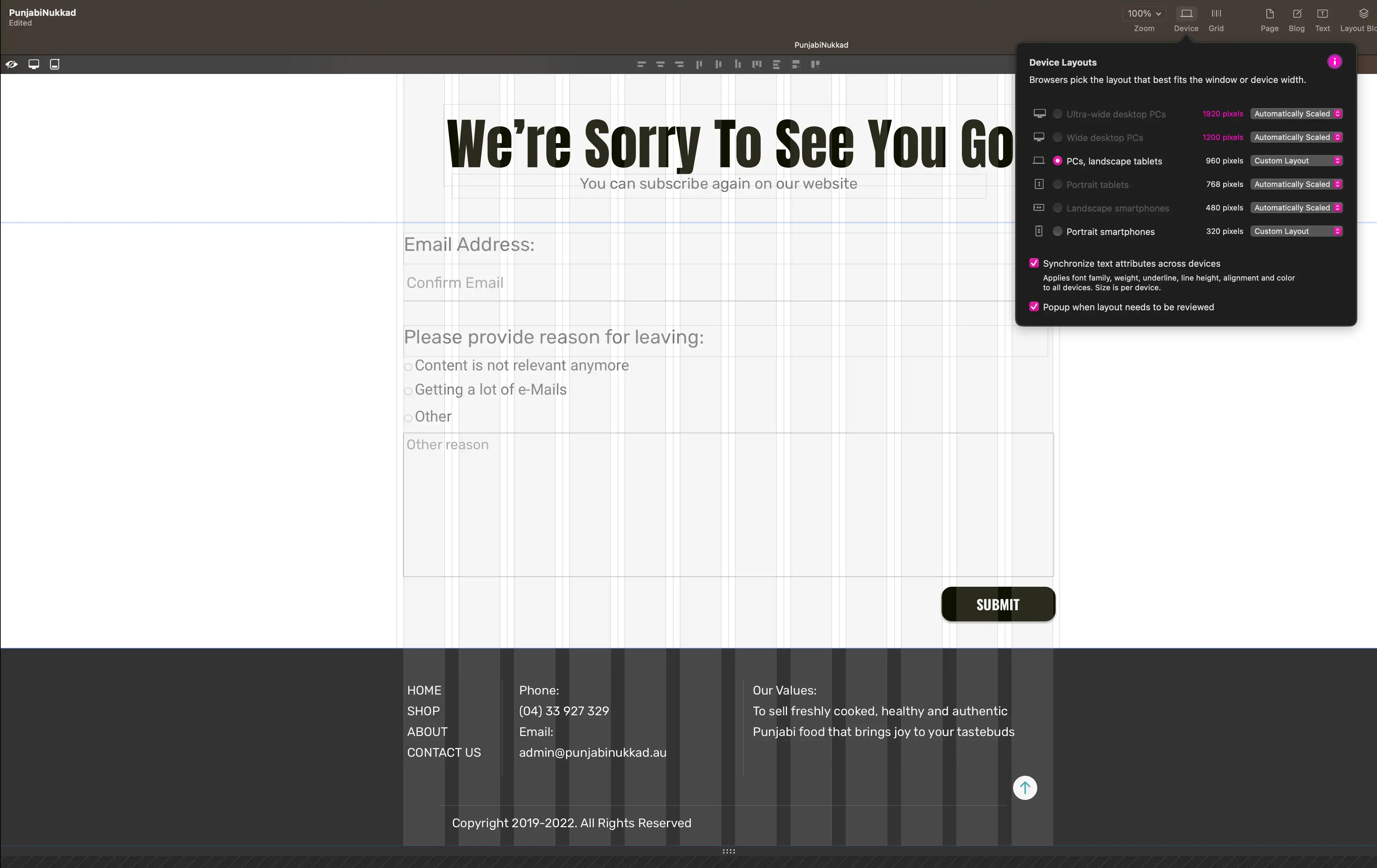
I am back with the same footer placement problem. I have tried hard, but looks like this is beyond my technical understanding how to fix it.
I have designed the below screen at 960px on the canvas with all other screens set to “Auto Scale” except for 320px mobile screen. Now when I preview the site in browser or even view the live website, I see the white space at the bottom of the footer. Rest all pages are fine.
No matter I increase or decrease the height of the browser (by dragging with the mouse), the footer moves with the bottom of the bowser on all pages except the “Unsubscribe.html” page. On “Unsubscribe.html” page if I drag the browser from the bottom to increase the height, after one point it starts showing the white space.
Please note the following:
I am working on 27" iMac, but designing my site for 960px wide screen and 320px wide screen.
When I view the live site from the server, it does scale for the wide screen desktop, but still shows that white space at the bottom.
The footer is not moving with the bottom of the screen on “Unsubscribe.html” page.
I am now tired and don’t know what to do, but it looks so weird on the live website.
Is there a hidden element in that position below your footer?
Is there a popup introduced on mobile that has enlarged on the desktop pushing the page down beyond the in place footer?
Maybe sharing your URL we can take a look at the code to see if anything is hidden?
If you pull up the length of the browser the white space below your footer disappears showing that your Contact Us page is not long enough. Trying placing your footer further down and see how that goes…
But this is quite unusual behaviour. Normally the footer moves along with the bottom of the browser no matter how long or short one stretches the browser height. Isn’t this what the setting “Move with the browser bottom” supposed to mean when we select it on the canvas. Moreover all other pages are behaving normal, the footer moves with the bottom of the browser when in increase or decrease the height. I mean this is what happens on every other site normally