Hi, I have a small problem with vertical scrolling animations.
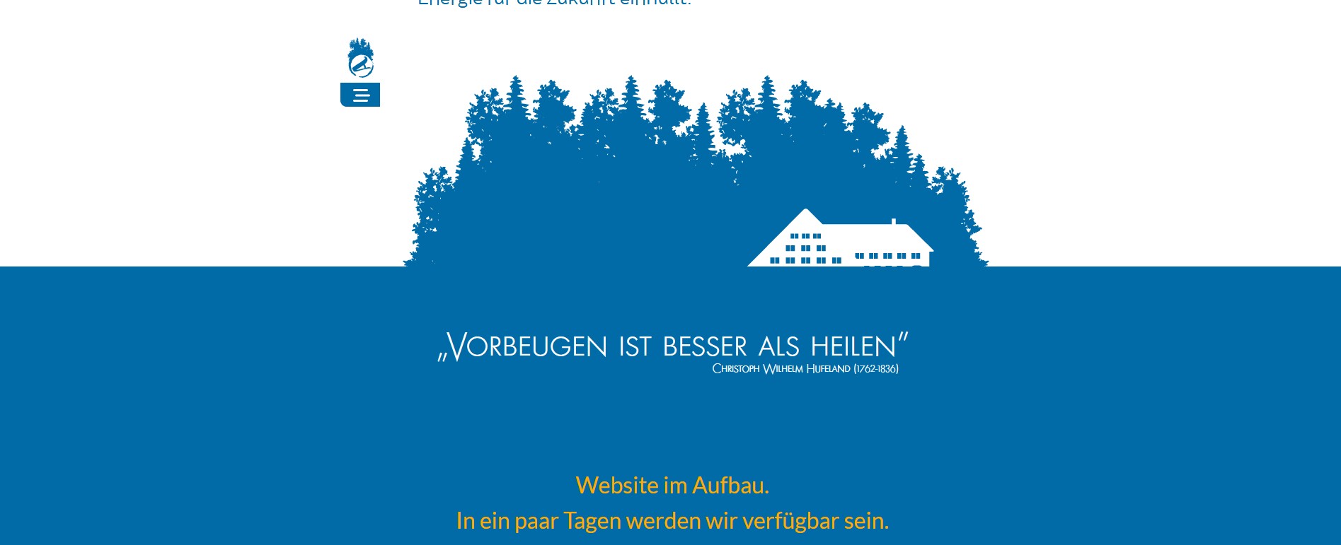
I’ve created an animation where a forest and a house pop up from the ground when scrolling.
The scroll works fine, but when I resize the page, the final position of the images is completely lost.
The same thing happens when I change screen, from the iMac to the Wacom. The animation breaks.
I’ve been working on it for two days and I can’t get the result.
I’ve also tried with an animation made in Hype. The problem here is that when I place it inside Sparkle the scroll doesn’t work.
It seems that Sparkle encapsulates the animation and the interaction with the scroll is cancelled.
The site is still under construction, but I’ve posted it, so you can see what I mean.
These animations can be controlled by e.g. the lower or upper border of the browser window. By changing the browser window, it also changes where these edges are.
It could also happen that another device (e.g. upright tablet) is recognized by the downsizing.
Attached are two screenshots, how the page looks like on my computer.
I have two screens in use. One is portrait oriented (resolution 1080 x 1920 pixels) the other landscape (1920 x 1080). On the portrait screenshot you can see that there is no animation and the forest is out of position. And on the landscape screenshot you can see that the house does not come up far enough.
Have you ever played with the different device types? The animations have to be adapted differently for each device type.
@Saeta as @saber1 put forward regarding the devices…
Moving the browser window around width-wise and height-wise is not how Sparkle generated websites works. That is more for the responsive websites created in fluid-width, rather than Sparkles fixed-width.
So like @saber1 mentioned, your scrolling animation needs to be set up per fixed width breakpoint, aka devices. Once done I would suggest checking on Safari by going Develop / Enter Responsive Design Mode so you can check it per screen width (aka device) that you have introduced.
If after that it still looks not correct then please get hold of Duncan at feedback@sparkleapp.com
Good. Now it works perfectly with a video and I’ m going to explain the process.
The first test I did with video I had problems with the colour.
The blue colour of the web is the corporate colour with a specific Hex. When I made the dump to video with Hype this colour changed slightly, and its integration in the page failed.
This problem was the one that led me to make the animation with Sparkle.
After your answers, I decided to try another way.
I discovered that Motion imports SVG elements as long as they are in PDF format. This makes the composition scalable and keeps the SVG definition. It also preserves the colour.
Checking the Safari developer tools @FlaminFig pointed out, I found that the responsive layout is always maintained.
If anyone needs it, here’s the tutorial for importing SVG-PDF into Motion:


