Hi guys,
with the option to have a wide screen available I would like to know in which device sizes you create your websites?
What is recommendable out of experience?
Thanks
Michael
Hi guys,
with the option to have a wide screen available I would like to know in which device sizes you create your websites?
What is recommendable out of experience?
Thanks
Michael
Hello.
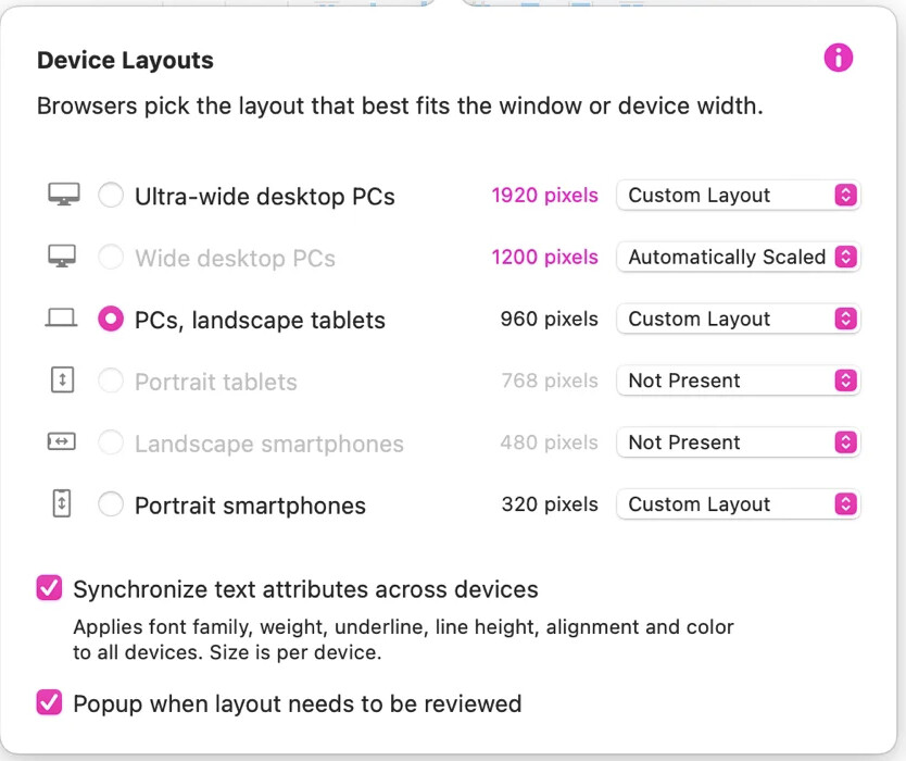
Excellent theme! I am already very curious about the answers, especially since another device (1920 px) is now available.
It would also be interesting to know how the layouts behave when set to “automatic”.
Is this the best solution as shown in the documentation?
Mr. F.
Hi Michael. I’m designing for a number of non profits. Often we are shaded by what we personally view. The tough pill to swallow these days is that viewership is 70% is smartphone. That’s Sparkles 320 device. That’s my first design. After that viewing stats indicate it’s laptops. The 960 size in Sparkle is the most acceptable, or you can take that to a wider device size. The ultra wide I would not use for laptop sizes. Personally I’m a big fan of landscape tablets that play very well in the 960 size. Tablet usage stats are surprisingly low, depending on your country. Canada and Australia and New Zealand tablet usage is high.
Sparkle 4 offers ultra wide which is great, down to 320 and that fills a good range of devices.
I’d design for smartphone first, then move to a 960. I often compare a smartphone to a post card when it comes to text sizes.
Have you guys picked it up yet that the last two (desktop and desktop wide) are editable? You can change the width…
I concur, but I’m continually blown away with smartphone stats. The 960 plays very well with laptops for sure, and is just fine with tablets. I cannot enlighten with automatic as I’ve never used the option.
One could play with ultra wide, and set pc and laptop automatic and see what happens.