You’ve been busy @Nathalie! 
Is mobile important to you? At the moment your text is far too small on your 320 device. I’m thinking you might be using “Auto Scaling” on that device which is a total no no!
1 Like
Thanks, Yes I saw that indeed. The issue is; if I make changes on the 320 device; the 960 automatically changes along. I just can’t figure it out. Thanks !
@Nathalie, have you styled your fonts for paragraph, title, header, etc…? Once you have done that then you can change the text size per device without it effecting the others.
1 Like
I did, it’s the headers and pictures that go all over on the one, if I change on the other.
Not really workable 
Hello.
It’s not just the font size that’s causing trouble here.
I think she wants the same layout at 960 and 320 px. But that is nonsense.
The page for smartphones must be fundamentally redesigned.
Mr. F.
No I totally do not want the same lay out. But If I redesign the smartphone site, the laptop site changes along, that’s my issue  !
!
Of course I want to make it as professional as I can, but it keeps changing on the other site if I make a change. The background images eg. are not there anymore, and the titles in between changing places. So I took the best of the worst with the ‘Auto scaling’ 
Oh and I had been watching the sparkle youtube films, this one indeed
Ok. Please show us the settings for the devices / layouts you use.
You have to adjust each page for all customized layouts.
Mr. F.
Isn’t this going to far off topic here ? 
I really don’t want to make it all about me. 
I don’t understand which settings you mean either. Maybe it’s a language thing to 
I do understand I have to make the whole page new, but as told; both sites are changing then.
You’re right. We should start over in a new topic.
I’m talking about this:
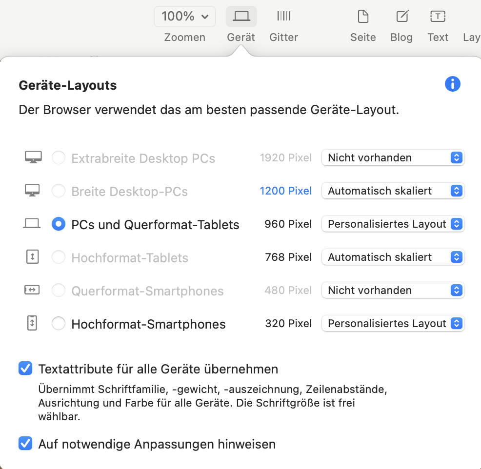
I can only edit (this is my setting) the 960 and 320 px layout. When i change a page in the 960, i have to switch to the 320 and adjust the layout there as well. In reversed order it is the same.
Mr. F.
Hey I moved this to a new thread as it was not really relevant there.
1 Like
Thanks Duncan !
And thanks to al of the responsers to offcourse!
I switch between those to, and after I did some changes I went back to the laptop version to have a look (fortunate I decided to try this al in a copy of my site )
This is what happens to the images, another place on the site and,…well it speaks for itself.

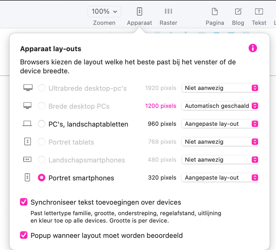
What I do is go to the menu and check another device, just as here
Yes, this is completely normal.
No whining or crying will help, you always have to rework both pages manually.
Mr. F.
Hahaha Okay, But it stays, if I get one site as wanted; the other is wrong.
If I correct the other,…the first will be wrong again (Just tried)
So I’ll stop bringing water to the sea right now, and just agree to have a small (landscape) mobile site
Glad I tried it on a copy though !
What you describe seems completely illogical to me.
Maybe you should send the file to Duncan (feedback@sparkleapp.com) (WeTransfer) so he can have a look at it.
And describe the error as detailed as possible, so he can reproduce it.
Maybe you can take screenshots from the problems you have / see.
Mr. F.
@Nathalie, have you introduced an image on your 320 device? If you introduce images on your 320 device then you need to remove them from your 960 device as they would interfere with your 960 layout like you are showing in your screenshot.
Thanks, that’s an great offer. Maybe I’ll do that
1 Like
New idea: Does this strange behavior occur only when editing, or also in the preview?
Have you placed elements that are marked as invisible on a device? And are they displayed now?
Did you notice the little eye icon in the upper left corner?
Mr. F.
Hello.
Would be nice to read some feedback from you.
I have a suspicion: do you start with the 320 px layout and then want to adjust the 960 px layout?
When you switch to 960, you see a small image, namely the one from the 320 page. You don’t like that. You remove it and insert a large image. Now comes the surprise: on the smartphone side everything is shifted again. So start again from the beginning. Remove the large image and put the small one back in. Now the 960 layout is strange again.
So you can drive the game infinitely further. The content on both layouts must always be the same - with some exceptions, e.g. menu.
That’s why I always start with 960 and then switch to 320. The elements must then be adjusted in size and position. This is easier in my opinion. And when publishing, Sparkle does the rest.
Mr. F.
I thought tis topic was closed so there for I wasn’t looking, and buzy with other things
I had made the 960 first and tried to change the 320 page.
So I really don’t know what it is anymore. As saying, I’ll leave it this way for now and have a look later.
The socials are shared now, and had no complaints but the people wanted the site in English hehe, only compliments about how it was looking, so I really have to thank Sparkle for that; it gives a professional look !