Struggling. How much text in an iPhone variant

Im doing a complete redo of our City’s Museum website. First done in weebly it was a dogs breakfast.
My question is more a design question than anything else. On a standard 960 px I can add a ton of text. But 60% of viewers are on iPhones. Do I add all the text from a 960 variant. Are people going to read that horrendous amount of text on a small screen? This is a non profit org and they’ve left it up to me. Take a look at this link, then imagine your reading on a small screen. http://billwood.ca/early%20settlers.htm

~Bill

Hello Bill,

No way will iPhone users, or any mobile viewer, read that amount of text. Even on 960 you’ll be lucky to get 10% of users to read all that text - and that’s just one section. This is why the web is so bad; plenty of numbing online brochures that say nothing. You’ve now entered the realm where the art of storytelling happens.

You need to use a combination of text, images, video, animation, music, graphics, and voice-over-image narration. It doesn’t matter the screen size, it’s structuring the story to keep viewers engaged. The opportunity of the web is all forms of storytelling are available. Some will say that’s also the curse of the web. Those people don’t understand storytelling.

You need to give users a reason to scroll, to go to the next section, to the next page. Users turn the page of a book to see what happens next, continue listening to a podcast to hear what’s next, continue listening to a song to feel what’s next. You will have to structure your story with technology to entice viewers to experience what’s next.

1 Like

Bill,

Design tip I didn’t mention…Start designing on 320 and work your way up to 960. This helps you focus and it’s easier on the mind to add content as you go up, rather than subtract content as you go down.

3 Likes

It’s quite common on these types of websites to try and replicate a visit to the actual museum. That isn’t really the purpose of a website. The primary aim should be to encourage people to VISIT the museum, rather than to tell the whole story online. Of course, there are situations where an online reference source could benefit a community - particularly for students of local history etc. However, this can be incorporated as a sub-site to the main site, which can be reached by a simple link in the main website. People who would use that facility would, most likely, be using a laptop or desktop device.

So the main website should be a MARKETING TOOL to help get people through the door, or to make donations to the work the museum does. In many respects, it’s worth looking at how the bigger and better known museums promote themselves online. Take THIS ONE as a perfect example of what I mean. This is a major museum in London, but the whole home page sells the concept of a visit to museum and calls for donations, rather than try to explain everything that’s in the museum. This is the page that is most likely to be seen on a Mobile device, so it has to work hard to attract visitors. In fact, if you check the example site, reduce your browser width to see the mobile variant. It doesn’t lose its impact and still encourages that important visit with as few words as possible. Also note the menu on the mobile version - its relevant to the purpose of the site.

You will also notice that there is a rather large footer in the home page that can take site visitors to other, less impactful areas of the site if that is what they wish to do. These areas of the website can be designed for the more serious researches among the museum’s audience and do not necessarily have to be so concerned about content quantity - if people want to go to those areas of the site, they will often have a reason for doing so and will be happy to get the information they’re looking for regardless of the device they are using. However, even those areas of the website do not have to be too wordy. Pictures paint a thousand words, and the example site embraces this idea very well.

So, the general advice is use the home page (landing page) to create impact and encourage visits. Keep all the other content in other sections of the website that can be easily accessed if users so wish through an easy navigation structure.

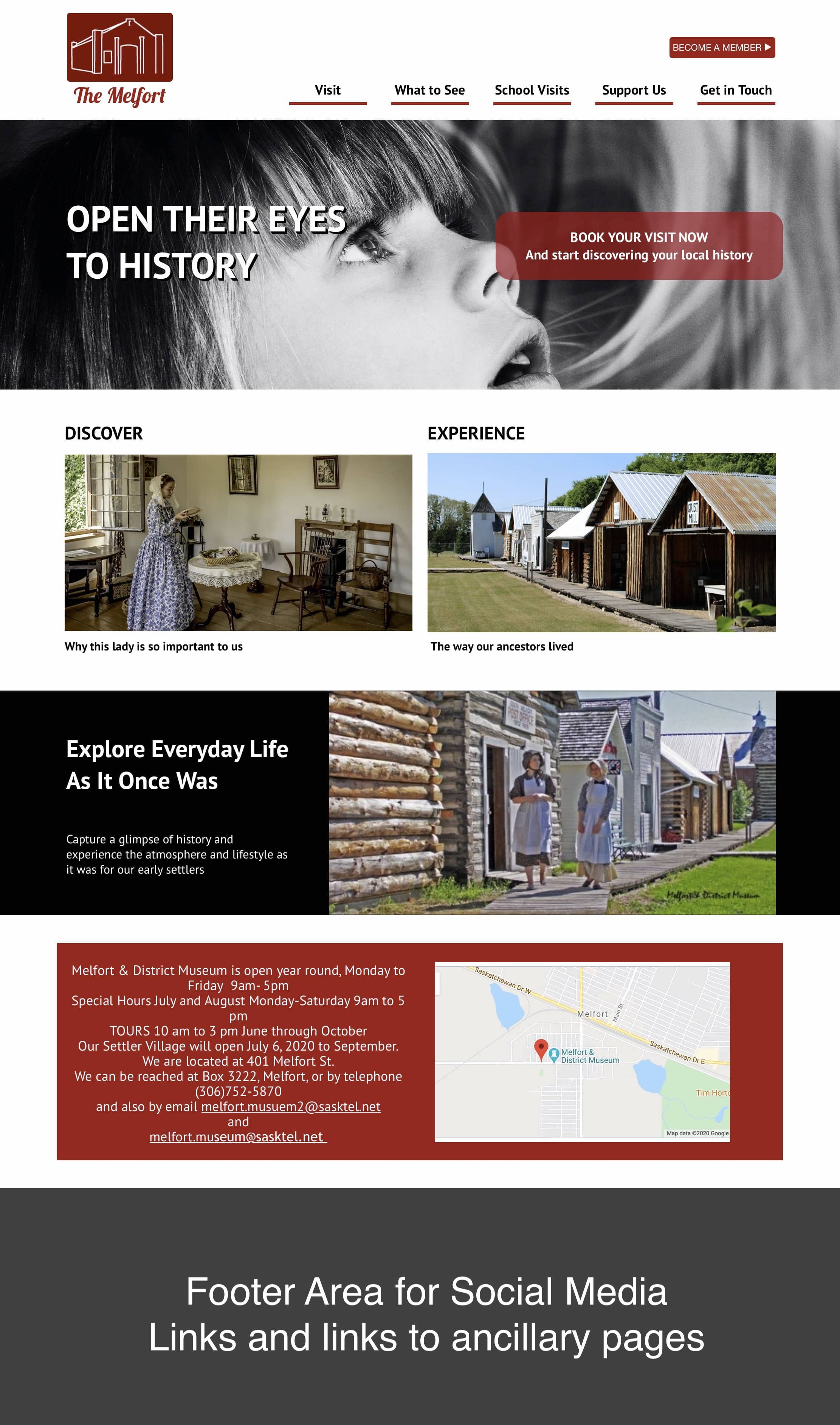
Here is an example of the general idea.

Of course, the page can be much longer and contain more elements, but you get the general idea. Don’t be afraid of making a long home page in this style. Remember, mobile users are well used to swiping their screen - in fact many prefer to swipe down one long screen than to use navigation links - so have it in mind. Design and layout are obviously a subjective matter, so you would do your own thing in that area, but it is essential to have a header that grabs attention. A picture of a red-brick building may not cut it in todays world, so be imaginative.

3 Likes

All true what @thetravelhikelife has said! :slight_smile:

Another point I can make here is remember that us humans are more scanning the text on a web then reading unless the text engages us, so break the content up with excerpts from the content that jumps out and emotionally engages.

…And also @francbrowne has some valid points! :slight_smile:

2 Likes

Gentlemen. Preaching to the choir. I was in communications for 47 years and couldn’t agree more.
I’m dealing with an older group volunteer group on this one and “branding and story” are above their heads for now.
Initially I’ve got to move info from a 22 page weebly site, to a more condensed version which I initially designed. I’ll do some fancy branding on the iPhone variant.
Certainly all very good points above and I Thank You! I did get them to change the logo :wink:
-Bill

That’s amazing. Love your work! I’m going back to the drawing board! Inspirational!

W

Frank. I’m still struggling with how to off load all this text. I’ve convinced the board about an updated splash page etc, bringing people to a museum. This museum is a village of sorts in a small city.
For the academically inclined their still stuck on text. I can do that with a PDF. I wonder if I can link to a particular portion, or page on a PDF, rather than the entire top of the document every time they click.
I’ve got so much text to work with it’s rather mind numbing. Thanks again Frank.
-Bill

I feel your pain - been there - done it.

It’s tricky to deal with links in PDF’s unless they form part of the PDF file. Basically, a table of contents type situation where clicking a link within the PDF will take you straight to the relevant article or page. The alternative, is to break down the PDF’s by subject matter - having one pdf file for a particular aspect of the subject matter. This way, you can create links all over the place that will take visitors to a specific PDF file.

One of the reasons I like interactive publications is that it’s possible to have links to specific pages that can be embedded in the webpages. So, if someone wants to look at a subject that was on say page 8 of the interactive publication, You can create a hyperlink within your web page that opens the interactive publication in a new window or tab at page 8.

To me, this is a best of both worlds approach, You can have a single interactive publication and yet retain links to individual sections which can be used in the main website pages.

My offer still stands. I’m more than happy to create the interactive publication and show you how to grab the links for specific pages so you can create a page of links in your website that calls up specific parts of the publication.

Skip the PDF’s.

Copy the contents of a PDF to a Sparkle blank page. One full PDF per page. This is called a “Pillar Post”

Take excerpts from the Pillar Post and place the excerpt(s) where ever in your site you choose. At the end of each excerpt have a word or phrase telling the reader more information is available by clicking. Select this text and go to the Style menu and select “On Click”. Select “Go to Page in this Website”, then select the Pillar Post page, select “New Scroll Location” in the final drop down menu. Then create a Scroll Location at the appropriate point in the Pillar Post. Use a menu or link here to take the reader back to their origin.

You can do this with all forms of media I mention earlier.

1 Like

Frank. Thanks so much for the offer, but as a Sparkle newbie I’d like to do as much as I can on my own. I’m playing around with a pop up layer. My terminology may not be correct because I’ve moved to a new program. This function is a bit like an ‘clickon’ function. I’m not sure how it’s all going to work as yet. A Clickon photo, may reveal enough space for a text story.
Since this a volunteer, non profit, the group is all volunteers. I’ll no doubt get stuck then you could help out.
I showed your mock up to the group and they’re very excited. If you don’t mind I’ll be using some of your design elements.
-Bill

I like that idea. The PDF page needn’t be in the menu at all correct. A photo could be linked the particular portion of the text. I did wonder how I could link the particular portion of the PDF and I think you’ve solved it.
Thanks @thetravelhikelife.
W

W,
Correct, you don’t need PDF’s anywhere in Sparkle. A photo would be a great link to a portion of text. The page of text could be excluded from the menu, yet still be published. This way you can sooth the academic people that their voluminous text is still there and accessible in digestible bites.

I must say Frank, you’ve completely opened my mind to web site design. I come from a broadcasting background, and we were always taught that less is more. Writing succinctly. Sparingly if you will.
Why I never made that leap into design I’ll never know.
Many thanks for making me think about viewing design, especially on smart phones. Smart phone design is ‘headlines’ if you will. Always. Tablet and laptop is Headlines, but just a touch more.
I’m completely rethinking how I do all my designs for non profits.
Great lessons Frank. Thanks again. I’m particularly fond of a page built recently. Certainly not done yet at all, but I’m on the path.
http://billwood.ca/indigenous%20peoples.htm

~Bill

@Woodrow Well, there’s a coincidence! One of my first jobs was working in Radio and TV publicity at the BBC. I guess that threw me into the world of media and messaging - a good grounding. Even today, we have our own media studios so I’m still fully aware of what has to be done to get “the message across”. Anyway, thanks for your kind comments. It’s always nice when someone appreciates a bit of friendly advice.

49 years local radio in Canada.

@francbrowne Frank another question. I want people to click an image for more information, but do not want to mention it continually throughout the site. I’m wondering if an Info symbol would work on every photo that I want them to click.
I could mention on the home page that this is an interactive site, referencing the info symbol. I’d only use this on the 960px variant.
What do you think of that idea? Thanks Frank.

W

I think it would be a clear and logical way to go. Whenever someone sees a small ⓘ symbol they usually know what it means and will click it. Doesn’t have to monopolise the image - just placed in one corner would be nice. On occasions like this it would be nice to have modal functionality in Sparkle. Clicking a link could then open a modal window with additional information without leaving the originating page. I’m hoping the next major release will have this option as a standard feature.

The good thing about using symbols like this is that you can include them in text quite easily, I use the Apple Symbols font quite frequently for this. You’ll have to make sure the font is installed in your font stack. Adding the symbol is done with the emoji and symbols viewer. Just place your curser where you want to pace your symbol in the text and then double click the chosen symbol in the viewer window. Here is an example:

1 Like

Frank. I’m probably overthinking this a bit. But a design question. I thinking of not having navigation bar at the top of the website move as one scrolls down.
My thinking is that it takes away from the various headlines throughout the site. I can always add a few mini links as you suggested in the footer.
What’s your feeling on this?
I appreciate everything you’ve taught me regarding interactive selling of our museum.
-Bill

Personally, I like sticky navigation because it saves people having to scroll to top. If the pages are relatively short, it’s probably sufficient to have a top navigation that isn’t sticky, but always best to add site links to the footer so people can find their way around regardless of whether they are at the top or bottom of the page. If it’s a long page, a sticky menu may be the way to go.

The general rules I follow are to limit top navigation to certain key areas of the site - areas that are more relevant to the overall goal of the site. This usually result in maybe 4 or 5 menu items. Things like contact information I like to link to a call to action-type button ether in the navigation area or somewhere in the site header. Links to other pages can be included in the footer navigation. The one thing I try and avoid is drop-down menus. Whilst some site can benefit from these, I’ve found that mobile users in particular are not great fans of multi-level menus. They appear to remove focus from the primary purpose of the site - allowing visitors to wander aimlessly through the site, thereby removing the carefully crafted journey that you may want your site visitors to follow.

Throughout the site, I also like to create links that take visitors off in other directions to pages that may be a little off the beaten track. Ultimately, the choice and style of navigation is really dependent upon the type of site being created. An e-commerce site, for example, would obviously be better designed to get visitors to the products of interest - maybe through a selector box or through multi-level menus that narrow down the search to specific product categories or groups.

I’m sure others will have their own way of working with site navigation, so there is no real correct way as such. My personal opinions are based solely on what my clients are trying to achieve (the ultimate goal of the website) coupled with the way research has shown how mobile users interact with their devices. There are always exceptions, but you should always start with site objective first and foremost - ask the question “what do I want my site visitors to do when they first enter the site”. and “where do I want hem to end up” By doing this, you can map a journey that gets your site visitor from home page to ultimate objective in as few steps as possible.

1 Like