In my menu bar I have several submenus. I would like the first 4 submenus to dropdown and spill to the right but I would like the last and fifth submenu to flow/spill to the left to avoid the dropdown going beyond the 960px screen boundaries.
When I change the fifth submenu to dropdown to the left all the other submenus also change and drop left. Is there any way for me to separate the way each dropdown submenu drops?
I assume there might be a workaround with creating a second separate menu bar just for the fifth submenu item, but I was wondering if there was another way to do things… Thank you!
I don’t have an answer to that question but a similar problem: I have a menu bar and one of the submenus has so many dropdowns (vertical order) that you cannot see them all in the responsive mobile version. I would like to place them in maybe two or three rows to save space. Is there any possibility? Thank you!
1 Like
Hi @emmaphelia I am sorry I have no solution to share with you regarding your issue as I am new to Sparkle myself. Hopefully someone with greater knowledge and experience will help answer our questions or guide us in the right direction…
Hello @emmaphelia and welcome! 
If I understand you correctly you would like to have a submenu within a submenu?
Or what do you mean by “rows”?
As far as I know, but I may be wrong, you can only have one submenu at the moment, so it’s not possible to have two or three “rows”.
https://sparkleapp.com/docs/menus.html
Long menus are tricky and can be a problem on mobile, yes I agree.
Maybe you can post a screenshot?
Hello @Marmalade
Yes, I think the dropdown alignment of the submenus applies to all the elements in the menu in the same way, so it’s either left or right for all of them.
I guess you could make two menu bars and rearrange them manually, but it means extra work.
Sorry. I also don’t have a better solution …
1 Like
Hello @shadowfax
Thank you for your help regarding the submenu alignment. Okay, I will have to create an extra menu for the last item on my menu list. That’s a pity… I appreciate your input.
Feedback for @duncan, please consider allowing greater flexibility for dropdown submenu alignment, thank you! 

1 Like
@Marmalade, With a bit of tweaking overall the menu works well.
I’m building out a new Sparkle website for one of my clients so maybe this can give you an idea with your issue - https://trevallyngrocer.com/dev/ The site only works on the 1200px breakpoint for now…
1 Like
Hi @FlaminFig thank you for the link, I checked it out – nice website and I like the menu bar that drops down from the hamburger icon!
However, I didn’t see dropdown submenus having independent alignment (there was only one submenu)…
@Marmalade, Thanks! 
Do you need dropdown submenus? I always think of how the end user will use it and I know those government websites with the endless sub sub menus and at times sub sub sub menus is just so awkward to navigate and leads to frustrations as you are manouevering your mouse through it all and it is worst on mobile. I never try to go beyond a sub menu otherwise I revisit the architect of the site.
1 Like
Hi @Shadowfax, thank you for replying to my question. I send you the link to the website where I have the problem, you’ll see it under the submenu “Zeittafeln”…
http://www.bertschwank.de
I would have liked to sort the years in three columns horizontally but maybe I have to think about a second menu?
Hello @emmaphelia
Thank you for the link.
Yes, the menu for “Zeittafeln” is very long. So that is a problem on mobile but also on the desktop.
Sparkle supports only 2-levels menus, so unfortunately you can’t have three columns.
So I guess the most practical way is to make a second menu, like you said, where you can group the years into “time periods” or whatever makes sense …
I think right now that is the best you can do.
I noticed … when I scroll down on the website, the footer is covering up the menu … so if you bring the menu to the front, that will not happen.
I think the era of multi-level menus is now very much over. This is due to the large number of people that now browse the internet on mobile devices. In many respects, this is a good thing as it forces us to be a little more creative in how we get site visitors from one place to where they want to be without tying up too much screen real-estate at the top of the screen.
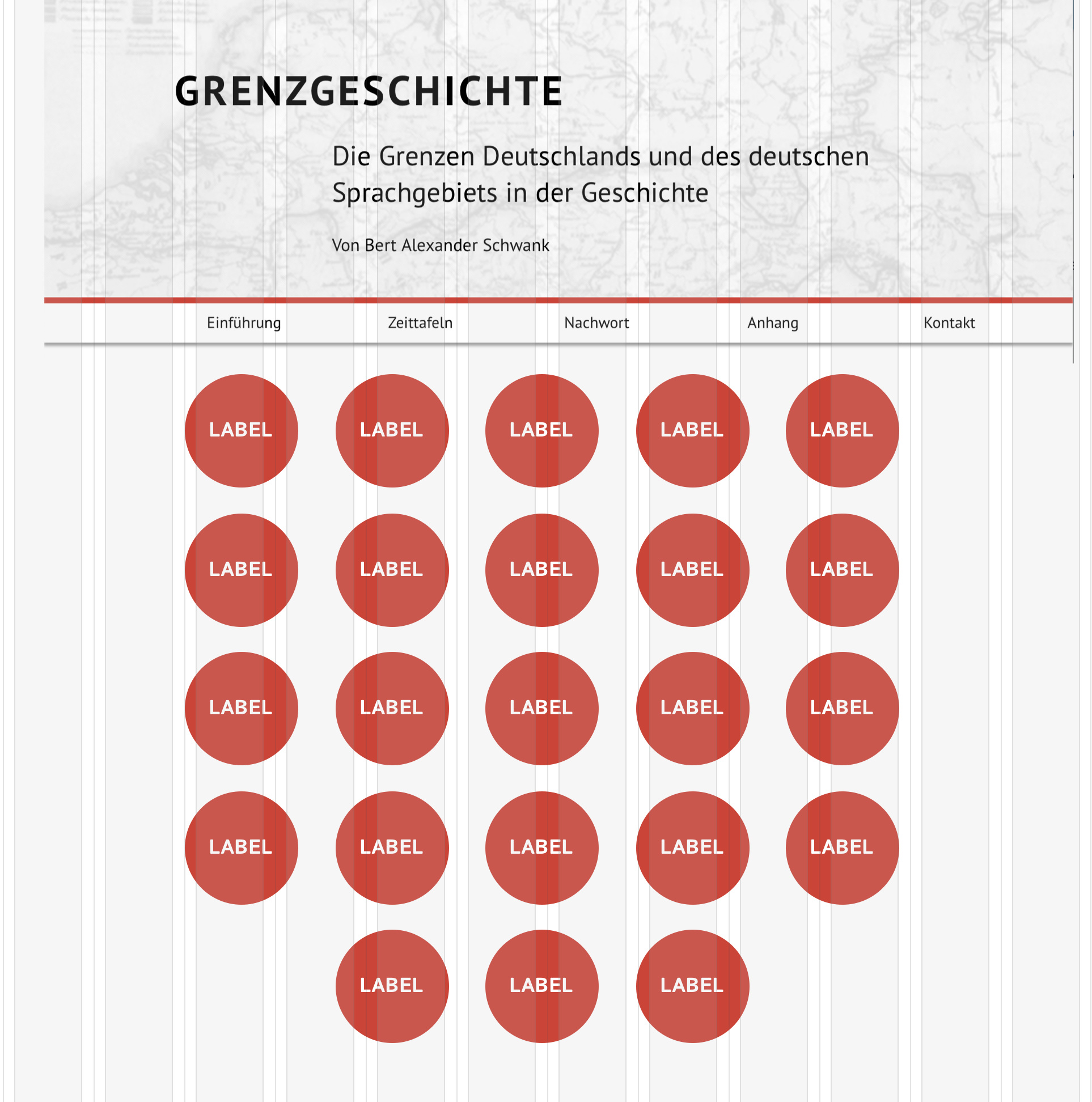
Sadly, in Sparkle we don’t yet have a toggle visibility option which could bring a sub menu into view in the form of a page-width box containing text or button links. Neither do we have a modal option that could display button or text links in a pop-up modal. So, the best option would be to forgo the drop-down menus altogether and use an interim page instead for the main link. The interim page can then contain a series of button links to the sub pages. This would clearly be a better option for those with touch screen devices as the links could be a set of buttons that are more easily targeted with stubby fingers. It adds an extra page to your site for each multi-level menu, but it should be a whole lot easier for your site visitors to get around. The interim page would also allow for site expansion later if you wanted to add further links. This is how the interim page could look.
Or Maybe circular buttons would be better:
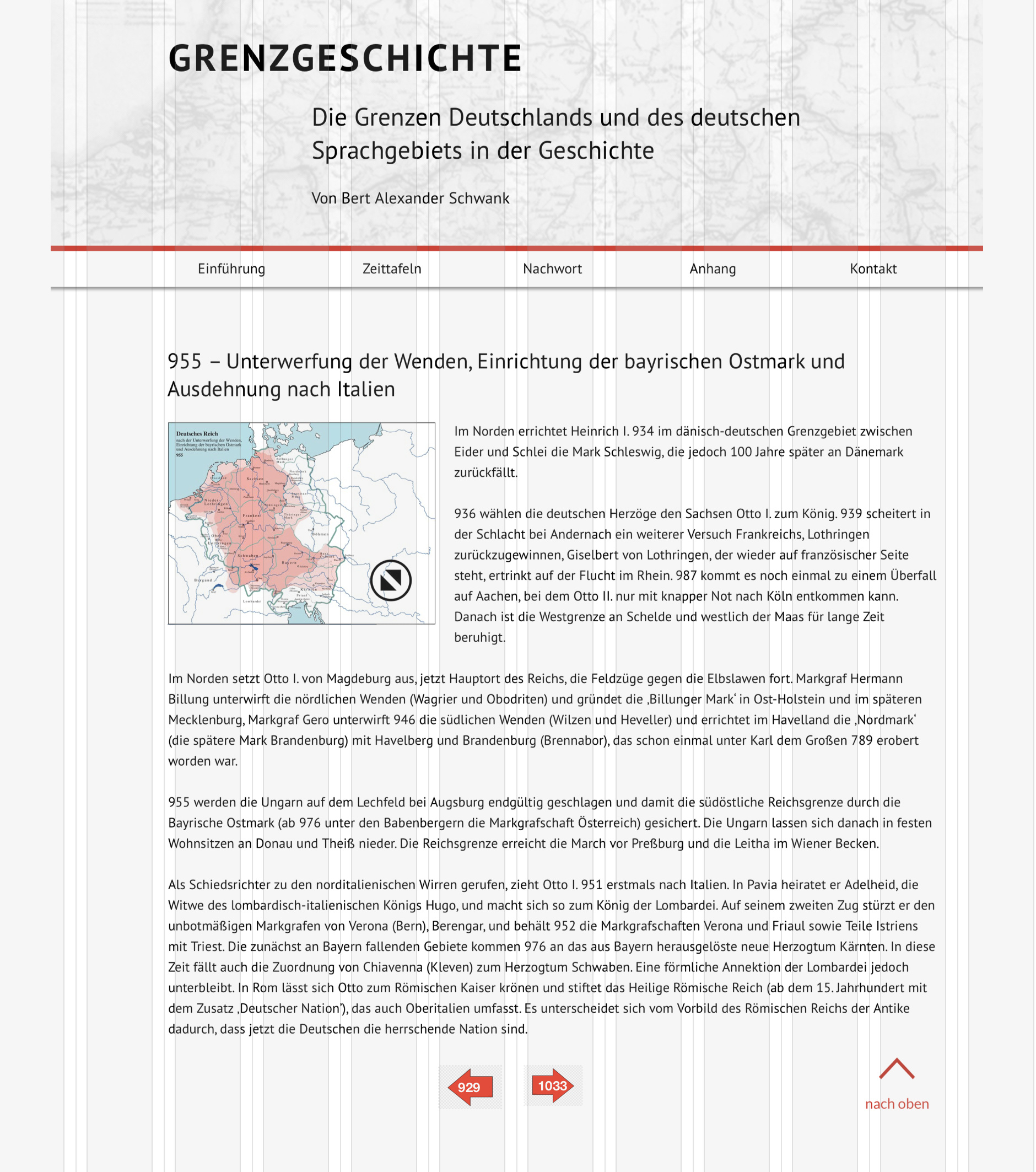
If you did go this route, I would also recommend adding a previous and next button at the bottom of each article page so visitors could step through the articles in date order without having to go back to the interim selection page. It would look something like this:
1 Like