There’s Movement At The Station As The Word Has Got Around

There’s movement at the station as the word had got around
Flamin’ Fig is hustling for the month of February… Ok that didn’t rhyme to well, but…

I have had the time to really get behind Flamin’ Fig and so this February is a busy month - a busy month for a number to template launches… 9 so far to be exact. You can get a sneak peek over at Flamin’ Fig.
I’m calling it the “Flamin’ Fig February”! The first one has gone out today! :slight_smile: and you can find it here - Mini-Blocks 3 Card Transition

I have also introduced a new family member… Mini-Blocks, that I’m sure you are going to love!
Also still working on the revamping of Flamin’ Fig to Flamin’ Fig 2.0 with a new one-of-a-kind Sparkle blog - dreamy!

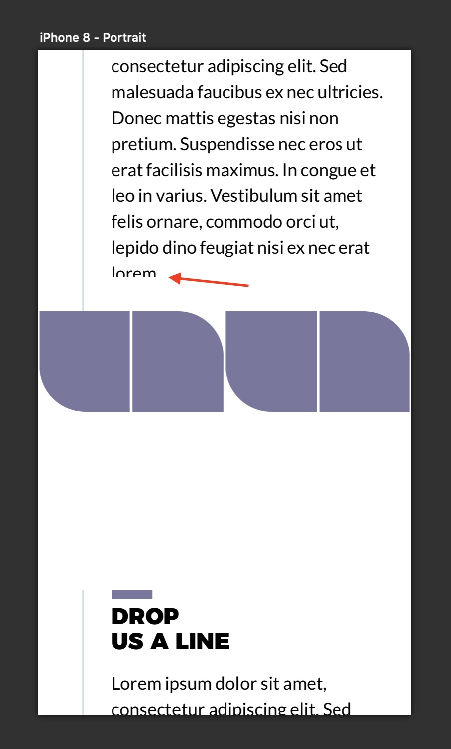
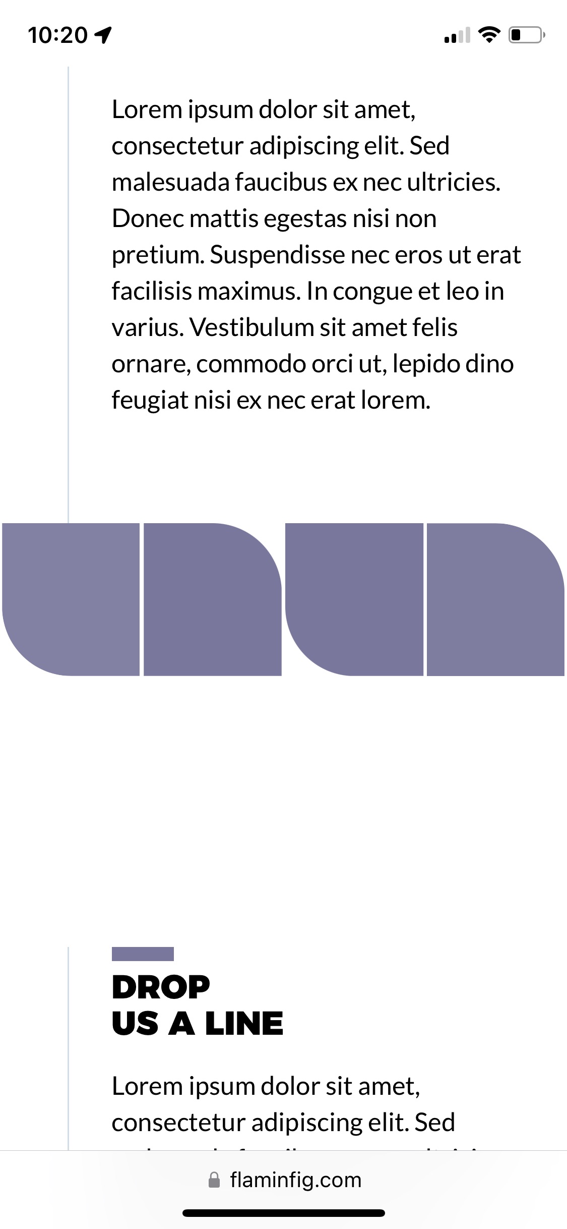
As most of you know (and this is one way of many ways in using Sparkle) I have moved all my designs and templates over to the 960 (editable) and 320 (editable) devices, auto-scaling the 768 and 1200 devices. For me this is an efficient work flow, but it is also based on User-research gathered over the last 7 years.

Over the next few days (I was going to wait for the launch of Flamin’ Fig 2.0 but alas…) I will be publishing a blog post on it which I think will be a good read just to further clarify my reasoning.

I’ll keep updating this post over the next week or so, but by all means go check things out at www.flaminfig.com

Thanks Sparkle(rs).


UPDATE 1:
Just launched the second template of the Flamin’ Fig February!
If you love FAQs accordions then you’ll love this. You can find it at - Mini-Blocks FAQs Transition


UPDATE 2
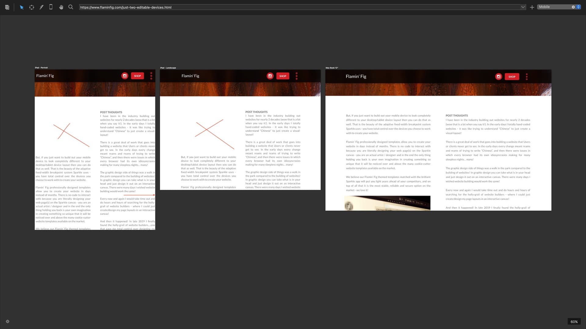
As mentioned earlier, I have come up with an efficient workflow with our Flamin’ Fig templates allowing you to save a lot of time when it comes to editing your website. Also this is one of many ways (not the only way) in creating a website in Sparkle, but if you’d like to find out about my take on it you can read it here - Just Two Editable Devices


UPDATE 3
Just launched the third template of the Flamin’ Fig February!
You are going to love the bold and balanced look! Another one of our new 960/320 templates, plus check out the home gallery - gorgeous! You can find the new template (called Konscious Fotography) here - Theme Kit 4 - Konscious Fotograpghy themed template 4


UPDATE 4
Just launched the fourth template of the Flamin’ Fig February!
Sleek, clean and balanced in looks! Another one of our new 960/320 templates. You can find the new template (called Financials Co.) here - Financials Co. : wealth creation and insuarance, Launceston TAS


UPDATE 5
Ok, just launched the fifth template of the Flamin’ Fig February!
This is one of our first Landing Page aesthetically created and oozing simplicity to further promote the CTA (Call To Action). Another one of our new 960/320 templates. You can find the new template (called Landing Page Webinar) here - The Art of Conversion Driven Design - Webinar Landing Page


UPDATE 6
Ok, just launched the sixth template of the Flamin’ Fig February!
This is our second Landing Page that screams attention laced with individuality. it is a must to get your Instagram traffic back to your website avoiding third-parties in doing so. This is where our template can help with luxurious eye-popping style! Another one of our new 960/320 templates. You can find the new template (called Instagram Bio Landing Page) here - Landing Page 2 - Instagram Bio


UPDATE 7
Ok, just launched the seventh template of the Flamin’ Fig February!
This is our third Landing Page that is elegant in appearance, sleek and fast loading for the design studios out there looking to promote their website through a sub-domain landing page. A great means to further boost your SEO. Another one of our new 960/320 templates. You can find the new template (called Studio Landing Page) here - Landing Page 3 - Services

And that is the last template for February (which I know we have past), but we have a few more exiting themes coming out for this March! :slight_smile:


1 Like

With auto-scaling you no longer have any control over the end result. Auto-scaling is easy, but errors can easily creep in this way. Why not add the 768 and 1200 as a custom layout? That way they are also automatically scaled from the 960, but you keep full control over the end result. Adjusting the 768 and 1200 later is optional, but if things are not right, they can at least be corrected.

Hey @Mart, thanks for your feedback! :slight_smile:

What you have pointed out I have done so on purpose, plus as mentioned above, Flamin’ Fig at present is running 3 editable breakpoints - 1200, 768 and 320. Flamin’ Fig 2.0 will be running the 960 and 320 editable.

To be honest with you I have not had any errors with the auto-scaling with my sites and templates because Sparkle runs fixed-width responsive breakpoints! No surprises like fluid-width responsive breakpoints!

Thought and fine-tuning does go into the 960 to make sure it looks great on the 1200 and 768 devices.
And of course I have freedom with the editable 320 device.

As mentioned this is the way I prefer to create Sparkle websites, but your suggested way is just as valid. That is the pure beauty of the Sparkle flexibility! :slight_smile:

1 Like

UPDATE 3

Hey Sparkle(rs) check out the new template! :slight_smile: :star2: :star:
See it above or see it here - https://www.flaminfig.com/theme-kit-4-konscious-fotograpghy-themed-template-4.html

UPDATE 4

Ok they are coming in hot!.. Just launched another Flamin’ Fig template for February! :slight_smile: :dizzy:
This one is called Financials Co.

See it in the post as the latest update, or see it here - Financials Co. : wealth creation and insuarance, Launceston TAS

1 Like

Hi FlaminFig.

Very nice, but has little errors.
Some of the right circles / images do not slide to the correct position when you resize the browser window. I checked that with the response view in safari.

Mr. F.

Thanks Horst (@Mr_Fozzie) for checking out my latest template! :slight_smile:
You had me panicking a bit as I’m thinking my perfectionism went out of the door!

In the end it looks like it is a Safari Developer Responsive Design Mode glitch. I have re-tested the site on all of my physical devices and the template has a good bill of health. All the scrolling animation is working as it should even the ones you mentioned - phew! :slight_smile:

All I can say is… “naughty Apple”!!!

Hi Hendrik.

You have an e-mail @flaminfig.com with a video footage attached.
There you can see what i discovered.

Mr. F.

1 Like

UPDATE 5
Ok, just launched the fifth template of the Flamin’ Fig February!
This is one of our first Landing Pages aesthetically created and oozing simplicity to further promote the CTA (Call To Action). Another one of our new 960/320 templates. You can find the new template (called Landing Page Webinar) here - The Art of Conversion Driven Design - Webinar Landing Page

2 Likes

Very nice template Hendrik. Text size looks good on all devices! 17 pixels for the 960 works just great.

1 Like

Thanks Mart (@Mart )! :slight_smile:

Doing the back and the forward and refinement, refinement 17px for paragraph text on the 960 device works nicely across the auto-scaling function of Sparkle.

UPDATE 6
Ok, just launched the sixth template of the Flamin’ Fig February!
This is our second Landing Pages that screams attention laced with individuality. it is a must to get your Instagram traffic back to your website avoiding third-parties in doing so. This is where our template can help with luxurious eye-popping style! Another one of our new 960/320 templates. You can find the new template (called Instagram Bio Landing Page) here - https://www.flaminfig.com/landing-page-2-instagram-bio.html

UPDATE 7
Ok, just launched the seventh template of the Flamin’ Fig February!
This is our third Landing Page that is elegant in appearance, sleek and fast loading for the design studios out there looking to promote their website through a sub-domain landing page. A great means to further boost your SEO. Another one of our new 960/320 templates. You can find the new template (called Studio Landing Page) here - Landing Page 3 - Services

And that is the last template for February (which I know we have past), but we have a few more coming out for this March! :slight_smile:

Your sites are beautiful! They are simple, beautiful, well done… It’s good work!
I really like the FAQ, it’s more original than the one I made : FAQ - Web Créations :smile:

1 Like

Nice template Hendrik, well done! I noticed a small problem with mobile auto-scaling (Safari, iPhone 6, 7, 8 and SE 2).

1 Like

Thanks Mart! :slight_smile:

Mmmmm… I haven’t got that on my iPhone 11. It looks like it is that pesty whole number auto-scaling macOS Safari and iOS Safari does. I’ll go in and lengthen the Text Box to compensate.

I’ll bring it to @duncan’s attention.
Thanks again! :slight_smile:

Hi FlaminFig.

Did you get my mails with video and Screenshot?

Animation issue with the 149 counter.

Mr. F.

Hi Horst…
No, I just sat down in my Studio. I’ll check it out, thanks! :slight_smile:

EDIT:
Ok I checked it out @Mr_Fozzie Horst. The video I can’t replicate on Safari Development nor on an iPhone. Putting it into Google Chrome mode I see the issue but when I view it in the actual Chrome iOS browser it doesn’t show.

But I do see the issue with Chrome mode on macOS but not in the actual Chrome iOS browser? I’ll pass it over to Duncan to check out anyways.

In the end I take on the results of the actual browser instead of relying on macOS Safari Development Mode which I know is not entirely up to date as the actual browsers update between macOS updates.

Hi @FlaminFig Mr. Hendrik.

Does a friend have a android smartphone with the chrome browser?
Ask her/him to check that out, especially the behavior of the 149 counter.
It is again the element on the right side. Left and center are both ok.

My Hardware/Software: Galaxy S20, Android 13, Chrome 110.0.*****

Maybe Duncan finds out more.

Mr. F.

I’m charging up an Android mobile device I have laying around so I’ll update it to the latest and take a look! :slight_smile: