Hi guys, hope you’re all having fun designing in Sparkle.
I thought that I would introduce this tip, and I think it will help those of you that are new to Sparkle or have not ventured into designing a mobile nav menu yet.
If you have many pages on your website, then creating a mobile nav menu that is functional / clean / and works well can be quite challenging.
Sparkle has a way of helping you build out a mobile nav menu when your website has many pages!
What you need to do is think about is how are you able to organise all those pages so that they are manageable!
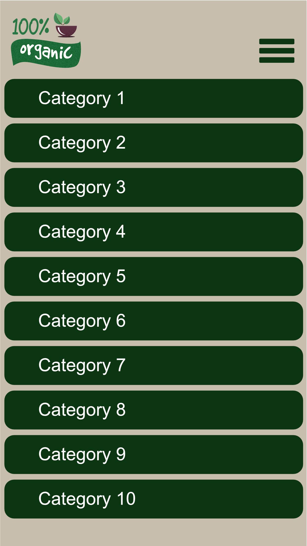
In Sparkle you can create ‘Sections’ and each section will be the top navigation menu for your website.
Lets say we are building a Music Store. We could create three sections:
Products
Books
Support
Each SECTION would then contain the relevant pages:
2. Books section will contain:
Mixing - Recording - Business - Song Writing
3. Support section will contain:
Technical - Account - Website
So by doing this, it keeps the website well organised and also a mobile navigation menu that works!
You can do a surprising amount of custom design so that the Sections Top Nav menu stand out, and another custom design for the sub pages of each section etc.
Have a look at this example I created to demonstrate the above using SECTIONS.
Excellent piece on menu navigation and how to better the experience on mobile!
I was thinking (what do you think?) that I would keep the home page seperate to the sections, only because users don’t usually search for a home page in the sub-menu dropdowns.
Just waking up this thread having been attracted by the thread title. I’m finding building a decent menu for the 320 mobile version of a fairly large site is still challenging. The neat and tidy mobile navigation example put up by rimram (thank you rimram!) still only seems to contain 12 pages in three Sections and I can’t see how to scale it up easily to a lot more pages and sections.
My site has about 90 pages in six Sections. This can’t be that difficult but i’m struggling. Are there any practical examples of how how to do this in Sparkle on a mobile site please, anyone?
I feel there is something obvious I’m still missing. There was a helpful video in another thread a year or so back but it seems to be unavailable now.
Wow @Mike4 that is a lot of pages!
To do that on a mobile menu just won’t work unless some serious thought goes into it and the ultimate is always how to make it as simple as possible for the end-user.
knowing the Menu (including the PopUp using the Menu) only allows for two levels deep by introducing sections maybe the following could help…
Have the 6 main sections in your main Menu (you will need to manually override the Menu) and when an end-user lands there they interact with a second navigation/menu to get them to the page. You will need to introduce back-buttons on these pages to get the user back to where they started on the second Menu…
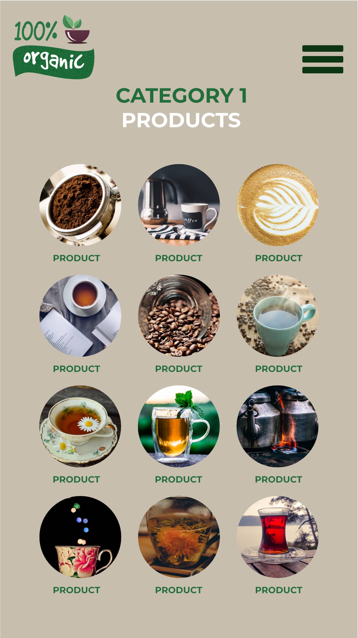
I prefer to design navigation specifically for the way people generally like to use mobile devices. Most mobile users prefer a drag-and-tap approach to site navigation, so instead of trying to create mega menus for small screen devices, it’s often better to have a category drop down with links that go to specific product group pages . Those pages will typically contain graphical links to specific product information. The nice thing about this approach is that the secondary navigation pages (products) can be as long as you like because they are normal pages. The category menu is static on all pages so its easy to switch categories, or to go back to the home page by clicking the site logo. Here is an example.
Even a complex sites containing hundreds of pages create the illusion of being simple to navigate without exposing the full extent of the site. This helps encourage browsing without having to navigate a set of smaller drop-downs and choices before you get to the information you want to see.
I’ve been trying to replicate this (but word links instead of images) on my equivalent of your product pages. I need to put about 25 links on each of my three ‘product’ pages, which is taking an AGE to do manually.
Is there a way to create a menu which is a fixed and permanent list of links to the pages inside a Sparkle “Section”, rather than being a drop-down list? Does anyone know?
It seems a simple requirement but I can’t see how. I’m probably missing something obvious, as usual!
If I’ve understood correctly, The product pages are a set of links (25 of them in your example) in each page. Because the links themselves are unique, they will have to be edited manually - there is no automatic function as such. I find the best option is to create one page of links and then duplicate the pages. Once you have the page copies, just go to each page in turn and edit the links. I don’t know of any other way to deal with this issue. The category links, of course, are much simpler to deal with because they can be in the form of a drop-down menu that can be made to display on every page.