I published my new website design yesterday and it mostly works just fine. However, when you visit my Home Page on a PCs and laptops (for example a 13 inch MacBook Pros), the page scrolls unnecessarily long so you have to scroll down on the page to see the nav bar. I’ve tried shortening the length of the Home Page but it doesn’t seem to make a difference.
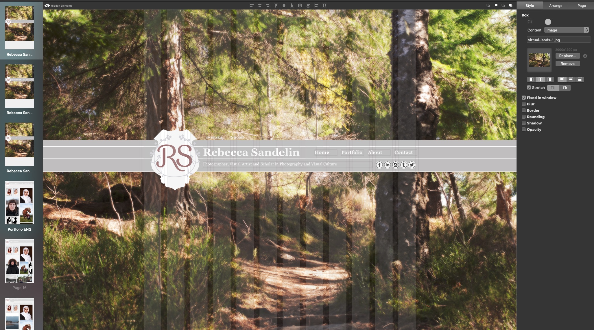
Here’s a of screenshots of the Style settings for the page’s Box-object, which is a full page width Image :
If you’re on a normal width-PC or laptop and would like to see what’s going on, the URL is www.rebeccasandelin.com. You might get a better understanding of the situation by looking at it, rather than reading my poor description of it.
I would really appreciate it if anyone has some insight or knows a work-around.
@rsand, I’m thinking it might have to do with the height of your image. Because you have it “Fixed in Window” and Sparkle doesn’t have “image-responsive height” the browser is honouring the fixed height of the image hence the scrolling to get to the bottom. The height of a monitor screen various a lot but I would say anything over 850px? will have the scrollbar of a browser engage.
What you could do is place the image in the page by going to Page in the right hand column, and go down to “Background”/Custom Content/select Custom Pattern. So now you can add your image to the page’s background (within the Custom Pattern panel) but you need to make sure the image is wider than 2800px and higher then 1400px so to fill out the larger screens and not have the image repeat itself vertically or horizontally to fill out the screen.
Good luck!
Thanks for getting back to fast! Just to check that I’ve understood correctly; you’re suggesting that I put the Image as a Custom Pattern across all Device Layouts with the same settings (wider than 2800px and higher than 1400px)? Or just the PCs/Landscape tablets layout?
@rsand, Yes the image size will remain fixed across all of the selected devices. I’m thinking Sparkle will handle the image file size (not the dimensions) across breakpoints.
Off topic, but just want to say that I enjoyed viewing your photos as I scrolled through your website.
However, the site is not mobile-friendly yet. The fonts are too small and the contrast is too light for comfort on my iPhone.
I would also like to see much larger images. Maybe try Sparkle‘a Lightbox feature? Or just use larger images to show off your nice work to its full advantage.
Thanks for your comment and for checking out my website
Thanks for your suggestions - I’ll keep them in mind!
All images are clickable and viewable in Lightbox so that you can view a larger version of each image at your leisure. I specifically made sure each photo had the feature actived for this very reason.