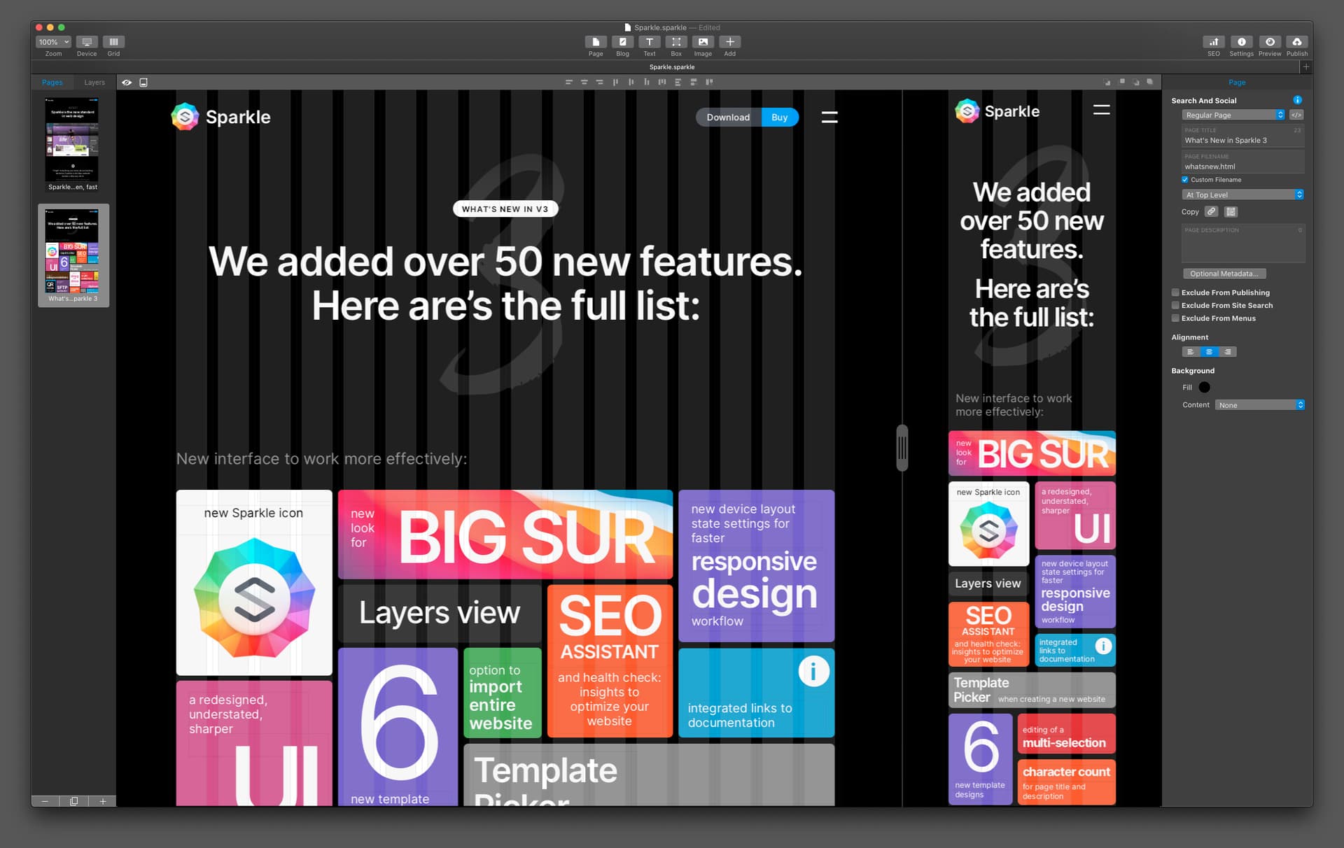
A few people have trouble designing for desktop and making the mobile version work well. This I believe is because they can’t see them at the same time. If we had an interface which showed both 960 and mobile on screen at the same time (in fact any of the sizes at the same time) it would be much easier. If you had both sizes visible, you can put an object on one size and see it immediately on another and move it about right there and then so you basically designing all the sizes you can see at the same time. Each window could scroll independently. Most people have enough screen real estate for this to be a reality. Any thought on this!
6 Likes
Yes @scoutdesign, this has been on my wish list to Duncan & Daniel.
Like you mentioned it will give the Designer a greater understanding of what is going on. This will also give the Designer a better understanding of what happens when you hide an element on a Device.
For me the two most important Devices are the 960 and 320, so having them side by side in my workflow would be heaven! 


3 Likes
Hi.
I guess you will need a 40" screen for this 
Will there be a MacBook big enough?
Mr. F.
1 Like
Thanks for the suggestion. While I agree it would be useful, I don’t agree that most people have enough screen real estate. This is not to say it wouldn’t be useful to those who do, but it’s not as universal as it would seem.
3 Likes
I think it will be much more useful than opening a popup every time I add a new object and switching from screen to screen. In addition, Framer’s Artboard-like working screen is also very useful. I wish there was that kind of canvas in Sparkle.
8 Likes
Safari offers, under its Develop menu, a Responsive Design Mode. This shows you multiple versions of your website. Open two Safari windows in that mode side by side in the devices you want to preview.
It’s not exactly what you want but it may be helpful.
3 Likes
@Mr_Fozzie there are a number of working models out there that work fine on the macOS desktop and the larger laptops. As you mentioned it would be an issue for the smaller 14" laptops.
It could also be set up so it is an option, not as the default, allowing the Users of the larger screens to take advantage of the side by side viewable canvas.
Hello Hendrik.
All well and good. That might still work if someone only designs two layouts. 960 px and 320 px, for example. But there are also some people who personalize three or four layouts. And then it gets tight.
What I would like to see is faster switching between the layouts to be personalised. It should be possible to set up buttons for this instead of the dropdown.
And another thing: the zoom factor that was set last (especially for the 320 px layout) should finally be retained. The eternal fumbling between switching and adjusting the zoom is annoying.
1 Like
@selcuk already thought that out by having a slider which could have you move between the devices.
But anyway it’s not my call but it would be a great feature!
I wonder if nobody actually uses the CMD-1 through CMD-5 for device switching? 
3 Likes
Hi Duncan, I use these keyboard commands all the time and they are very useful. But Selcuk’s mockup is exactly what I mean. Much quicker to have it all there updating each window immediately and having them visual for immediate feedback. A lot of designers have at least 27 inch monitors which could easily display this. It’s certainly isn’t ideal breaker not to have it, but it would be an amazing option to ‘turn on’.
Hi.
I don’t. 1st time i see this. Is this in the documentation somewhere? Or is it shown in the UI?
Mr. F.
Keyboard accelerators are always in the top of the screen menu. These particular ones are in the view menu.
1 Like
OK. Found it. I think i can get used to this.
Please fix the zoom factor settings. It should remember the last chosen zoom, at least until the project or sparkle is closed.
Mr. F.
1 Like
I am using…
(Post must be at least 20 characters.)
Hello… Great idea well done!!! This way of viewing is great! That would be an extremely useful option! It’s really very complicated and time consuming work of creating websites and always having to use CMD 1 - CMD 5 or see the layouts separately. It would be very useful and wonderful to have the simultaneous vision of the 2 layouts (or 3) together on the screen and to be able to correct them at the same time!! I would very much like Sparkle to implement this very clever option. For use on small and large screens, everyone has the choice.
We look forward to the Sparkle developers realizing this great idea soon!
One of the great advantages of Sparkle is the live preview! Especially if you have a second screen, you can see live in the browser how changes in the editor are affected. This even works on all kinds of devices in parallel. So I sometimes look at the page on the iPad and the iPhone (either landscape or portrait) in parallel. Or … open two Safari browser windows on a second monitor and then scale the windows so that in one a desktop window is displayed, on the other e.g. the smartphone portrait format. Changes in the editor - for whatever device - are thus live traceable. In the end, it looks like @selcuk 's suggestion.
Personally, I honestly don’t need more.
I join @selcuk’s proposal.
I agree that it can be an option to activate if you have a screen that allows its use. It does not have to be something fixed and mandatory for all, but it is certainly an idea.
I must be missing something here. I have my ipad and iPhone and Mac open and live so can see everything that’s happening when I make a change. I get if you don’t have a phone or tablet to have open. I have three screens though and can even add a fourth with the iPad. So lots of room for many devices in this mode.