My first site on Sparkle converted from a WP theme.
https://jrbev.dreamhosters.com/
Positive and negative, but be respectful and constructive.
Curious to hear your comments.
All is welcome,
My first site on Sparkle converted from a WP theme.
https://jrbev.dreamhosters.com/
Positive and negative, but be respectful and constructive.
Curious to hear your comments.
All is welcome,
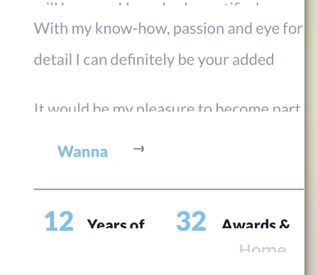
Congratulations! I have only looked at your site via iphone & it looks great. However, the font is too small to read in parts so you may want to take a look at that. Design though is lovely.
Great example of a responsive site, elements move around properly.
+1 about font being too small for mobile; this is one of the challenges of Sparkle is to get readable text in all breakpoints. I’ve struggled with the same.
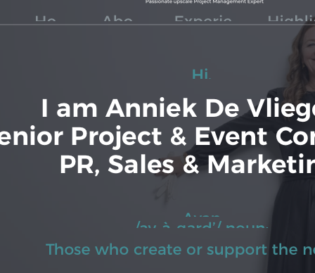
Why not wearing shoes in sitting pose? It’s contrary to the professional presentation you’re making; I’d suggest either crop the photo just below the knees or replace it.
@jazzbird thank you for your comment! Yes, i am aware of the small font size on mobile phones. Still need to work on that. Do you suggest i simply make the same font bigger?
@wolfferine thank you for your comment! As i asked @jazzbird too, do you suggest i simply make the same font bigger?
@producerguyaz thank you for your comment! As you struggle with the same problem as i do, do you have any suggestions how i can solve this problem?
Concerning the “no shoes sitting pose”  this is the wish of my client, but i will definitely considering your advise and give her the feedback. Thank you.
A really good start @Jurgen! and welcome onboard!
A nice modern feel and layout! Great job! Having had a quick look it looks like you have created your website for the one device - extra wide desktop? If that is the case then adding a couple more devices would take care of the tablet and the mobile.
That way you will be able to adjust the font sizes, especially for mobile…
Hello.
All in all it is a well organized and structured layout. But there are also weak points.
In the upper part, the green font on a gray background is quite difficult to read.
The one-line menu disappears when scrolling. Here I would at least let a hamburger menu appear.
The layout is not made for smartphone. If I had to guess I would say the 320 px layout is set to automatic.
The latter has the consequence that text is cut off. This is bad, as you can see here:
As a school grade I would give you a C.
Mr. F.
Nice website, agree with others on font size.
I’ve had success beginning with the mobile version of my site, then updating to the desktop from there. Try it, you’ll like it!
FYI - Your Mobile Facebook cover photo is cropped, losing the top of your face.
Suggest resizing photo to fit optimal dimensions:
640x 360.
Tell your client, that from someone who works in commercial advertising that this particular pose will kill her entire marketing push. It makes her appear that she doesn’t take her career seriously and that her decision-making skills are not good. Which means a new client won’t trust her and go to someone else.
There’s a difference between what a client wants to do, and what will actually work in selling her to new clients; those concepts are rarely similar. And if she’s the one making marketing-style decisions this could be disastrous for her. She should consult with an experienced advertising company and get solid advice. Girls may think it’s cute; men will be immediately turned-off by it and dismiss her as goofy.
The font issue: I don’t have any advice. There are tools and instructions throughout the Sparkle documentation and, those who have had the same issue (there are dozens of posts about this particular thing). I avoid this by using large-scale elements and text because my personal struggle to fix it was taking far too much time. It’s not an elegant solution but it works.
Do your research here on the forum and you’ll find tons of advice. Others have done this successfully, I’ve just never been able to understand the process completely as it’s not intuitive.
Thank you for your comment @FlaminFig as i am a newbie and this is my second website I’ve made and learning everything from scratch i know i still have a long way to go. But i am really happy with the constructive comments i received here. I will try to find out how i can add more devices so i can adjust the font sizes as well.
Thank you for your comment @Mr_Fozzie. I am really happy for you (school) C grade! As i am a newbie and this is my second website I’ve made and learning everything from scratch i know i still have a long way to go. But i am really happy with the constructive comments i received here. I will try to find out how i can adapt the site to different devices. Also, as I can’t change the color of the text (this is her main color from her business) i might lower the gray overlay to more transparent , this way the text will more come out.
Thank you for your comment @macmancape . Do you mean you create your site first for a mobile device and when everything looks OK you add tablets and PC’s?
Yes, exactly. Mobile is most important now…80% of sites are viewed that way.
Depending on your layout, you may be able to then use the Automatic Scale setting for larger versions.
It worked for me on this recent site:
Dave
A bit late to this discussion. Just looked at the site and I suggest that you change the photo with “Namaste”. What’s written under it is not what a professional walks around events wearing. If I’m looking at this website and I see this photo (although one needs to zoom in, and it’s clear that there was an attempt to blur it), I will dismiss any thoughts of contacting this person.
Take it for what’s it’s worth, an advice.
@darklight, thank you for this! I was inspired by the word “Namaste” and I did not zoomed in on the pic so I hadn’t seen the word under “Namaste”! Again, thank you for your critic eye and I will change the picture definitely!
Well done Jurgen. I think you’re well on your way.
Learn about styles and produce the site suitable for mobile. I did not view the original images but I think they’re fine now.
Agree with Fonzie that the green text on grey is hard to read.
I do like the color scheme.
If you’d like a few ideas for your mobile site, view this forum on a smartphone and check the various links provided on what can be accomplished.
