I have been using Sparkle fairly intensively for the past couple of months to rebuild my existing site (which was done on an old version of Quark).
I have the following list of things that I am missing from Sparkle. No doubt many of these are already in the works, but there may be one or two new ideas among them. Thanks for reading.
Indenting of blocks of text, left and right, rather than just first line. Also, hanging indent of first line. (Pages does this)
Ability to set leading in points. (Pages does this)
Ability to show invisible characters (Pages does this)
Ability to add colour fills and frames to text boxes.
Ability to add new colour swatches to the colour palette, and name them, rather than just change the presets.
Rollovers for pictures!
Super step and repeat (as in Quark).
Ability to set a colour for linked text, and a different colour for it to change to after being clicked.
Ability to save text boxes as a graphic.
In the Lightbox, it would be useful to be able to change the size of the little Action Overlay arrows - I find them too big at present.
In buttons, when the fill is a gradient the button colour doesn’t change on click. Can this be changed?
I have previously reported my dismay that text reflows at different Zoom levels in certain browsers, notably Safari, making it difficult to position illustrations in text. This is particularly awkward in text-intensive pages like mine. I hope this can be addressed in a future release.
Yes, but it would be simpler and more precise to be able to apply the attributes directly to the text box rather than a separate element.
I thought that was more about editing the existing colours.
Yes, but it was the ability to change the text to another colour when the link has been visited that I was particularly thinking of. This colour change used to be quite common but perhaps it’s going out of fashion.
Agreed, but that’s limited to screen resolution.
But the button rollovers (if that’s what you are referring to) don’t allow you to change to another picture, unless I am missing something.
Hey sorry for the late reply. I think many of your suggestions are in the spirit of how Sparkle works. Maybe we can meet half way
That Pages or Quark do something isn’t necessarily an indication that Sparkle can or will do by the way. We try to stick to what web standards allow for the most part, and while anything is possible, some things are just too convoluted to be worth it.
indentation of a block of text is something that would make sense, though I kind of miss the exact use case for this. Hanging intends are more tricky.
Points as opposed to the multiplier? It kind of feels more like a “user interface sugar” issue, the multiplier is more robust to changing font or font size. (i.e. 14px with 1.1 multiplier means 15.4px leading?)
Spacing is generally frowned upon in web context, and it doesn’t really work anyway, so which invisible characters? Newlines?
One one hand text background seems like something you would want mostly for habit/legacy reasons, “this other tool does it” etc. On the other it falls short of setting a background for more than just the text (say you have a combination of text, image, buttons, etc). We do have a few requests about this but it feels shortsighted.
Definitely.
Also definitely (though it’s really limiting to think of link animation as just that).
No idea what super step is.
Embarrassing that it’s not there yet.
Search engines don’t work with images, bad guys OCR them anyway. No idea why this would be a thing.
Yeah.
Yeah this should be improved, there’s a technical reason but you don’t need to care.
There’s most likely no chance for improvement in this area. Text rendering is different in different browsers, even if we make it 100% consistent in one, it’s all wasted in a cross platform context.
@ianrid You’re such a tease! While we wait how about improvements to Sparkle’s layering function. A simple implementation such as in Keynote’s Object List would be a great workflow enhancement.
Hey thanks for the reply Duncan. Some more for the wish list:
I also think layering would be great OR at least just the ability to make an object disappear (cmd +3, like in Illustrator or InDesign) so I can work on things behind it and it doesn’t get in the way. Really needed this when adding lines to separate paragraphs.
Also, the ability to allow photos and/or text to scroll in their own columns (not the whole screen, just the text or column of photos, in any direction) is super slick and really cool. I just found this on Adobe XD and it really opens up a whole bunch of possibilities. I don’t know how feasible this is, just a suggestion.
As you will have gathered, I come from a print background, which is why my site was originally made with an old version of Quark. My site is very text-intensive and I continue to think in print terms. Some further comments and elucidations:
Indentation of a block of text: This is useful for block quotes. Hanging indents are useful for lists. There is a workaround by forcing line breaks with carriage returns but it would be nice to be able to set up indentation for a whole paragraph like in Pages.
Line spacing in points (i.e. leading): In the print world we talk of 10/12 point, 11/13, and so on. So it’s more natural to print designers to do it that way.
Invisible characters: Yes, I was thinking of being able to see things like carriage returns and spaces.
Rollovers: You’ll have seen sites where mouseover changes the picture, often adding annotation. It’s a nice trick and I think it would be valuable in Sparkle.
Super step and repeat is the ability to make multiple copies of an item such as a box or a line, and specify their positioning vertically or horizontally. At the moment if I want, say, a dozen horizontal boxes or lines for a table I have to duplicate and reposition each one separately.
I guess there is a fine line between allowing the Designer to freely create or use automation to create. This is what I find so rewarding with Sparkle where the tools are there but I have scope to create with it in varied and non-conformist ways!
Yes, Sparkle can add so much more (and I’m waiting! :)) but I’m pretty stoked how I can create on its free-flowing canvas!
@FlaminFig I agree that line exists. I see it more of a division between designer and non designer. Taking the latter first, non designers build one, maybe two sites. Their need is more “automation to create” as you said. Non designers are looking for convenience, not learning or mastery of the software.
For us designers it is a workflow issue. We design many sites. Since time is money, to “freely create” our feature needs are for effectiveness and efficiency. @ianrid feature wishes are all workflow. Without knowing anything about him I know he is a designer.
When I see the requests for a full-featured blog I know the requester is not designing as a profession. Both perspectives are correct, just different needs. Sparkle does a good job walking the line. The proof is overall both groups like Sparkle.
Why Wordpress fails so badly is it wasn’t built for designers or non designers.
It must not be easy for Duncan and Daniele to be striding both camps and getting it right for both!
And you are right… from my end the workflow is important and although I love the free flowing creativity I need to keep check on my time investment - so I would love to see a designated area in Sparkle where we can assign our global styles; colours, font styles, buttons, icons. This would be a big step in reducing my workflow in creating a website project as the website branding is already done before I start building out the site.
The continued traction of Sparkle out in the wild will further improve, expand, and adapt so I can’t wait to see what Sparkle3 brings to the table!
Some comments from someone who just discovered Sparkle and have spent som time playing with the free trial:
Indenting of blocks of text, left and right, rather than just first line.
Yes – I use this all the time in my current app (plan to buy Sparkle now). This allows me to make sure that the text in text boxes appear too close to the edge of mobile screens. OTOH - Maybe this isn’t needed in Sparkle?
Ability to add colour fills and frames to text boxes.
Agree. Slightly different shades of gray, for instance, makes it easer to mark various text/tables/images etc as belonging to the same article – which is useful on pages with several articles after each other. It also makes it easier to see when one element on a page ends and another begins (if they have a slight different background color).
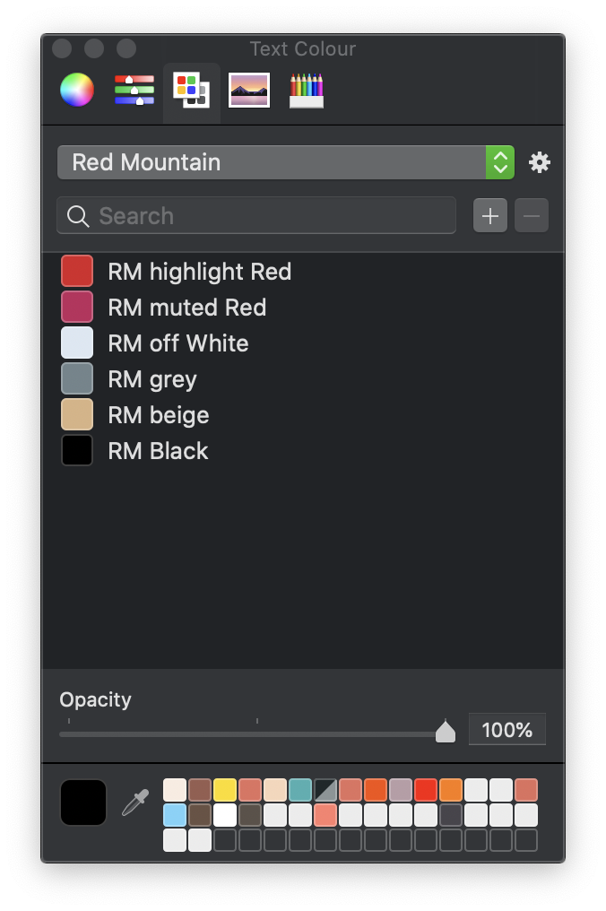
Ability to add new colour swatches to the colour palette, and name them, rather than just change the presets.
Not sure what a color swatch is, but I’m looking for a way to access my stored user colors from other Mac apps within Sparkle. Is this possible/at all related to color swatches?
Ability to set a colour for linked text, and a different colour for it to change to after being clicked.
Absolutely, and the same goes for underline. It should be editable for each individual piece of linked text, and not just a rule which is applied for all linked text (on the site or within a text box), because sometimes I want to add a link (just as a search engine boost), and other times I want the readers to see that there’s a link associated with the text they’re looking at. Very important, IMO.
Ability to save text boxes as a graphic.
Yes, search engines look at file name for images and also for ‘Alt text’ added to images, and these both make a difference/are useful ways to achieve better Google placement.
My main wish, though, is responsive web design – text boxes etc which automatically is resized based on screen width, and which also works in real time, so that pages/elements on pages are reorganised when changing browser width.
You can currently size and position text boxes so they don’t touch the screen edge
You can add boxes to your page and place your text on top of them to create the backgrounds you want.
Create your colour swatches in Apple’s colour picker. You can save them under project names and give each colour within the swatch their own names. Here’s an example:
You can then transfer your project colours to the Sparkle colour swatch by replacing the standard colours. Furthermore, the colour picker is common to most apps, so the same swatches are available to you whatever app you happen to be using.
Currently only possible to change the link colour (no rollover options). However, you can change everything on navigation links.
Not sure why saving text boxes as a graphic would give you more SEO points than machine- readable text, But if you wanted to create images of your text boxes, just switch to preview mode and use the Mac Cmd-Shift-4 option to snap a screen shot of your text boxes. I have no idea what you would do with the images from that point on to help you with SEO.
Sparkle adopts an adaptive design approach. Whilst your page elements are automatically applied across each breakpoint, you will have to resize/rearrange them to better suit each device variant. Once that is done, your final website will adapt to all devices you set your site up for.
I would add ALT text – a pic with relevant ALT text seems to have more effect on search engines than just the same words written. But thanks for your detailed reply! I have some other questions as well, but will search a little bit more and start a new thread instead of hijacking this one.
The layout Sparkle generates is responsive (a fixed layout switcher, specifically). You are probably thinking of “fluid” layout, and Sparkle only does fluid in a limited fashion (full width boxes, and other elements).
Fluid layout as it is done in code or popular frameworks produces a generally unpredictable layout, which forces the designer to check for overlapping, clipped or jammed content at all possible browser widths. This complexity (and time expense, so ultimately cost) is part of the reason why so many websites are built based on whole page templates or more granular templates (like say a bootstrap hero thing).
There are a handful of designs which work better with fluid layout, but in general Sparkle can do very similar things.
Sparkle’s fixed width switcher means once you have developed the desktop layout and the mobile layout, and let Sparkle auto-scale the others, you now exactly what it will look like on all devices.
You could even say that if a fluid layout is the only way to make a website, or the only thing stopping you from using Sparkle, perhaps you are missing the bigger picture.
And there’s nothing automatic about the reorganization of page elements, only design decisions. We strive for giving control over those decisions to the designer, whereas in most templates they’re defaults that you either don’t change or change via CSS (good luck with that).
With all that said, we have been working for a long time on improving Sparkle’s layout engine, to find a middle ground between fluid layout, understandability of the user interface and predictability of the layout. It’s still not going to be ready for Sparkle 3, but it is definitely a focus for the next major release.
Thanks for you reply. My main interest in ‘fluid’ is that I already have created a large site based on the fluid kind of responsive, and seriously consider moving over to Sparkle due to what seems like a better workflow in some important areas. When understanding the fluid concept the way it is implemented in my current main app (Everweb), the results are actually quite predictable, and I’m curious about which other elements in Sparkle that are fluid.
There seems to be a few benefits from using fluid solutions: not having to set set unique layouts for mobile/deskptop/tablet is a main one for me. Full width boxes, combined with a Max Width setting for these boxes (combined with something called ‘responsive rows’ in the other app) seems to do the trick for most of what I need. I wish I could experiment more with how the Everweb concept works in the free version, but it seems that I have to buy one of the paid version to figure out how the concept works.
Since I already have designed maybe 150 pages in the other app, it would of course be easiest to be able to use the same concept in Sparkle. The other app (Everweb) has some major shortcomings when it comes to dealing with text (which is what I mainly do, sometimes articles that are several pages long), which is why I’m considering at least starting to make some of my new pages (for the same site) in an app with proper text handling and a good UI.
…so I started to use ALT text more.It seems to help, and it would certainly make sense if it helps, because if you have an article of, say, 700 words, and have only one image, and that image is having a file name and/or an alt text which eg is ‘green bananas’, the earth engine should assume that green bananas is essential topic on that page. I check out my Google rankings regularly, and I just checked 4-5 words that are essential on my site right now, and my pages were among the top 10 matches for all of them – and I’m pretty sire that this improved when I started to make sure image file names and ALT text reflected what the site is about (among a number of other things, of course).
If there’s a reason to assume that ALT text aren’t useful for search engine boosting, I won’t spend time on adding them, of course – but I haven’t seen anything that suggested that these words are ignored. Would be happy if I’m wrong, of course!
I think you’re misinterpreting all this material. It is all specific to actual images, nowhere does it say that you should turn text into an image, for the purpose of setting the alt text.