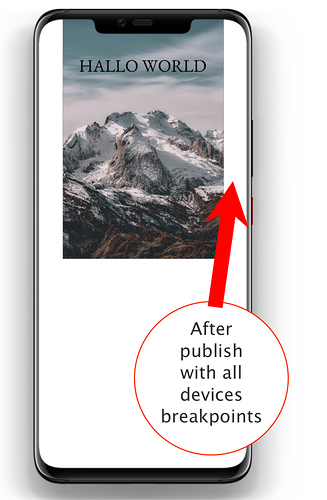
After publish my page with all devices breakpoints I have issue on 320 pixel mode on mobile device appear sides fields.
If it publish with only 320 pixel mode looks ok without fields.
On local host preview no problem with all devices breakpoints! Help please!
@Timon, The best way around it is placing your hero image in a “wide box” for your mobile breakpoint so to eliminate the margins (the image will spread across your screen not within the 320px breakpoint) which appear on the larger mobile screens.
Hi @Timon, welcome. That’s an unfortunate artifact of the single-device preview.
Sparkle defaults to previewing the current device you are editing only, because it would be very confusing otherwise: you would be perhaps moving a box on the desktop-960 device, but maybe the browser is wider and is previewing the wide desktop-1200, and the box doesn’t move at all.
We also configure single device layouts to automatically zoom (auto adapt to the screen width) on mobile devices, because that’s the only way to trigger a desktop-only layout to be fully visible say on an iPhone.
The combination of the two is when you’re editing a mobile layout it will be slightly zoomed in, but the actual preview would be the multi-device setup.
We should probably find a way to address this issue at least for preview, but this is the explanation of why it happens.
Like @FlaminFig said, using full-width elements is the way to fill in the layout margins.
