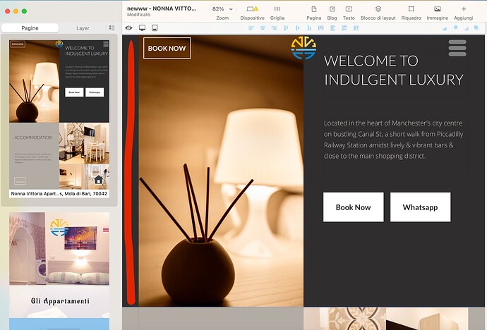
“Hi everyone! I’m trying to align an image to the left and make it take up the entire width of the page on the left side only in Sparkle. I’ve tried using the “Align Left” option and setting the width to 100%, but it didn’t work. I’ve also tried using CSS, but I’m not sure how to add it to Sparkle. Can anyone help me with this? Thank you!”
You might design your element with another app and place that in your box?
Would you mind to show what kind of element you want to align to the left? So we can have a better thinking about what to look for - a solution?
Kind Regards,
Uwe
There is a new feature for images in a wide box: background shift.
You can move it to the left or right edge of the screen.
Mr. F.
This feature does only a part of the job but pinning to the left or right would be much better here and this is not possible so far in sparkle. As far as I experienced, pinning would only work as intended with fluid width breakpoints and not with fixed width breakpoints. Although images in full width behave in some way like the page is with fluid width breakpoints, elements/images placed inside the boundaries of its device/breakpoint stay as they are set up.
Kind Regards,
Uwe
Hi Mardar91,
Not sure what you mean. You’ve said you want to align in left but then to take up the full width of the page. Do you mean full height of the page. Can you show us exactly what you mean in a mock up or even a drawing. Do you want the image to stay there when you scroll or can it move with the page? Try and explain it more clearly for us.
Well for the image the new feature: background shift will not do its work and your button will not always be “pinned” to the left browser window – … . Same to the image on the right side.
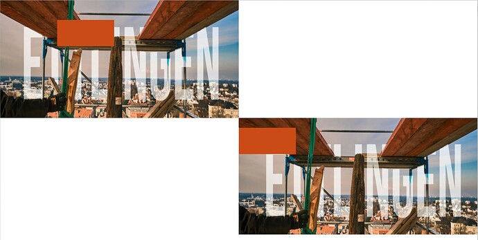
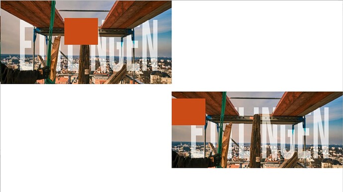
As far as I tried sunday night it looks like this when you create your image across the full width and assume the height. Unfortunately it is not possible to really see the outcome of full screen images, I wrote about this about a year ago with Duncan and he was aware of this, so that means: images can be kind of put in certain way to look like this:
The images itself look like this:
That orange-red frames are your button(s).
They must be always inside the boundaries of your devices canvas.
Maybe we get a better approach in some future for full frame usage of the whole browser window?
Kind regards,
Uwe
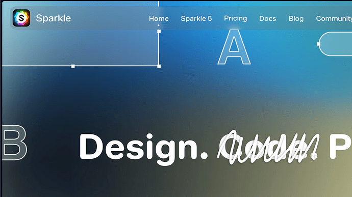
You can also see the same issue on sparkles own website:
It also get cut off on its far right side - and left side.
Depending on your screen you may check.
You may have a try by expanding your own (first two) devices manually from 1920 to 2500 and so for the next one, keeping in mind:
I also tried it but it still gets kind of unpredictable what the final user gets to see.
Kind regards,
Uwe
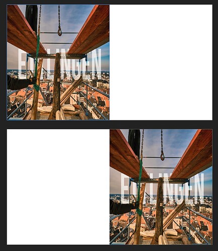
You may try left aligned in the designs page panel? Here you can choose wether to use centered, left aligned, right aligned of the whole site but of course this might look bad on mobile devices? But this is as of this reading the best way to get anything left aligned.Luckily the vertical-half-designed is there but of course all other elements which are not full width (like my example) are left aligned, too.
Not satysfying but who knows what happens next with all newer versions.
Kind Regards,
Uwe
It’s really odd that you’d get a cut layout. Do you have browser zoom active?
Not sure what is happening here. Have you tried pinning a ‘Fixed in Window’ pop up aligned left and using the full height option. Still a little unsure how you are putting this together.
