Hi there, here is a new page i made with sparkle. Gästehaus GrupelloI’m going to edit some small things, but since you guys are always a great help in finding errors, I’ll put it here already.
Cheers
Steffi
1 Like
The biggest issue is typographic legibility. The white type on a very busy, mostly yellow background does not make it easy to read.
The o thing thing, I’d say is that there is far too much gratuitous animation of type. Adds nothing to the experience and because it looks gimmicky and gratuitous, that is going to reflect on the business.
Without a full critique, the are the two main things that jumped out at me.
Finally, before I read it in English, I assumed it was for a property development company, or similar, rather than a family-run guest house. I think the feel is a little off for your market.
Hope this helps.
Thank you. I totally agree. I will definetaly change some things. The layout was very clear, but step by step it became more and more. Now i have to reduce animations and pictures. But does it run properly?
Thx Steffi
Hi @Steffi, I’ve just had a look through your site, I used the English version, which brought up an issue, when I clicked on ‘Arrival’ in the menu, it reverted back to German and back to the top of the page.
I do like the use of the bi lingual button between German and English, it really helps with visitors.
One critique I do have is the site is very text heavy, as soon as you land on your site you are bombarded with text. I would suggest having some nice photos of your building and surrounding area then have selected text underneath. Although the text is informative you may be offering too much info. That said I’m no expert on the hotel and bed and breakfast world. Keep going, it is looking good and with some tweaking it will improve it no end. 
1 Like
Aaah, thank you. I’ll fix it. The Big amouröse of text is the clients whish as all of the pictures in the background. And there is not more to show from the house. Only the street and the rooms.
But I’ll Talk to the client about that.
Thx Steffi
Great design @Steffi Just darken most of the photos and you’ll be fine with the typography. Animations are all working.
-W
1 Like
Thank you! I darkened a little bit, but I have to ask the client if i can go much darker.
Hi ! Love the site! Love the low prices, too!
One item in the English site is the word “homely” you used. You meant “homey” or “homelike”. However, “homely” means ugly. See screenshot I’ve attached.
Otherwise, very very nice! I do agree with someone about using fewer animations.
- Dave
1 Like
Thank you so much! I i used deepl for translation. 
And yes, it is very cheap and the people who run the guesthoose are very nice.

Maybe use cosy instead?
Nice site, a bit text heavy.
Have a great day!
Thomas
Hello Thomas, thank you very much. What do you mean by “cosy”? I know it’s too much text, but there’s nothing I can do. The layout was quite different anyway. But you know that for sure, it just evolves. xx Steffi
“cosy” > “gemütlich”
Hi saber1, I understand the translation but not the context. I am supposed to “maybe use cosy” does not make sense to me.
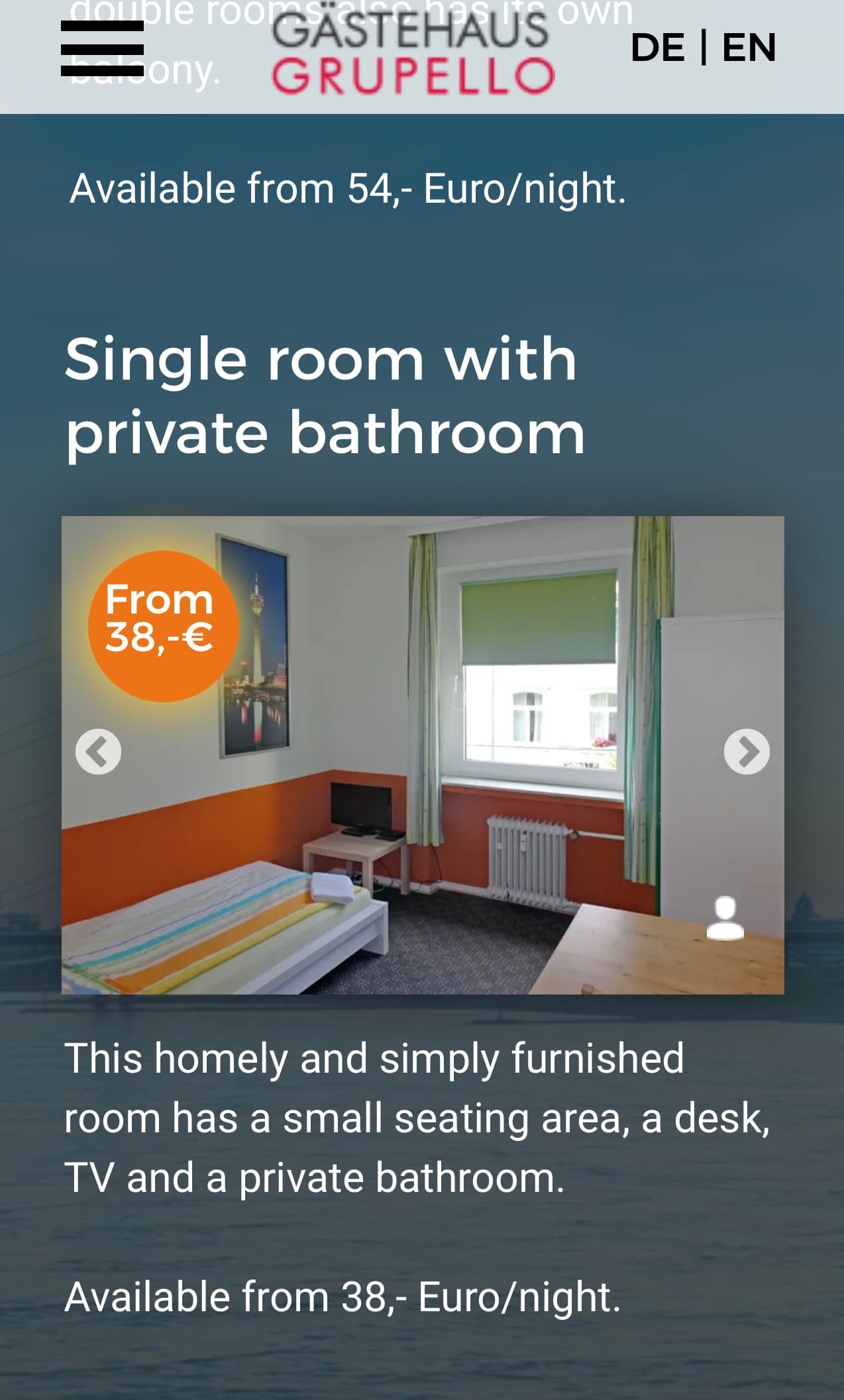
This cosy and simply furnished (or maybe minimalst furnished) room…
is what I was referring to.
1 Like
Aaaah, now I get it. I’ll ask the client. THX!
Homely Definition & Meaning - Merriam-Webster
homely : [adjective] suggestive or characteristic of a place of residence or home.
1 Like