I noticed that by using layout grid and inserting into it text and image, these fix self in vertical mode when the browser resize his window.
This could be a good way to create a flexible site without became crazy to arrange all object of the page?
I ask to more expertise people here of me so at I avoid me to star a new work that then could be totally wrong!
What do you thing?
Probably, perhaps, the more correct way is arrange everything manually, but this tool, perhaps, does it make our job easier?
You can to a degree. When you talk about ‘fluid layouts’ I assume you’re talking about the ability of Sparkle to rearrange things automatically to fit on various device layouts, rather than have the content fluidly adapt to any browser width.
In the context of layout grids, you do have the ability of setting the grid cells to change in size for minimum and maximum device widths. For example, adding the default layout grid to the canvas, you will get 3 x 300px square cells alligned horizontally across the page. Over in the style panel you can also set a minimum and maximum width for the largest and smallest device. The default setting look like this:
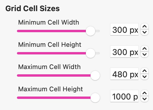
This is saying, the smallest grid cell size is 300px square (the size needed for display on a standard desktop and smartphone screen) whilst the largest cell width is 480 (the size needed for display on a wide desktop). Sparkle will use these dimensions to arrange the position of the cells depending upon the device layout. So, in the case of a smartphone layout, the cells will be arranged vertically - one above the other because the cells are set to display at 300 px wide, so only one cell can fit within the display width of the device. On a standard desktop, the cells will be the same size, but displayed horizontally - because the page width can accommodate three cells in a horizontal arrangement. Likewise, on a wide desktop layout, three cells can also be displayed horizontally, but the width of each cell can increase to 480 px because there is additional space to allow for the larger cell size.
So far, so good. Now, whether or not the content will expand proportionately depends on what you place in the cell. For example, if you place an image in the cell that’s set to Fit or Fill the cell, the image will adapt to the cell size on other devices. However, if the image is not set to fit or fill, you will see some image clipping depending upon the size of the cell on each device. I the case of the default Layout Grid settings, both the desktop and smartphone variants will look the same because the cell size is the same, But on the wide desktop variant, more of the image will show in the cell due to the larger cell size.
When it comes to other content, such as text, these elements still have to be sized to suit the device. Switching from the desktop device, 15pt text content will normally shrink down to something like 4pt when displayed on the smartphone variant. Likewise, the text on buttons will also be reduced in size on the smartphone layout.
The takeaway here is that whilst the layout grid will reorganise the placement of cells on the page, it will not, at present, preserve or scale the content in every case. That said, If a text box was placed in the standard desktop variant at 15pt, when viewed on the wide desktop variant, it will autoscale to something like 24pt. This anomaly may be something that may improve over time, but at the moment, autoscaling of cell content seems to only work in one direction (smallest to largest).
2 Likes