Ok… I have scoured the Q&A’s and can’t seem to find the answer for version 5.5. Doing a very simple 4 page site and am completly confused on how to make it look good on devices. I built it in 1200…but it’s very tiny on phone…am I supposed to build it first in 320 and go up…or…960 or Help… I even tried putting my right foot in and shakin’ it all about…nuthin.
Sparkle is a responsive fixed width website design platform.
The 1200 Device would work on the large desktop, laptop and even tablet (landscape) but for the rest your average user would hit the exit button!
So in Sparkle’s case you need to introduce more Devices. For me most of the time I work with the 960 Device and Automatically Scale the 1200, plus Automatically Scale the 768 Device. I then introduce the 320 Device and manually work it so to look great on mobile!
So for me I have created 4 Device layouts with two of them editable saving me heaps of time in future edits!
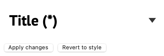
When building your 1200 px site, always use text styles for formatting text - i.e. body, title etc. In most cases you will change the fonts and sizes etc. for each of these styles as you progress through your site - just remember to update the styles when you make changes. For example, If you had a title/header, format it as ‘Title’ from the style panel, then change the text as you want it to appear and then hit the ‘Apply Button’ under the style name.
This will ensure consistency in your website and make things a lot easier when it comes to creating layouts for different device screens.
Create sections of your web page by using the layout block feature. Typical sections may be Navigation, Hero, About Product/Service, Footer etc. Basically, use each section to express one idea or concept. here is a typical page structure with all its sections shown.
Complete your 1200 px site and then switch to mobile device view. You will see your page with very small text and images/graphics scaled to fit the device width, Zoom out of the page, extend the page length and move your layout blocks down the page to create a larger space at the top.
Select your first text block and change the font size to a more acceptable size - 10pt - 12pt for body text, maybe 18 for Title text etc. When you change the text size, don’t forget to update the style by clicking that ‘Apply Style’ button again. This will change the text style everywhere it appears on the page, but don’t worry, it’s only changing the text style on that device only - your desktop site will be exactly as you left it. You will notice that all your text boxes will have red outlines - this is signifying that there is more text than will fit in the box, therefore you will enlarge and re-arrange the text boxes to better suit the device screen.
If you follow this procedure, you can quickly reorganise your page for the smaller screen size, maybe placing images under text instead of to the right or left, as in the desktop site. For content that may be in 3 columns on the desktop, you would typically arrange them into a single column layout on mobile.
Because you’ve placed everything into layout blocks. you can deal with each section of the page - independently .extending the size of the layout block and moving complete blocks up or down the page.
Once you have your mobile layout arranged, you can set all the other devices to automatically scale.
For a more detailed explanation of how this works, I suggest you download a copy of the free design guide from the link below. There is a whole section on how to scale websites for different devices.
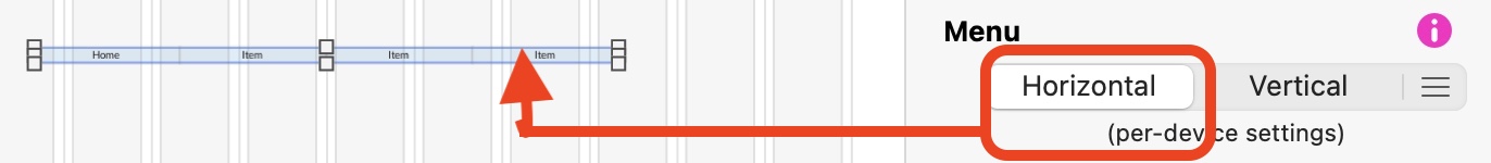
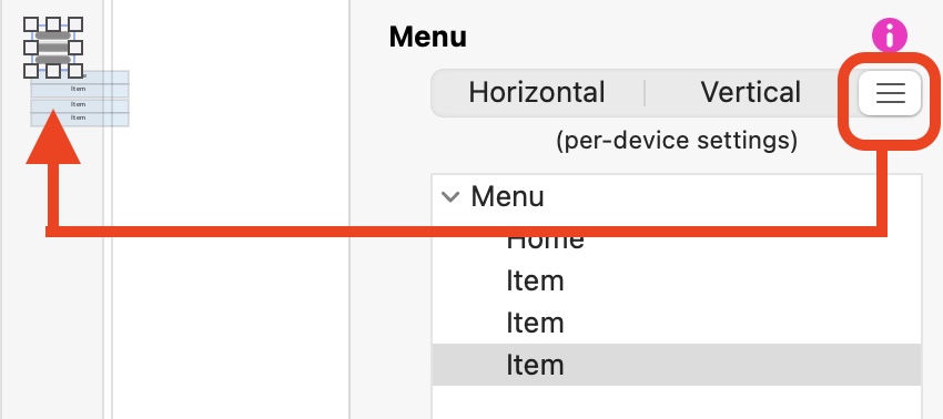
Your best option is to not have the normal text menu on the mobile pages. Instead, select it and change it to a compact menu - the text menu will still work on the desktop pages, but on the mobile it will turn into an icon that you can position up in the corner of the screen.
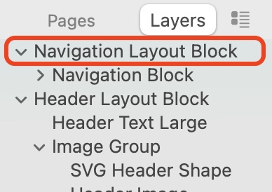
The problem at the top of the page may have something to do with the layer order of the items on your page. Always ensure that navigation menus are the first thing in the layers list on the left of the screen.
Hey … I am having the same issue. Created site in 1200, then switched to phone device 320 - made everything look correctly and added a vertical menu bar…redid every page…then switched back to 1200 device and everything was changed and weird!! I thought that when you worked in each device it didn’t put those changes into the other one…huh? Am I doing something wrong? My site looked great on tablets and desktops but phone view was teeny weeny…so I corrected it all but now when I try and correct the desktop back to what it was it screws up the phone view! Changing the menu bar to vertical with a slight color made my desktop version with a color! WHAT!!! I’m not doing a scrollable site with this one, if that helps.
You may have to create a completely different footer for the mobile version - one that is better suited to the device screen size. If you can post a screenshot of how it looks at the moment, I can offer you some ideas on how to get it looking good on mobile.
Firstly did you style your text on your 1200 device?
Secondly have you styled your colours on your 1200 Device? These will be global so if you change it on your 320 Device it will change on your 1200 Device.
Thirdly remember if you add new text boxes or new elements on your mobile then they will show up on desktop. So you need to hide these elements on desktop by going to the right hand panel / Arrange / Untick Show On this Device
OMG! Thank you for this info…it’s weird cause I needed to have a vertical menu on the phone but when it changed my menu for the 1200 I was shocked…so I will return to this disaster in the am…all the docs I read are for older versions and posted last year …so it all made me slightly crazy!
I’m excited to follow your directions. THANK YOU! I’ll let you know how it unfolds.
Great!
Also remember (I know I’m stating the obvious) but if your text box is red coloured on mobile it means you need to expand it to see all the your text in Preview. This might be the case with your footer?
Yes please…I would love help with this. Seems what you see in design doesn NOT show up in preview…which is quite frustrating. Im also having crazy issues with mobile nav…I change font size but it doesn’t show up in preview and still cuts off all the menu titles?
I think this is the best explanation I have seen so far about layouts and text for different devices. I’ve downloaded ’ The Freedom to Design book# By Frank Browne’ and will be studying it closely.