Hello everyone,
Here in the office, I usually work on a computer with a screen resolution of 1920 x 1080 pixels.
I use Firefox as my browser.
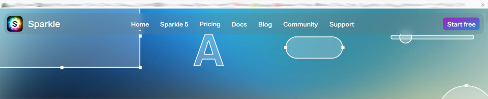
When I call up the Sparkle website with it, the menu is stretched across the entire width of the screen.
No zoom active in the browser.
However, this is only the case for the “Home”, “Sparkle 5”, “Pricing” and “Support” categories. It looks “normal” for “Docs” and “Blog”.
What could be the problem here?
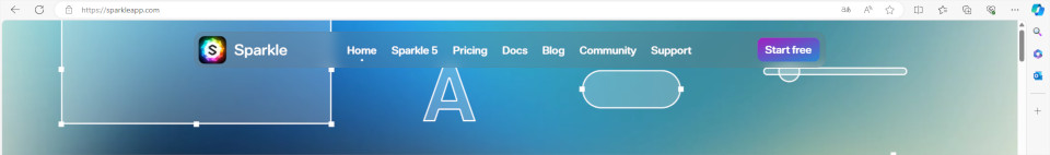
For example, when I open the page in Edge, the menu looks “normal” in all categories.
Of course, I don’t know how the designers intended it.
But Firefox and Edge both show different behavior on the same page on the same device. As the example with the “Home” category shows.
I’m asking because I want to find out when which design is displayed in a browser.
So when is a 1200 pixel layout shown, when is a 960 pixel layout shown?
With the resolution here in the office (1920 x 1080), there are exactly 120 pixels between these two design options in Sparkle.
All I can say is that I have Safari, Firefox and Edge all open with the same browser window width and all are showing Ultra-Wide web pages except for Docs & Blog. These two web pages don’t seem to be using the Ultra-Wide setting.
Depending on which Sparkle device setting are shown (960, 1200, or 1920+) is very much dependant on the device you are viewing it on and also if your browser is full screen or a floating window that is smaller in width than the device you are using it on. Is there a mathematical formula for when a device is shown as opposed to another, well…
So the page is displayed differently for you than it is for me?
It’s a pity that this doesn’t seem to be consistent.
Since Edge does something different here than Firefox. Both browsers in full screen.
They are different project files. The home and some of the directly connected pages have a 1920 layout. The documentation and blog don’t. The difference between browsers might be due to a page zoom setting in the browser itself.