Since recent I noticed the font size is different between safari and chrome on the mobile. Has anything changed? Safari works, Chrome doesn’t. Seems like Chrome increases the font size…
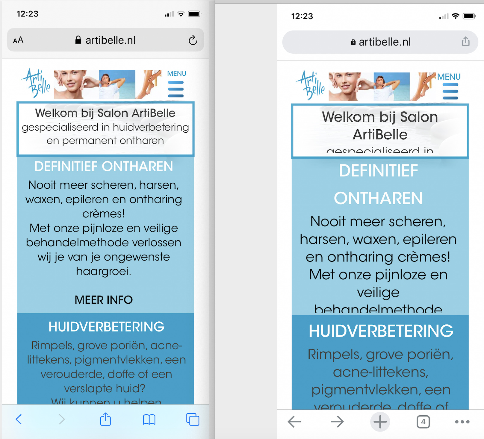
Website is in Dutch but the picture is clear. Left is Safari.
This is most likely to do with text-scaling in the Chrome Browser. If you open Chrome you will find advance options in the settings menu. One of the options is Accessibility. Select that option and you will see a text scaling slider. For Adaptive sites, such as those created in Sparkle, this should be set to 100%. It maybe that on your device it’s set differently. If it’s higher the 100% your text content will display larger and force the text boxes to overlap other page elements.
1 Like
Thanks for the quick reply.
For sure I can adjust it in Chrome but people visiting my website won’t do this. Btw. It seems to work on Android. Perhaps an issue related to the Iphone / Chrome combination?
It seems it has to do with the font size you can adjust on the iPhone. It doesn’t impact Safari but does impact Chrome.
Yes, chrome does implement a few features that we don’t always need. There is some sort of text-autosizer involved in the background, but as you say, not everyone will have their chrome browser set up to prevent font scaling from happening. The idea was simple enough, increase the font size so that it better suits the device screen size. However, this only really works well on responsive rather than adaptive sites. I must admit, however, that I have a few sites created in Sparkle that don’t exhibit this behaviour, so I think it’s something that is device specific. If I check your site on my android phone, it displays perfectly regardless of any font scaling I may apply. You may like to check out one of my sites HERE to see if that displays correctly - it does on all of my devices, but if it distorts on your screen, then you have to check your phone or browser settings to see if something is overriding the website settings. Let me know what you see when viewing my site on your mobile,
Hi @PeterBouten, the problem is a mis-configuration of the Microsoft IIS web server.
You need to create a file in the top level of your website, named web.config, with the following o content:
<?xml version="1.0" encoding="utf-8"?>
<system.webServer>
  <staticContent>
     <remove fileExtension=".woff" />
     <remove fileExtension=".woff2" />
     <mimeMap fileExtension=".woff" mimeType="font/woff" />
     <mimeMap fileExtension=".woff2" mimeType="font/woff2" />
  </staticContent>
</system.webServer>
This should work, remove it if it doesn’t.
2 Likes

Thanks Duncan. I’ll give it a try and will share my findings.
@PeterBouten, From what I know this is a common cry across the web with the latest Google Chrome… again!!! Not a very trust worthy browser of late!
After the update it plays with the font size and sets it to “Large” instead of the default “medium (recommended)”. Check yours under Setting / Appearance / Font Size.
Yes, there is something not right. This is how it looks on my devices in a Chrome browser:

So, I guess you’ll have to try the solution given by @duncan. It’s not an issue I’ve come across with the servers I’ve used, but it sounds like a possibility.
On safari it looks like yours (and correct) on my iPhone.
Hi Duncan. I tried but it doesn’t change anything. Again thanks for your support.
Ok so I’m not sure which is which. Which website is it? What have you screenshotted there? A device? A simulator? Please give me all the details to help me reproduce.
Looks like you have… Chrome running on iOS?
I see the rendering differences in your screenshot, but it’s not the default Chrome setting. There’s no way the differences are due to browser engine differences, because on iOS no browser is allowed to use anything but Webkit (same as safari).
I never use Chrome on iOS, I just launched and it shows up fine:

So the conclusion is, something in your Chrome is different, not a new default (as far as I can tell).
Hi Duncan, Sorry for the late reply.
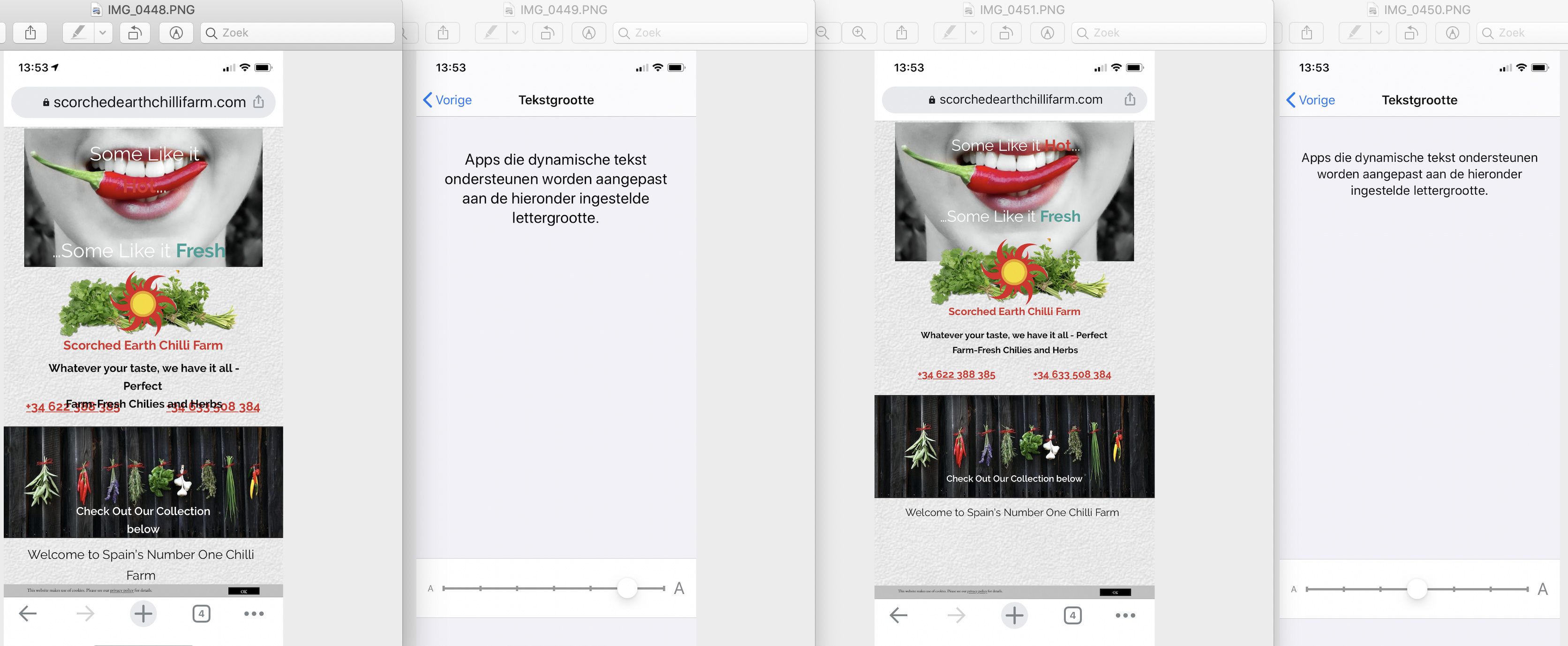
It has to do with the text size setting within IOS. I have it on standard everything looks fine. If I increase the text size to very large in Chrome the text will be shown bigger. See the picture attached. Left with an increased text size, right with the standard. You can see the setting on the Iphone (in Dutch but you can see the text size setting at the bottom).
Btw. I also tested Chrome on a none IOS device - ALL GOOD!
So it’s indeed the combination Chrome / IOS. On the IMAC it’s also no problem.