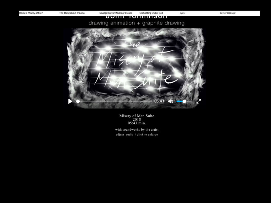
Hello. Having successfully published my new Sparkle website and seeing how great it looks on my desktop iMac in both browsers, I am disheartend to see the “hamburger” menu on desktop disappears and functions completely differently and messes up my design. What to do?
3. iPad browser view MENU Always Open every page
Thanks for the fast reply, Duncan.
When I tried to post my question with 3 screenshot PDFs a message told me “new users” can’t post more than one. I think I’m an established user.
Anyway, the issue is that my “hamburger” menu that is situated at the left of the screen on iMac desktop browser windows and works very well: http://www.jt-art21c.com
but appears like the one you see on my iPad (attached image) stretching across the top of the screen and blocks items and doesn’t work.
My question is how do I format both to appear the same on either device?
Thank you, JohnTomlinson jtart21c@gmail.com
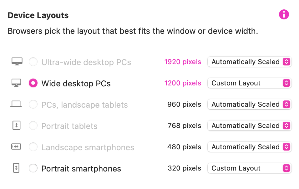
It looks like you have only a 960 device in your Sparkle project?
If that is the case your website won’t look the part on any of the other devices like the 768 and 320.
You need to add a 768 device either through auto-scaling or custom layout.
The 320 need to be introduced as a custom layout.
The way Sparkle works is, depending on the device used to view your website, the server will move across the appropriate device layout. In your case the 960 device (if that is the one you have used) is being served to a 768 (tablet) or a 320 (mobile) and of course it looks a mess.
John - you’ve defined the presentation of your menu as “hamburger” in only 1 device. Unfortunately, as the presentation scales up, or in your case down, the behavior of the menu is switching back to the default presentation (not logical but it is what is). As @FlaminFig suggests, you can toggle one of the lower, if not the lowest, device resolution to “Custom” (screen shot attached) and then set your menu presentation in that device to also display as “hamburger” style.