Hello all,
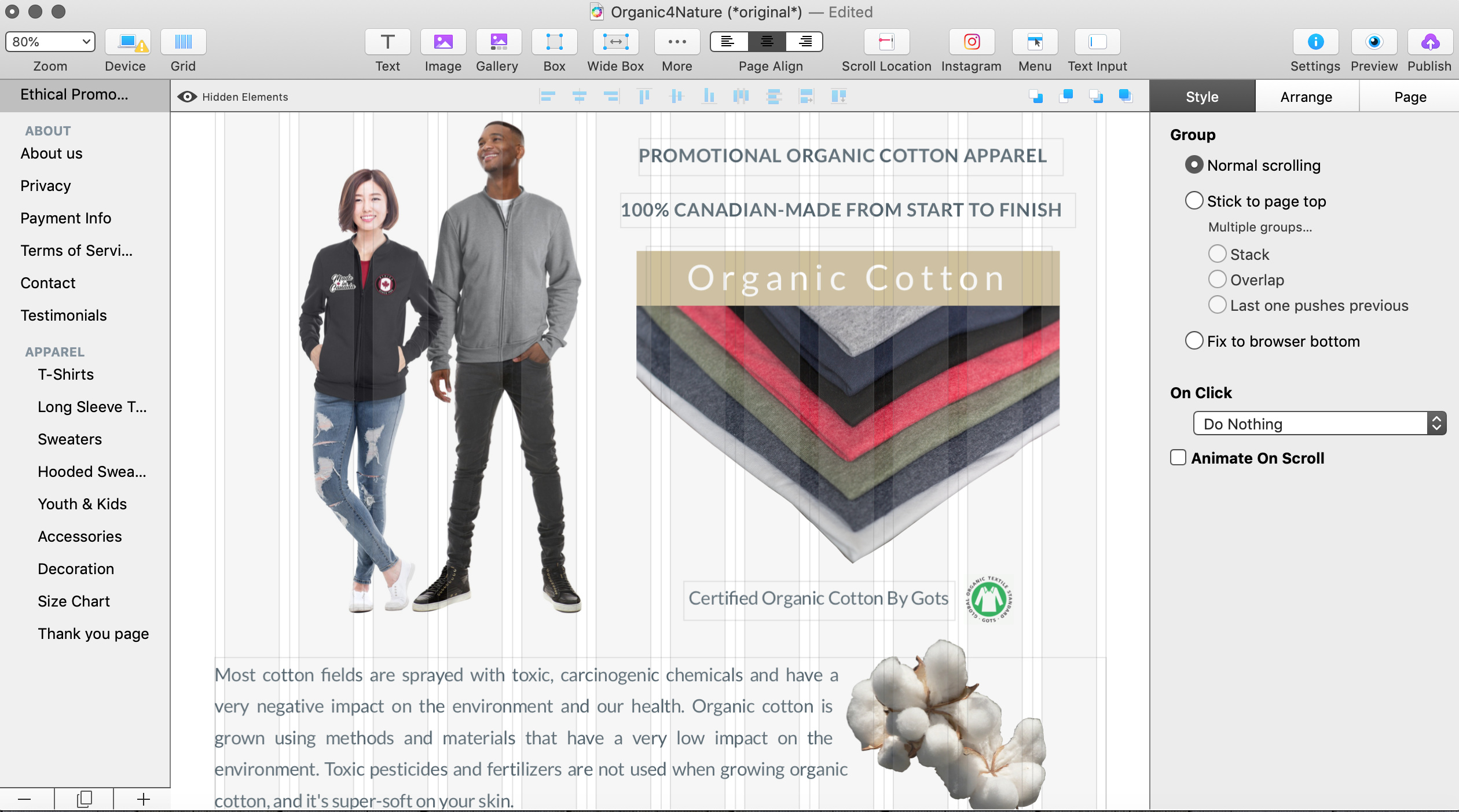
As per my 3 screen shot this is my landing page build using 960 px as suggested in the documentation. I am starting to work in the device layouts. As suggested I’m starting with 320 px. My third screen shot is showing the 320 px layout. Is it normal that everything is squeeze like this? If I understand the instructions, I have to go from text to text picture to picture and make all this fit in the 320 templates?
@o4n, Yes you got it.
When selecting the 320px layout Sparkle does a size reduction calculation which your 320px layout screenshot shows. Then we have to go in and make space and rearrange the elements…
Initially, Sparkle will attempt to scale your elements to fit the narrower page format.
What’s required next from you is to rearrange the elements and scale them appropriately. As an example, you would probably want to scale the photo of the two models up and center the image within the narrow 320 px page width, and then move the image of the fabric color samples below the photo of the two models and scale that image up to fit the width of the 320 px page width.
Similarly with the text blocks, you will probably want to resize each block to fit the width of the 320 px page and stack them. You can then also redefine the paragraph styles for the 320 px page. (e.g., if a paragraph style on the 960 page called “Heading” is defined to be 18 point Helvetica Bold, then on the 320 page that same paragraph style can be redefined specifically for the 320 page to be 14 point Helvetica Bold.
A layout that works for a wide, multi-column layout will have to be reworked for a narrow one-column layout. Sparkle preserves all of your elements from device layout to device layout, but you must reimagine the layouts for the narrower pages and move and scale the elements appropriately.
Hey Guys,
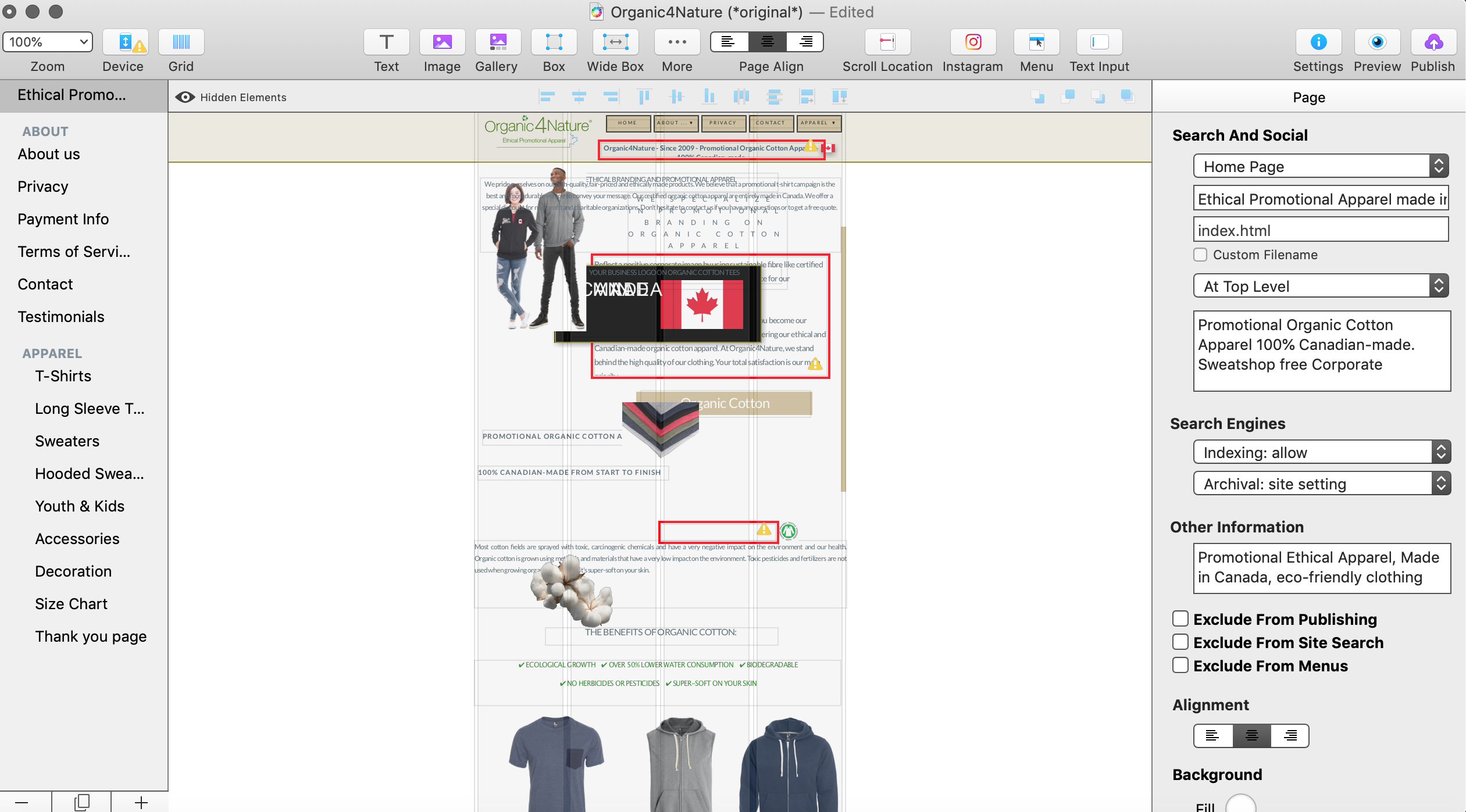
I was doing some changes as suggested in the 320 px.layout, and to see how it looked I preview it on safari, all my website pages elements(pic & text) in the 960 px. got misaligned so bad that i use time machine to backup from yesterday before I’ve started to work in the 320 px. layout. Not sure why working in the 320 px layout changed all my 960 px. on all my website pages …
@o4n, The only thing I can think of is that you might have been previewing your 320px layout in Safari because you have “Preview current device only” selected in your Device panel? thinking it was your 960px layout.
Or the other issue is that you added elements to your 320px layout which would mess up your 960px? That’s the best I’ve got without seeing it…
Hi guys,
Yes, i did group most text and pictures on the landing page and previewed it
in Safari. Some pictures and text from the landing pages where on other pages of the website … Because I didn’t know what i’ve done and why it happened, I decided to use time machine to restore to yesterday. I going to work back in 320 px slowly and preview it often to see if things are going ok. Some of you have mentioned tp preview in firefox and chrome, i’ll do this.
Hi @o4n
You can also preview it directly on a mobile phone while working on the 320 px layout.
I hope it will work out for you with the second attempt, I know how frustrating it can be when you loose so much time and work.
But thankfully you had a time machine backup!