I am working on my third website with Sparkle and encountering something that was not an issue on the first two. I want the “header” on the homepage to be the same for computer and for vertical (and landscape) tablet. The other pages will have a modified “header” that is used for both the computer layout and the phone layout. On this new website my iPad ends up showing the modified “header” on the homepage. I tried circumventing this by custom building the vertical tablet device, with no success. I am wondering if the homepage “header” is throwing things off, or if anyone has some advice? Website: www.alzwithchrist.com
@updeinva, it looks like your tablet is picking up your mobile device instead of the 768 device.
Also check how you are Previewing your site. Viewing multiple devices make sure your have “All Devices” selected and also tick “Computers and mobile devices on the local network” as in the screenshot below…

I discovered that on a computer if I decrease the size of the browser window (Safari) that the header changes from the computer layout header to the phone layout header. The computer layout header was built around a SVG vector. Could that be the issue? If so, is there a fix so that while on a computer it always retains the computer layout header? Likewise, is there a way to force a tablet to pick up the computer layout and not the phone layout?
@updeinva it is natural (if you have created more than one device) that when you decrease the browser window size that it will trigger the other devices as the browser window is made smaller. So there is nothing wrong there.
The issue is why your tablet is picking up your mobile device.
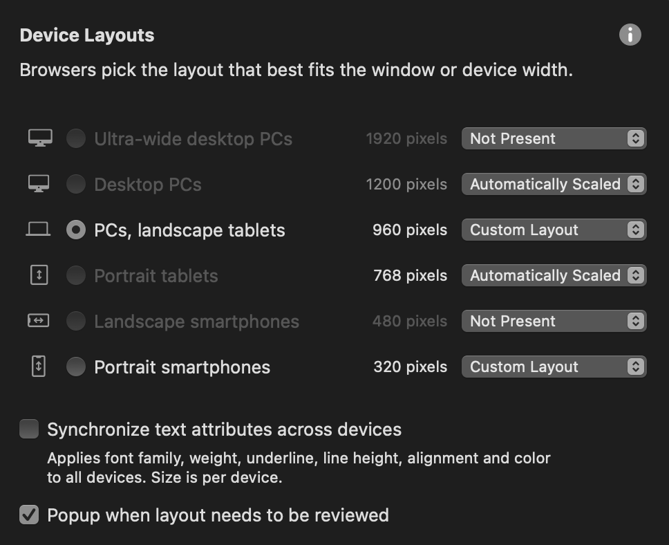
How do you have your Device Layout arranged? This is how I use it and have never had an issue with the tablet picking up the mobile layout. How is yours setup?
My first two websites I started with the 960 Layout, then did the 320. This third one I mistakenly started with the 1200 layout. I then did a custom layout in the 960 and reset the 1200 to Not Present. I think things got a bit out of whack. I now am getting my iPad to show the 960 layout in landscape view, but not vertical, which shows the 320 layout. My two previous websites, built at 960, would show the 960 layout in vertical view. I’m getting closer. Thanks for your help.
1 Like
As I have shown you in my screenshot, if you were to also Automatically Scale your 768 Device all will be good on your iPad in portrait mode! 