Hi guys!
I’m new here, and would like to introduce myself with my website: www.ritmix.eu
I’m a beginner, with no special knowledge. I’ve learned how to use and how to make a website by watching sparkle’s tutorial on Youtube.
Would you like to suggest me:
how can I manage the news, so as not to take up too much space on the page?
I’m having trouble with scaling fonts on mobile. Google Search notice me that the sites is not working well. Any suggestion?
Hallo Elena,
don’t worry about Google. I also become always the information that my side is not running well on mobiles. I’ve decided that my side is made for desktops and I have no version for mobiles. So Google will worry about this and I don’t worry about Google …
I think, before you start your website it would be better to decide what you want. Do you want to built a mobile side or a desktop side or both? With Sparkle it is very easy to realize a good website in every format. So on … it’s your turn.
Hi, thank you for your point of view.
I’ve built my wsite for desktop, then analyzing google analytics data, I’ve understand that the mayor use is on mobile.
there’s no standard for how a news section should be designed, really depends on what it contains… if if you have seen something around the web that you’d like to replicate, send screenshots or links and we’ll take a look and give tips.
The device setup is mentioned in the documentation, let me know if this helps:
@Horst, I know what you are saying but in today’s online world it is not an option it is a necessity! You are right that we shouldn’t go over the top with Google, but if you want to be found and give your user (which is now 55-75% of all website traffic) a good experience then mobile is a must, not an option!
Yes, Hendrik, I agree to you for 100%. What you are saying is absolutly correct and is the case for all websites that are designed for „normal“ users, for buyers, for customers and so on.
Before I started my website https://www.elektrostatikhilfe.de I had also, like the millions of other website designers, to decide for which target audience is my website created. I know my target audience very well since several years. They are working in different factories, in production areas. Normally they have not so much time to take a look on the smartphone only for playing or a little information, because they have to take a look that the production is running. When they find in the production area a problem effected by electrostatic, they are looking for a suitable and fast solution. Yes, they take a first look on the smartphone and they are searching for special electrostatic terms … o.k… Then they find so much information. The most of this informations are written in academic words, very difficult. So they have to scroll and scroll through many difficult text on a small display. And this, I find, is unacceptable. So I put my „academic words“ only in a desktop version, easy to read on a desktop.
By the way, the project Elektrostatik Hilfe is a privat made project beside my job in an electrostatic company. I’m sorry that I cannot satisfy all the calls for the mobil version because there is no time for this.
But this is only my private situation. For all the other people that want to create stimulating, inspiring, interesting and profitable websites (with this wonderful Sparkle Website Designer) it is strictly required to build the websites also, or only in a mobile version.
But I hope all this creative people won’t let bring them out of their way by the strictly SEO rules and always arriving Google „Mobile wake up calls“. Creativity comes first. Sparkle makes it possible.
@Horst, Thank you for adding a bit more to your story!
I hear what you are saying and I also hear the workers interact with mobile at times so it makes sense the call you have made. Have you thought to make your content searchable? This would allow the users on mobile to get to the information a bit quicker if you ever considered making a mobile version.
I know you have search for your desktop version already. Have the users mentioned it is a great idea having your site searchable?
Anyways thank you for further clarifying… appreciated!
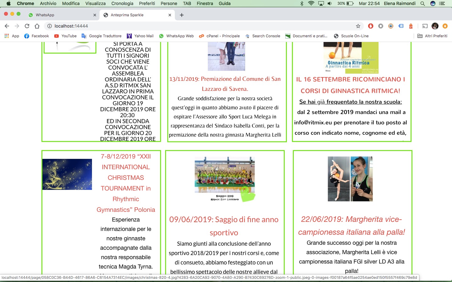
 How can I keep It update, without work 3 hours, only for move each box?!
 thank you, I have a lot to learn.